
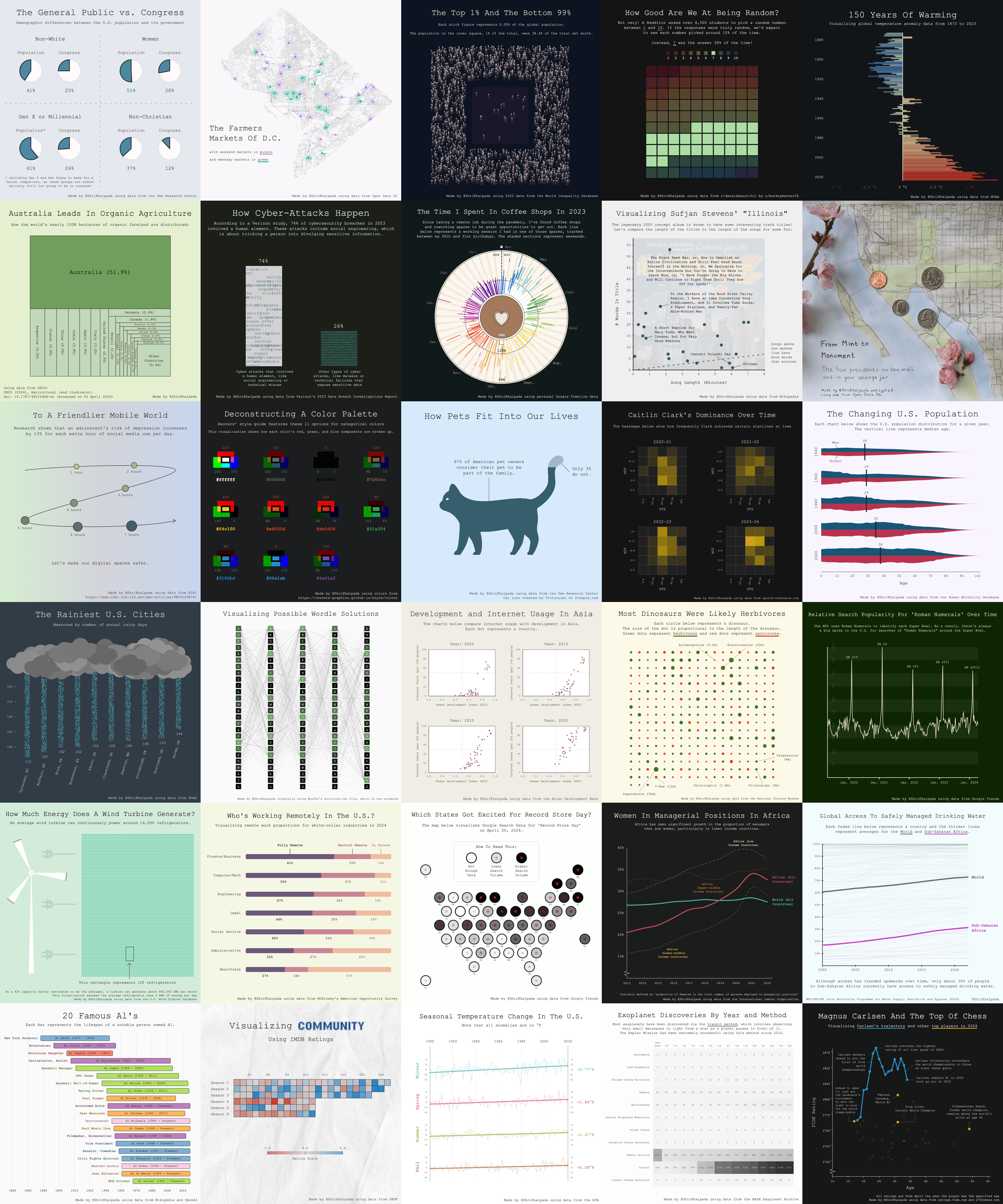
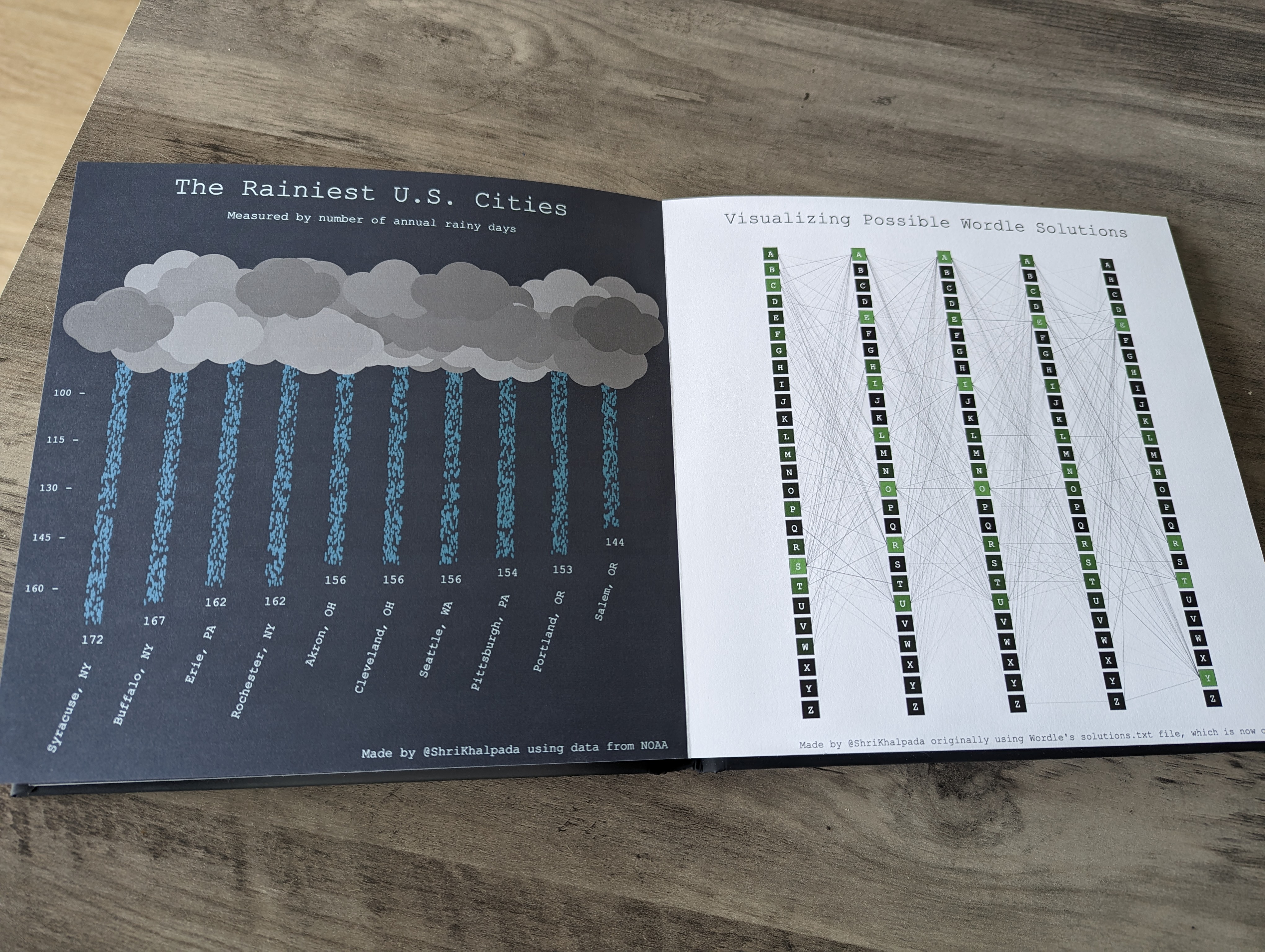
Summer 2024 Update: I got a physical version of this project made!
Some time in March, I heard about the #30DayChartChallenge. It's a community challenge with a simple premise: create a visualization based on a given theme every day in April. It seemed like a fun way to push myself creatively and learn, so I decided to give it a try.
I gave myself a few constraints for the challenge to (1) help give all the visualizations some cohesion and (2) limit some of the decision-making I'd have to do each day:
- Make each visualization a square so that they'd fit neatly in a grid at the end.
- Use the same general template for each visualization. From top to bottom: a title, a subtitle, the visualization, and a footer that cites the data source.
- Use the same font in each visualization. I chose Courier New.
- Spend no more than an hour on each visualization.
- I definitely went over an hour on a lot of them.
- I tended to do a few charts at once every couple of days instead of making one every day.
- Use p5.js for each visualization.
- I've really enjoyed using p5.js for some of the visualizations on PerThirtySix and some of my personal projects. It's relatively high-level as far as graphics on the web go (drawing and styling a shape is usually as simple as a few lines of code), but quite low-level as far as visualizations go (you have to draw and style each shape).
- To that end, coming up with chunks of code I could reuse for different days was key, as was leaning heavily on AI tools like ChatGPT and Copilot to help. I found these tools especially helpful for code involving positioning, which got to be a bit complex for some of my pieces.
Beyond that, I tried to be creative with each visualization. I hope you enjoy reading about my experience and if you do, feel free to follow me on BlueSky for more data viz content!
Without further ado, here they are.
Day 1 (Part-to-whole)
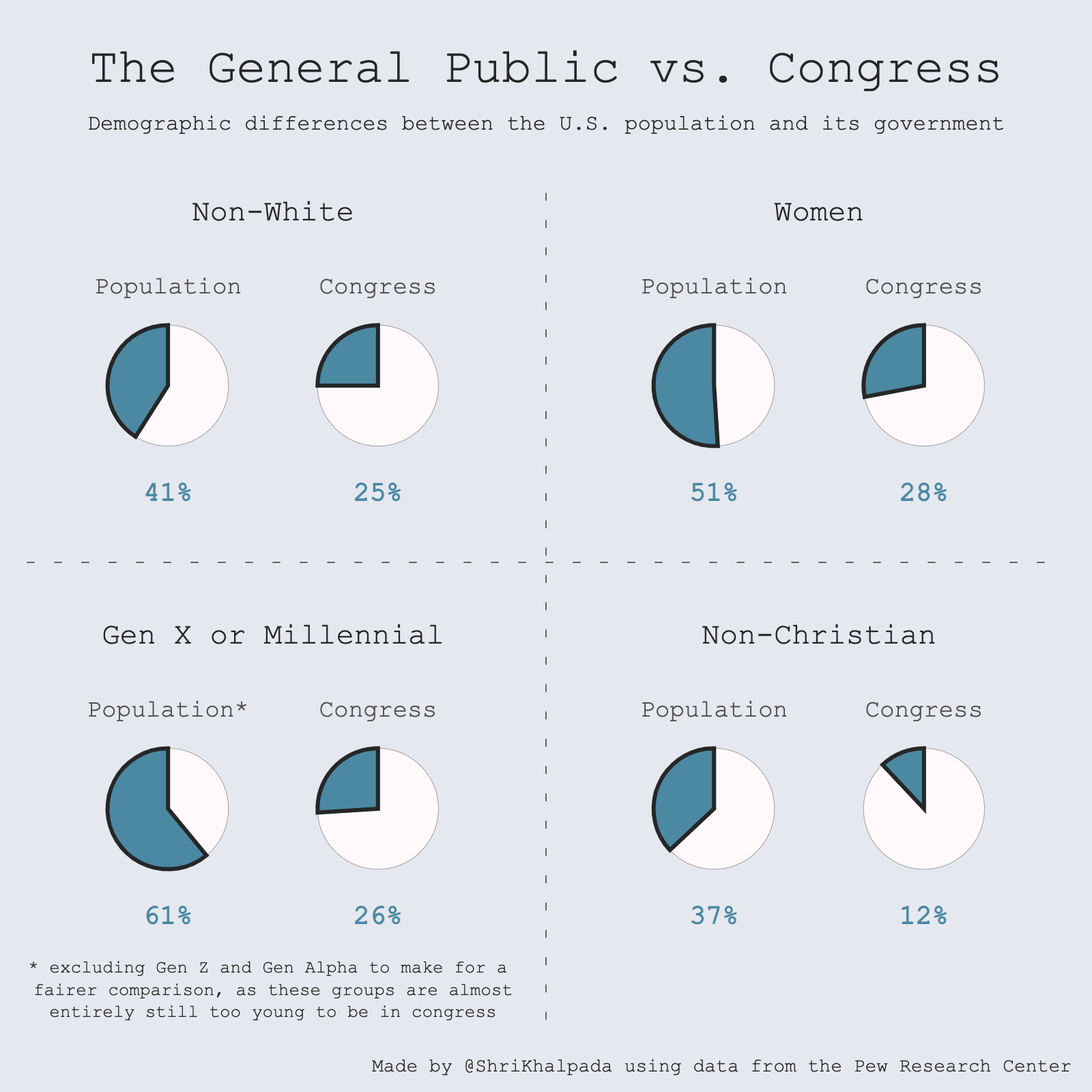 For the first challenge, I wanted to use a dataset that was ready to visualize without much extra work. I originally planned to just use the first quadrant around race to show Congress' representational shortcomings, but found additional data points that drove home the point.
Day 2 (Neo)
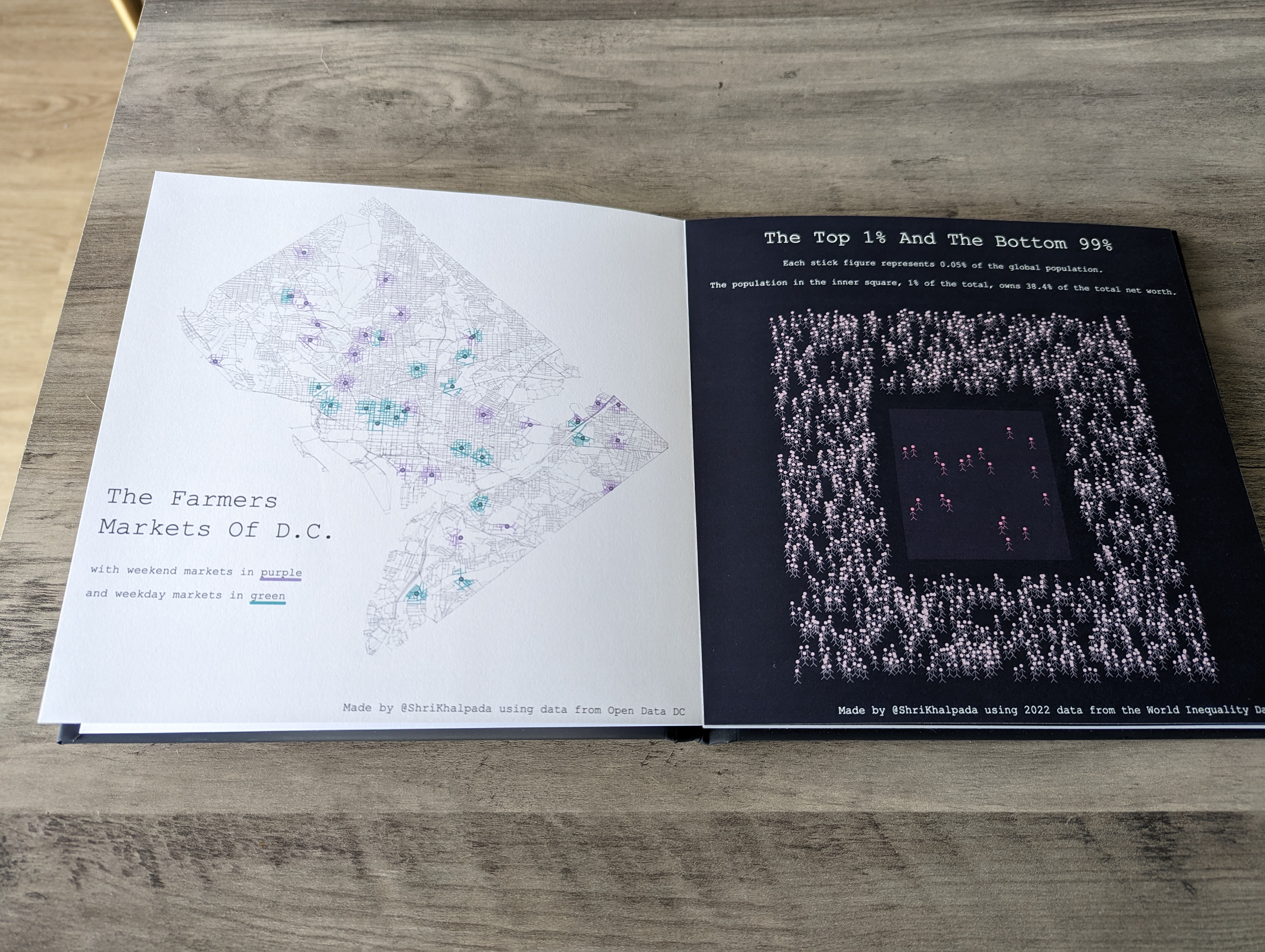
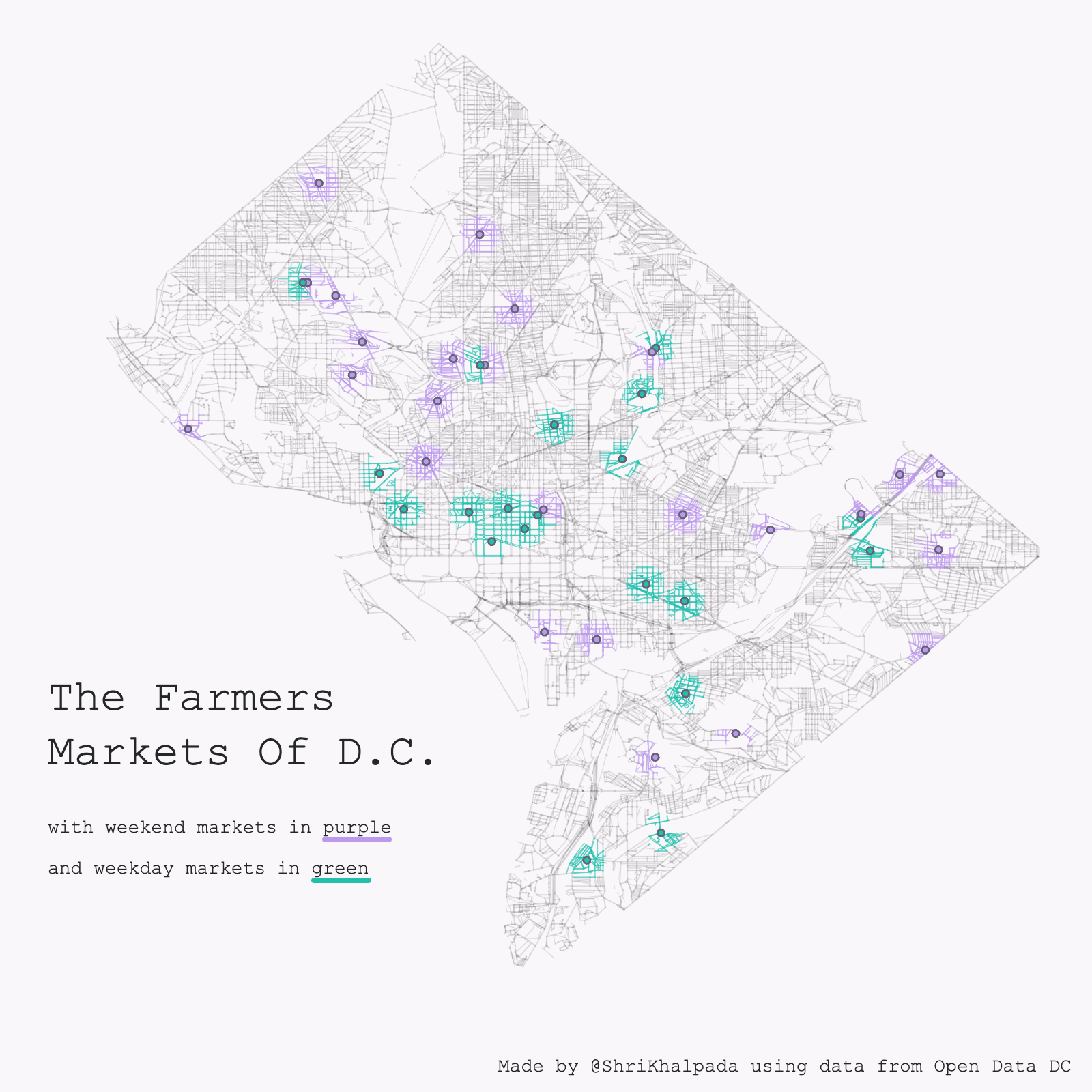 Being from and living in DC, I love playing around with data from Open Data DC.
I have some code from a project I did a while ago that visualizes DC road data, and decided to build on top of that to visualize data around farmer's market locations in the city.
There's a neat effect here, where each road is colored based on whether it's close to a market.
Day 3 (Makeover)
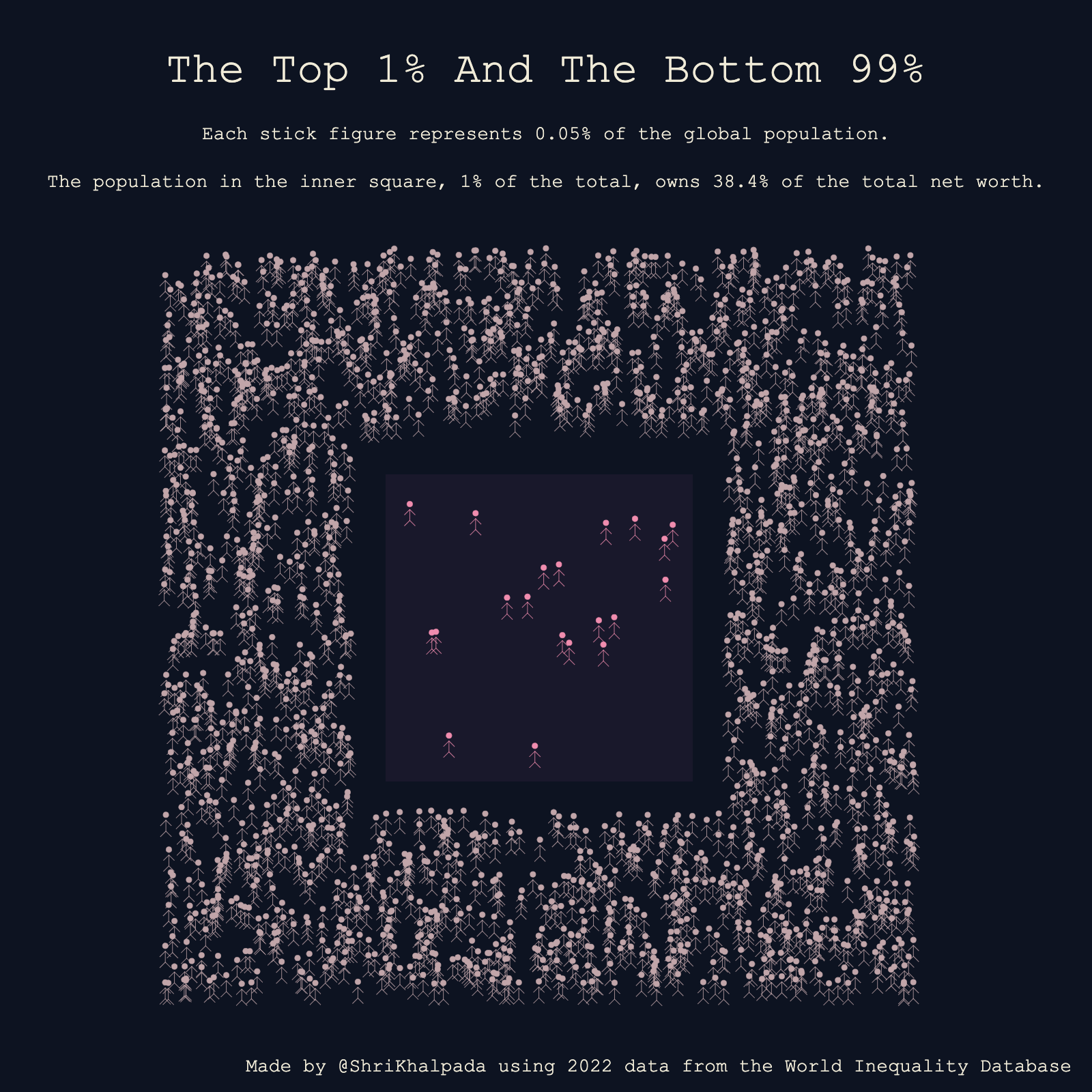 This is a riff on PerThirtySix's piece on wealth inequality.
Using simple constructs like stick figures and space, in my opinion, is an underrated way to represent data that shows distribution of resources like wealth. It just feels more humanizing than encoding human lives as a few pixels of width on a bar chart.
Day 4 (Waffle)
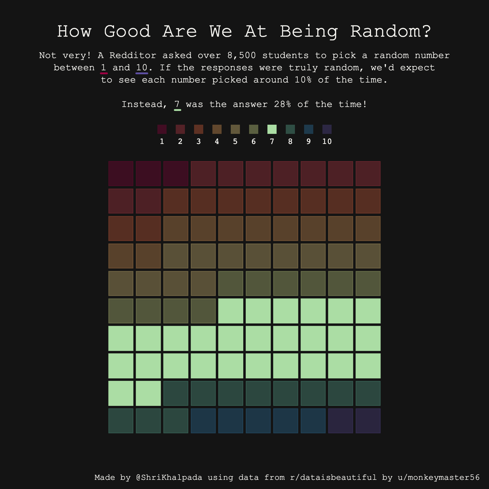 The data for this came from an interesting thread on Reddit. There's a really interesting video on YouTube by Veritasium on the topic as well.
Day 5 (Diverging)
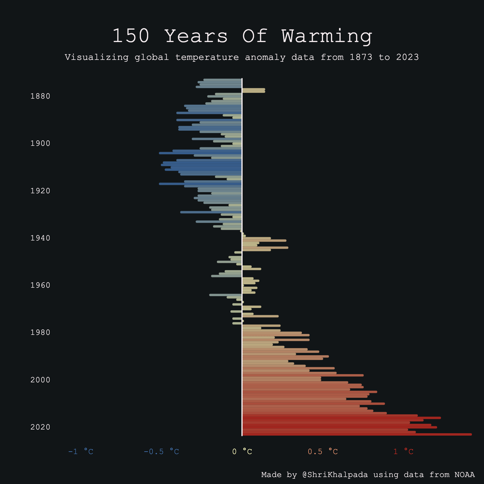 Climate data seemed like a natural choice for the theme, and I was pretty familiar with this dataset from PerThirtySix's piece on climate change.
Day 6 (OECD Data)
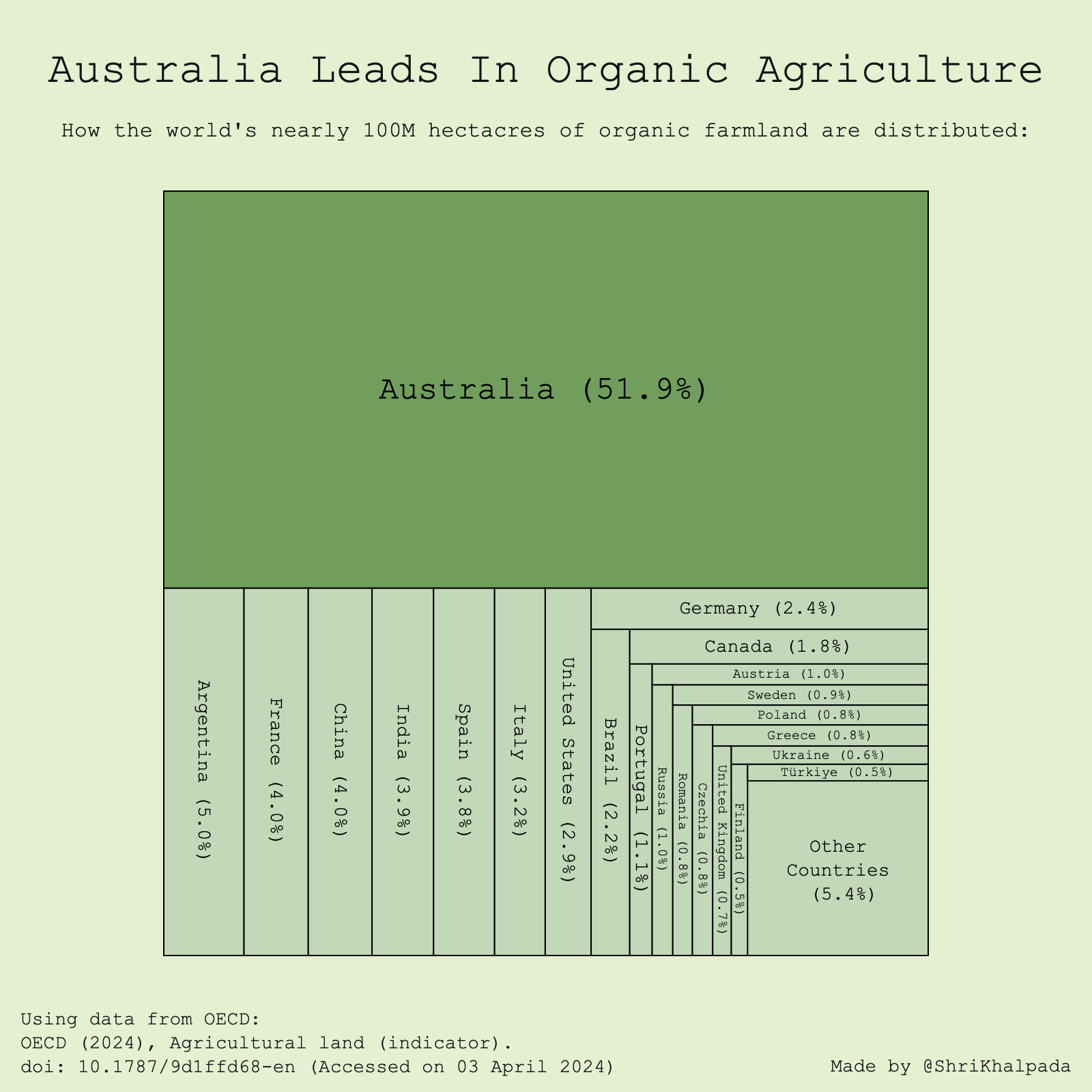 I had never worked with OECD data before, so this took quite a bit of clicking around on their website until I found an interesting dataset on agricultural land. This was the first really surprising thing I learned doing the challenge; I genuinely had no idea Australia was so advanced in organic agriculture!
Day 7 (Hazards)
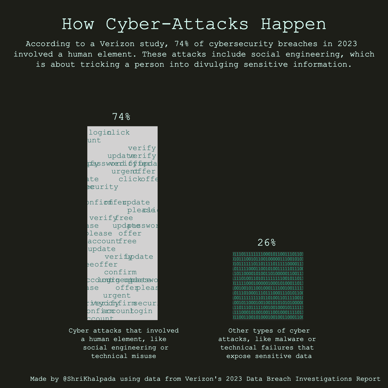 For this one, I found a dataset from Verizon analyzing cybersecurity breaches. I decided to go with a stylized column chart for this one, which was much simpler to implement than some of the last few days but hopefully just as effective.
Day 8 (Circular)
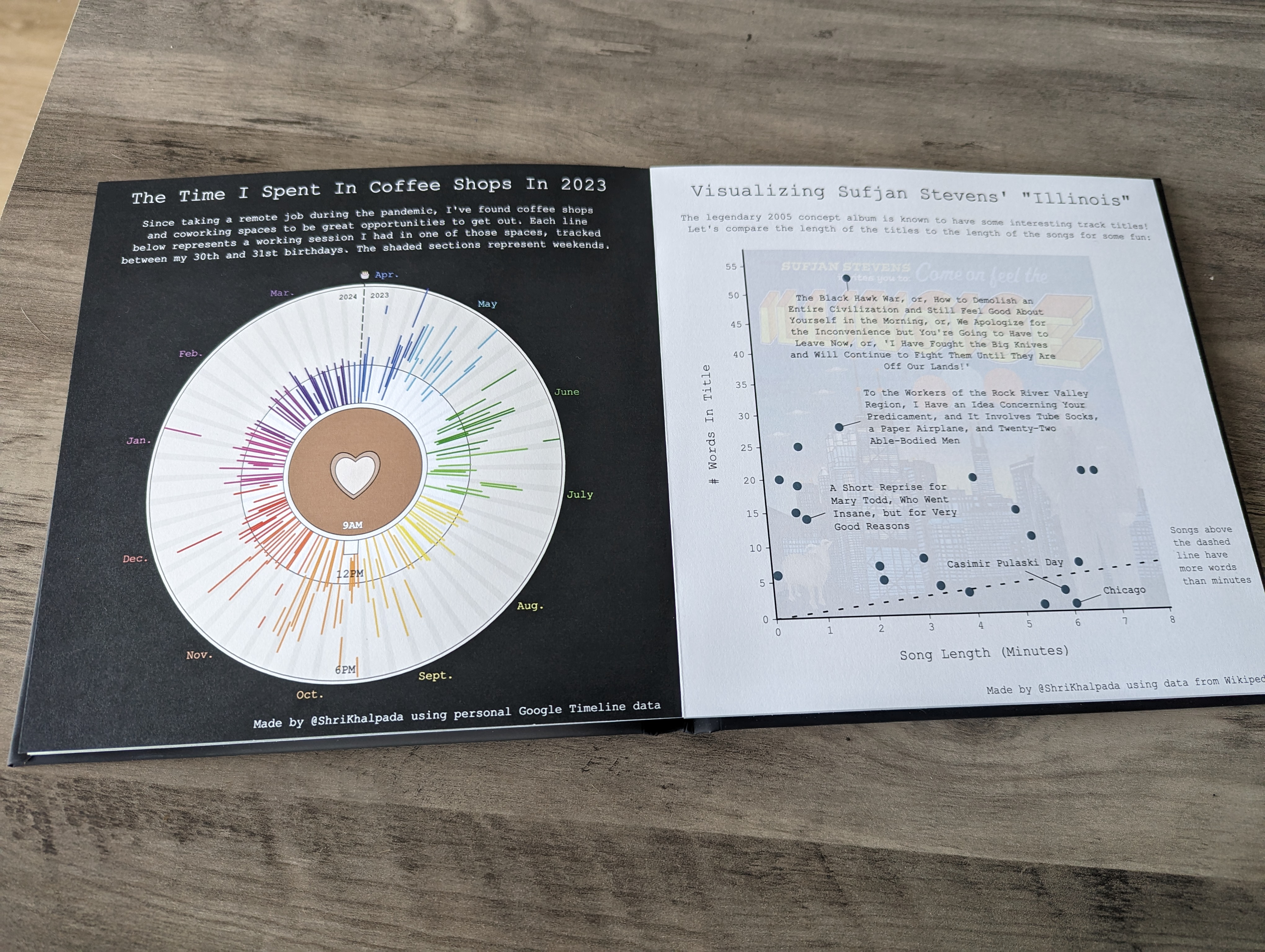
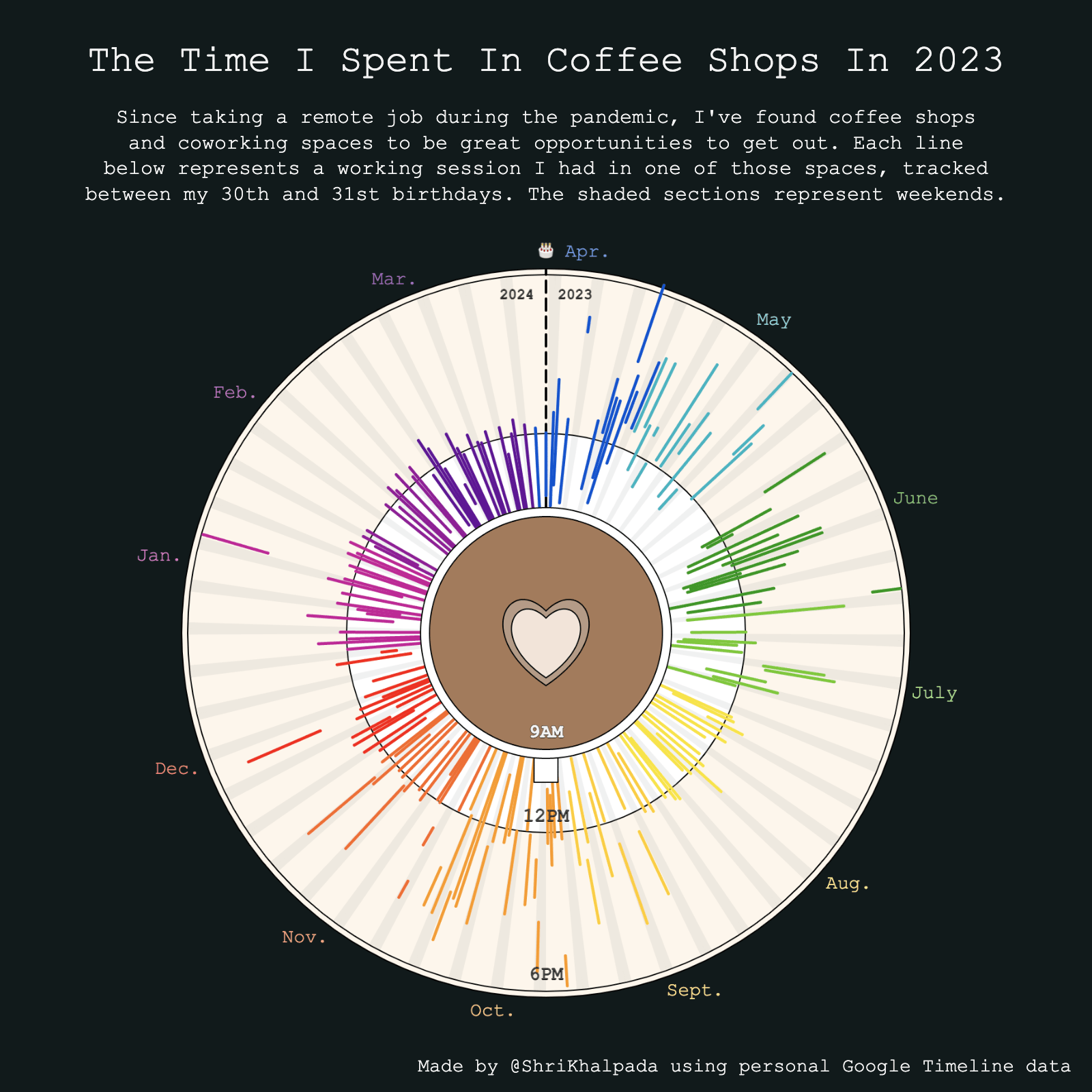 I was traveling for the solar eclipse this day, so I knew I wouldn't have a lot of time for this challenge. I had an old visualization showing my time spent in coffee shops in 2022, so I fed it a new year's worth of data from my Google Timeline to get a new chart for 2023.
I love how clearly it shows the point late in the summer where I decided to try to have a more regular morning-based schedule.
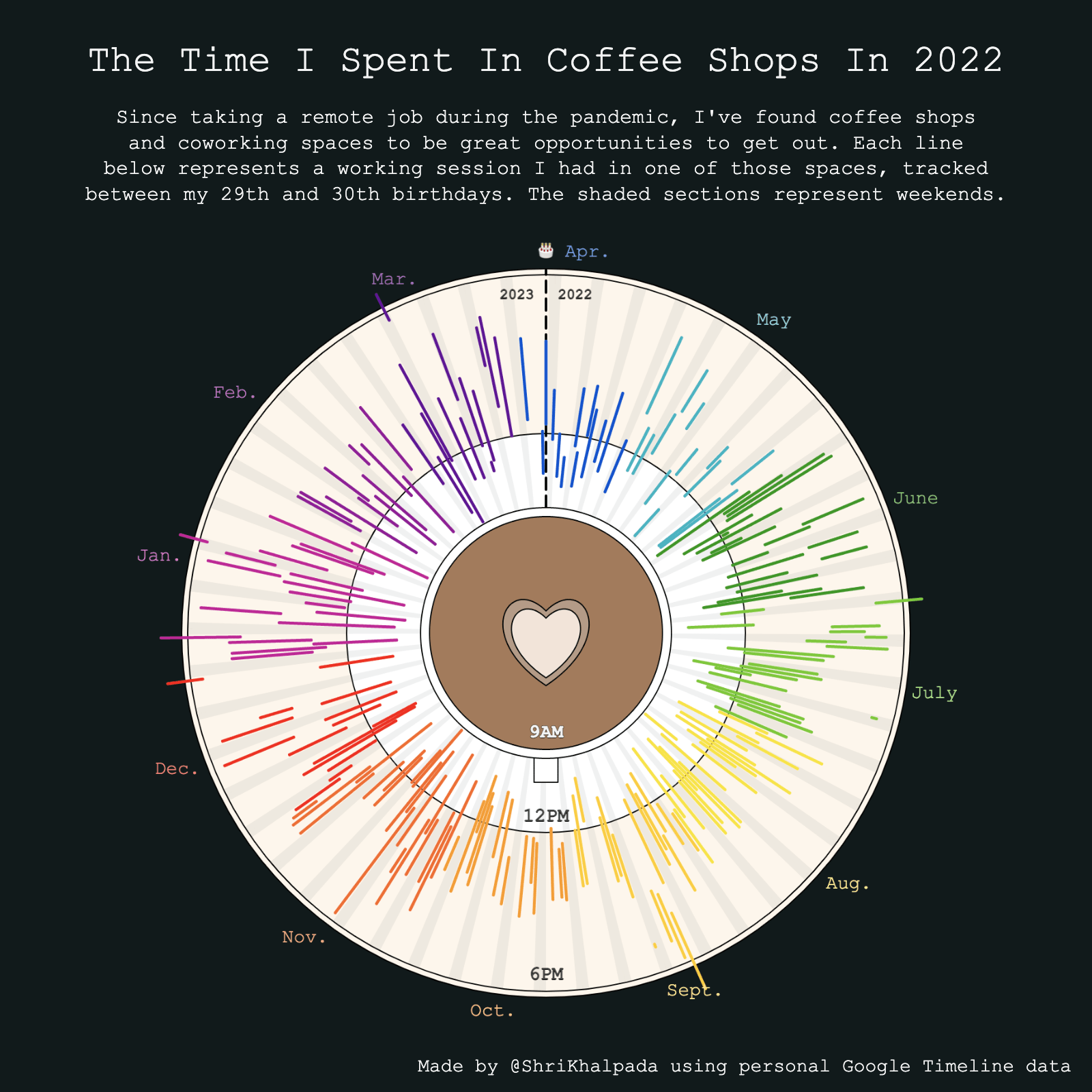
Here's last year's version, which I find slightly prettier but more chaotic:
Day 9 (Major/Minor)
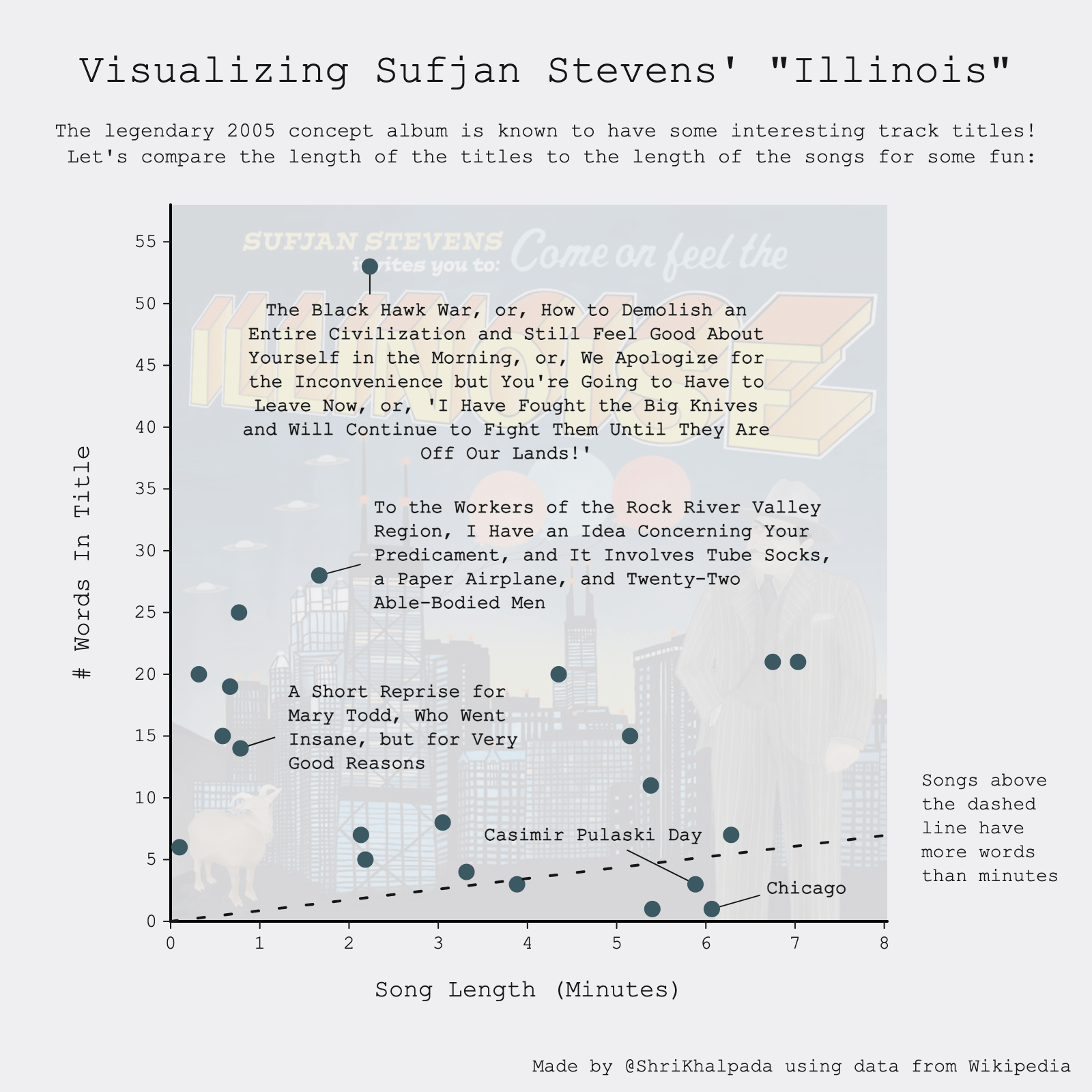 Anyone that knows me knows that I love the music of Sufjan Stevens.
Day 10 (Physical)
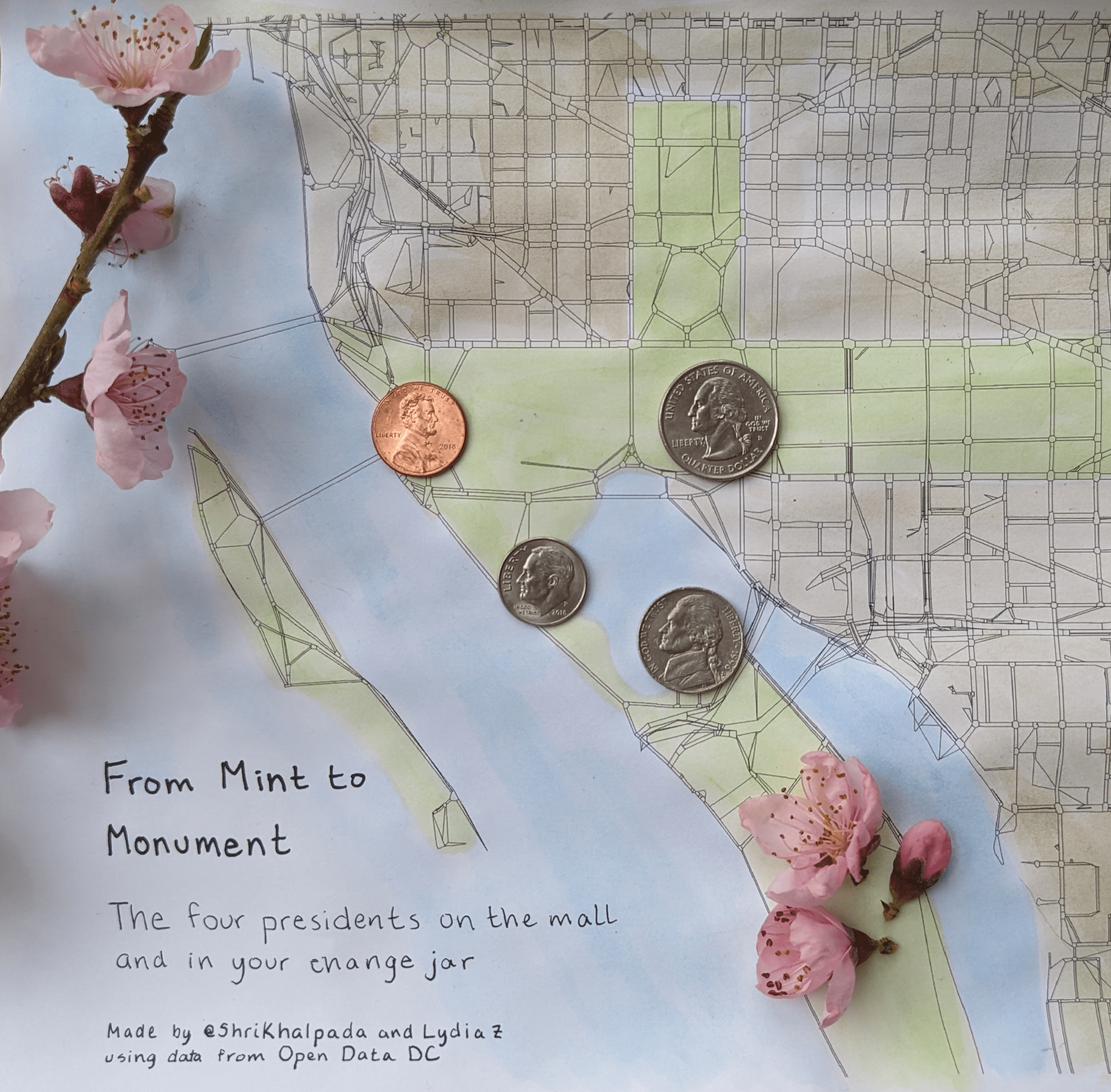 This one was fun! We printed a generated image of DC road data (the same data that powered Day 2's visualization), and made an afternoon out of painting, crafting, and trying different ideas out.
Day 11 (Mobile-Friendly)
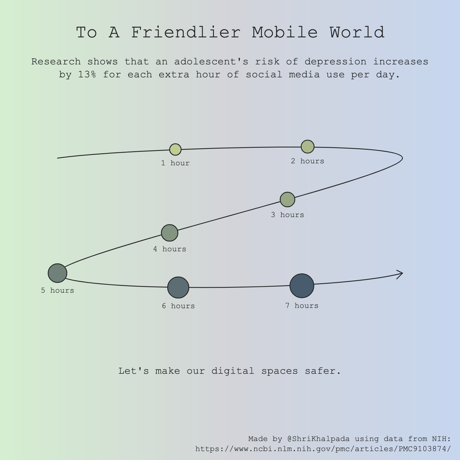
Since I was locked into making all my visualizations squares, I wasn't really sure what to do for the "mobile-friendly" theme. I decided to go for irony and think about how our modern mobile experience can feel un-friendly.
The end result is a pretty abstract visualization, where a circle representing risk gets larger as usage increases and starts to spiral downward.
Day 12 (Theme Day: Reuters Graphics)
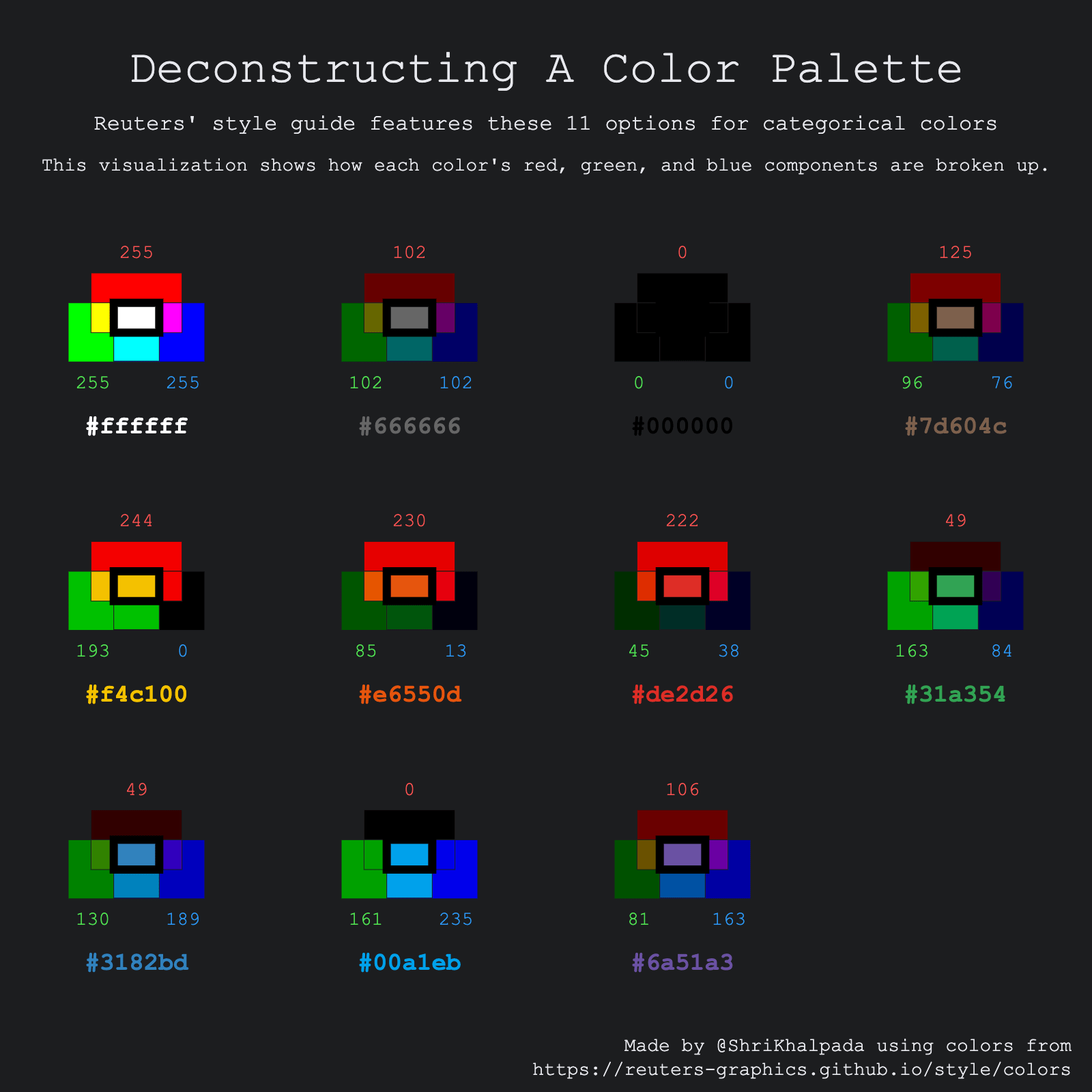 I genuinely had no idea what to do for this one. I eventually found a Reuters style guide, and thought it'd be kind of cool to deconstruct the red, green, and blue components of the colors. This one is less of a traditional data visualization and more of me just having fun experimenting.
Day 13 (Family)
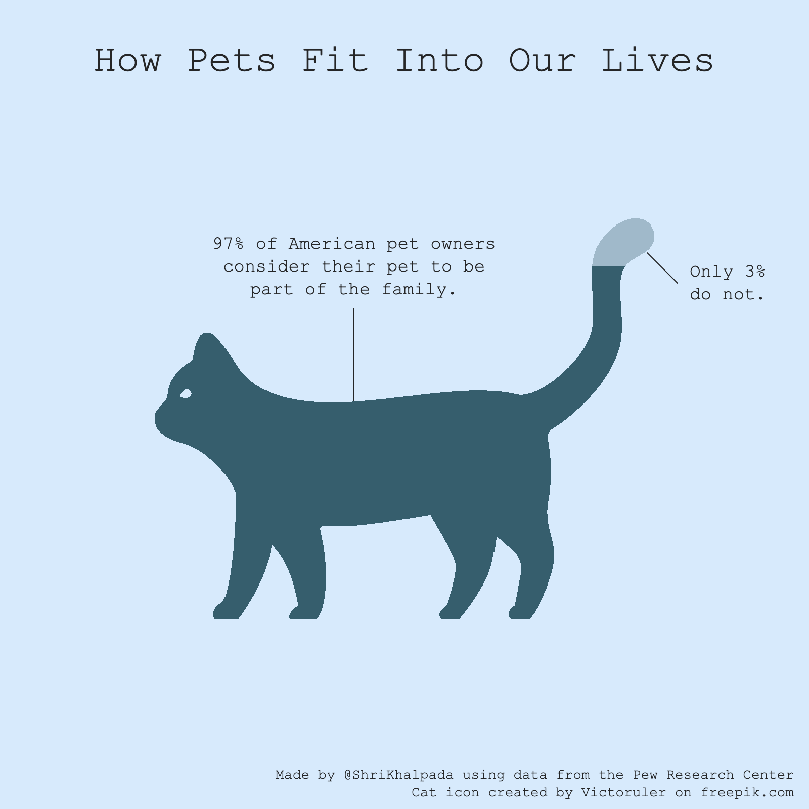 This is another one built on top of data from Pew Research, and probably the only one approved by Dorrie.
Day 14 (Heatmap)
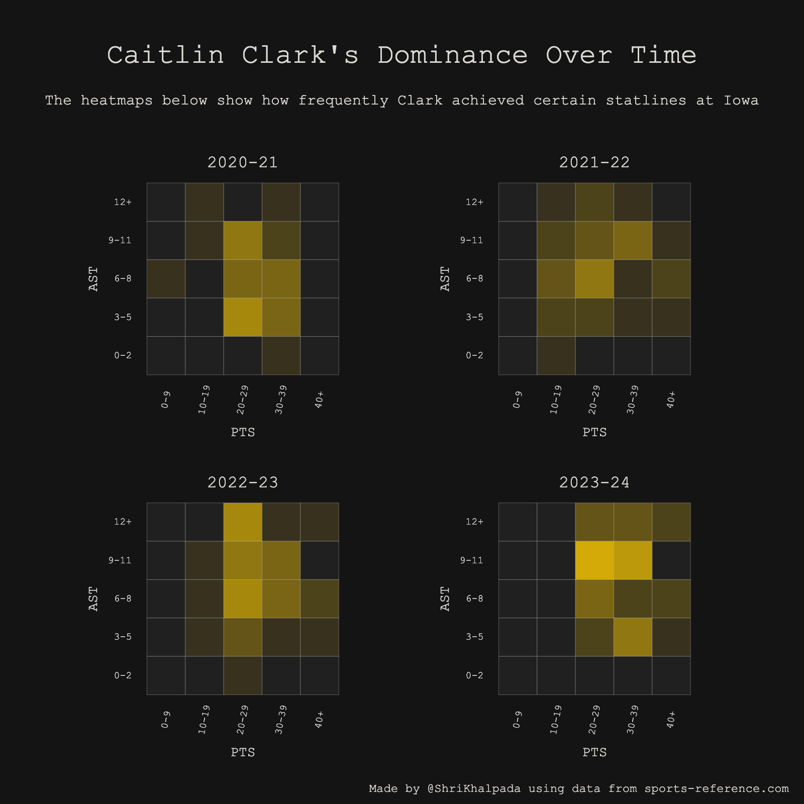 This felt especially topical the day before the WNBA draft!
Day 15 (Historical)
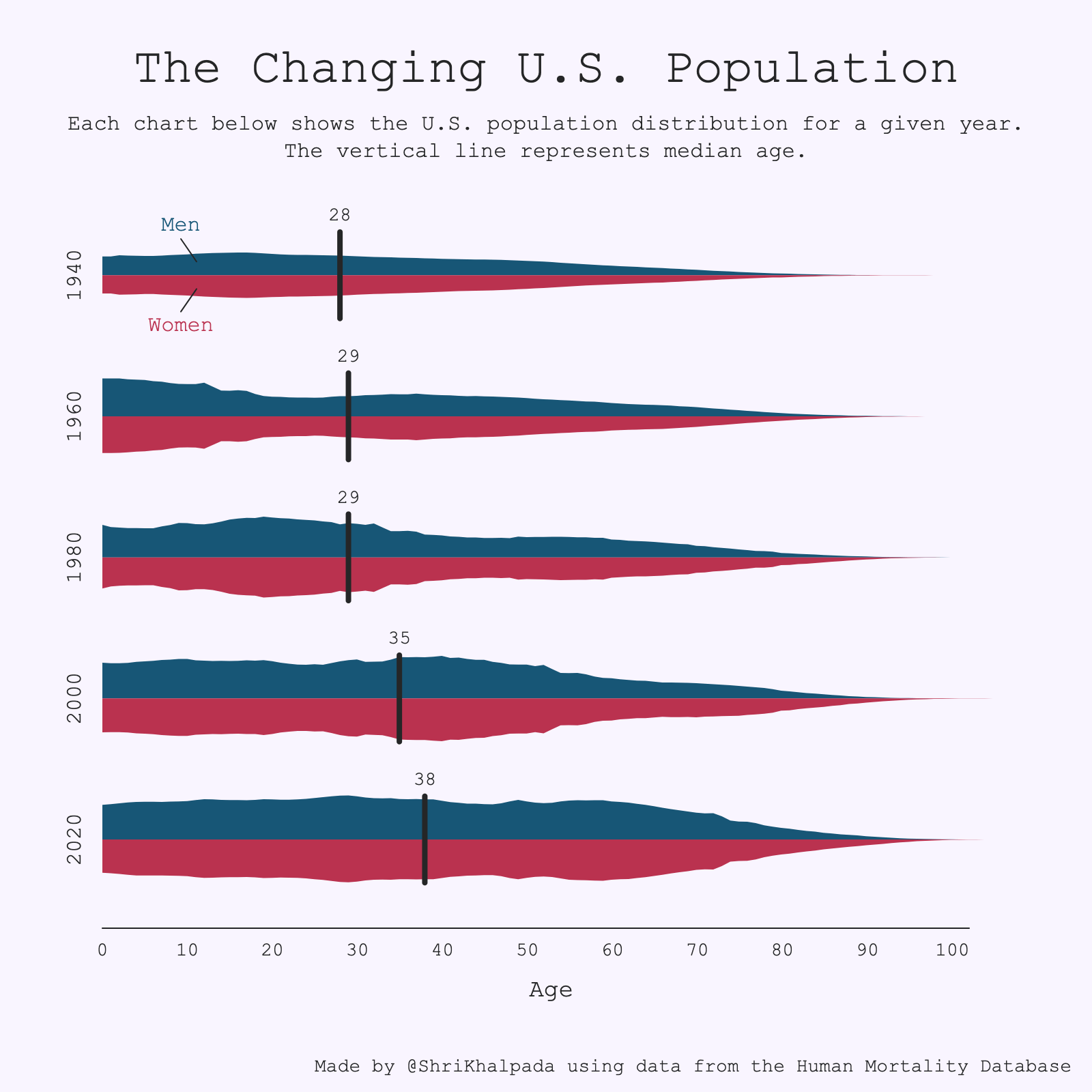 This was a cool dataset to play around with. It's interesting to think that my current age (31) would be above the median just 50 years ago.
Day 16 (Weather)
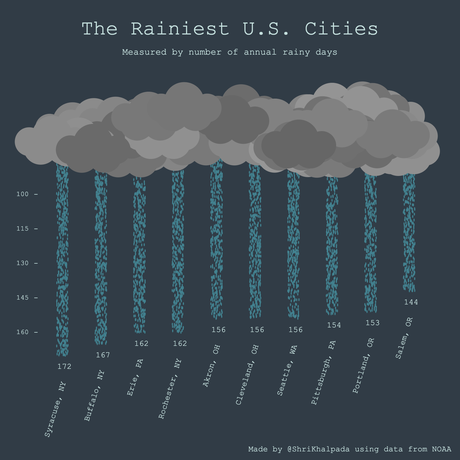 I was proud of the visual metaphor on this one!
Day 17 (Networks)
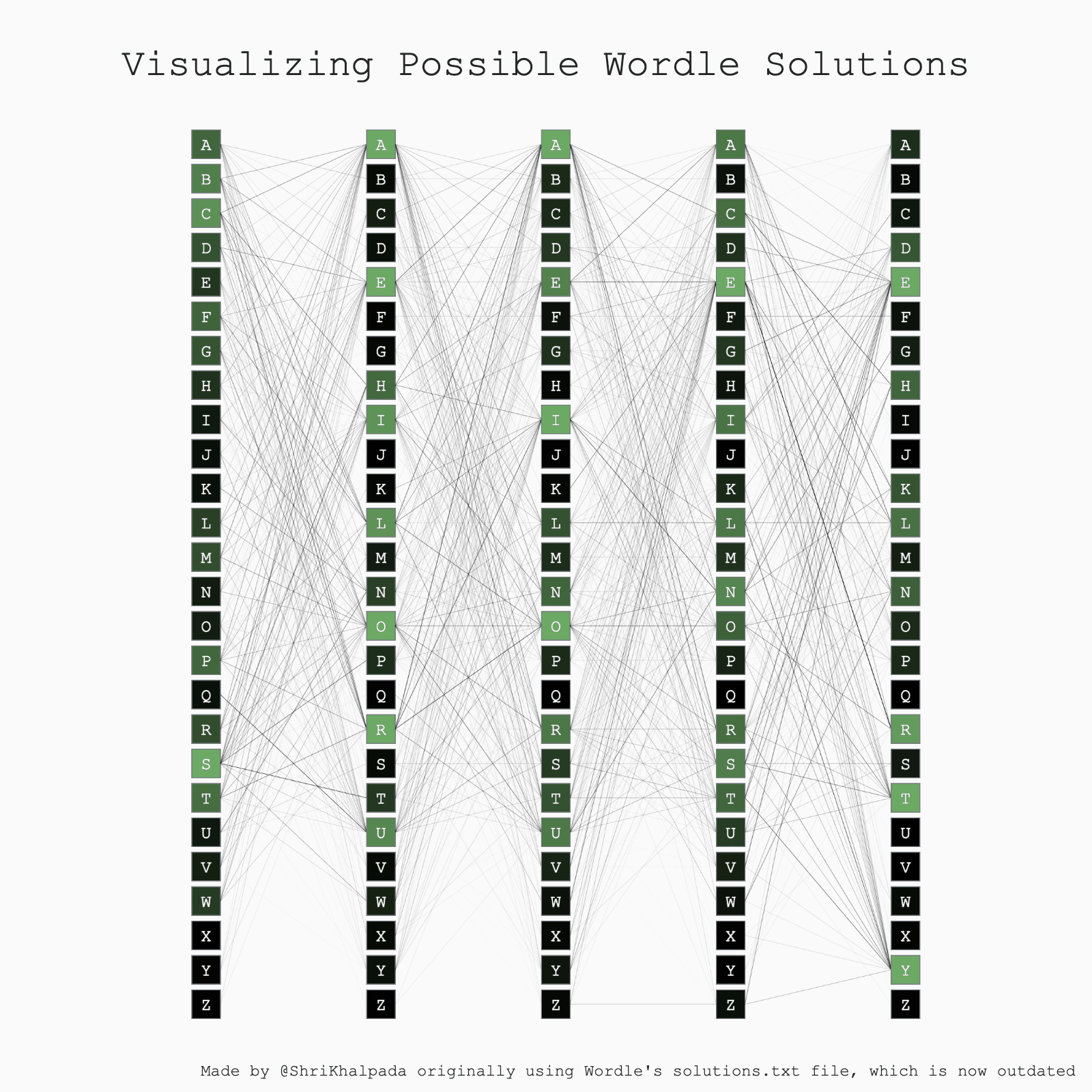 I didn't have a ton of time this day, so I tweaked some old code a bit and called it a day. That old code is what powers PerThirtySix's interactive Wordle Solver today!
Day 18 (Asian Development Bank Data)
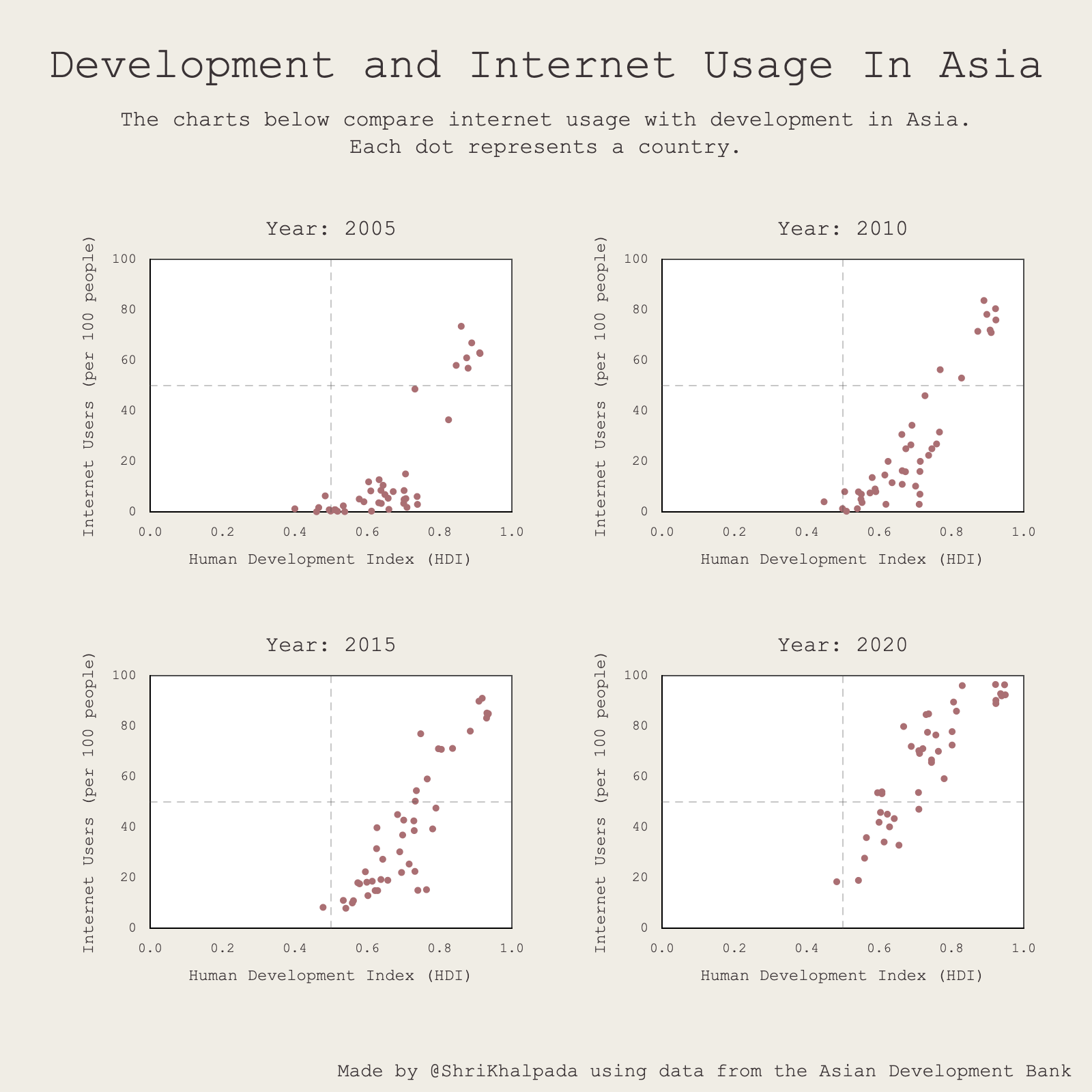 It would be interesting to find a story with this data, maybe around a specific country or a government program promoting digital accessibility that was especially effective.
Day 19 (Dinosaurs)
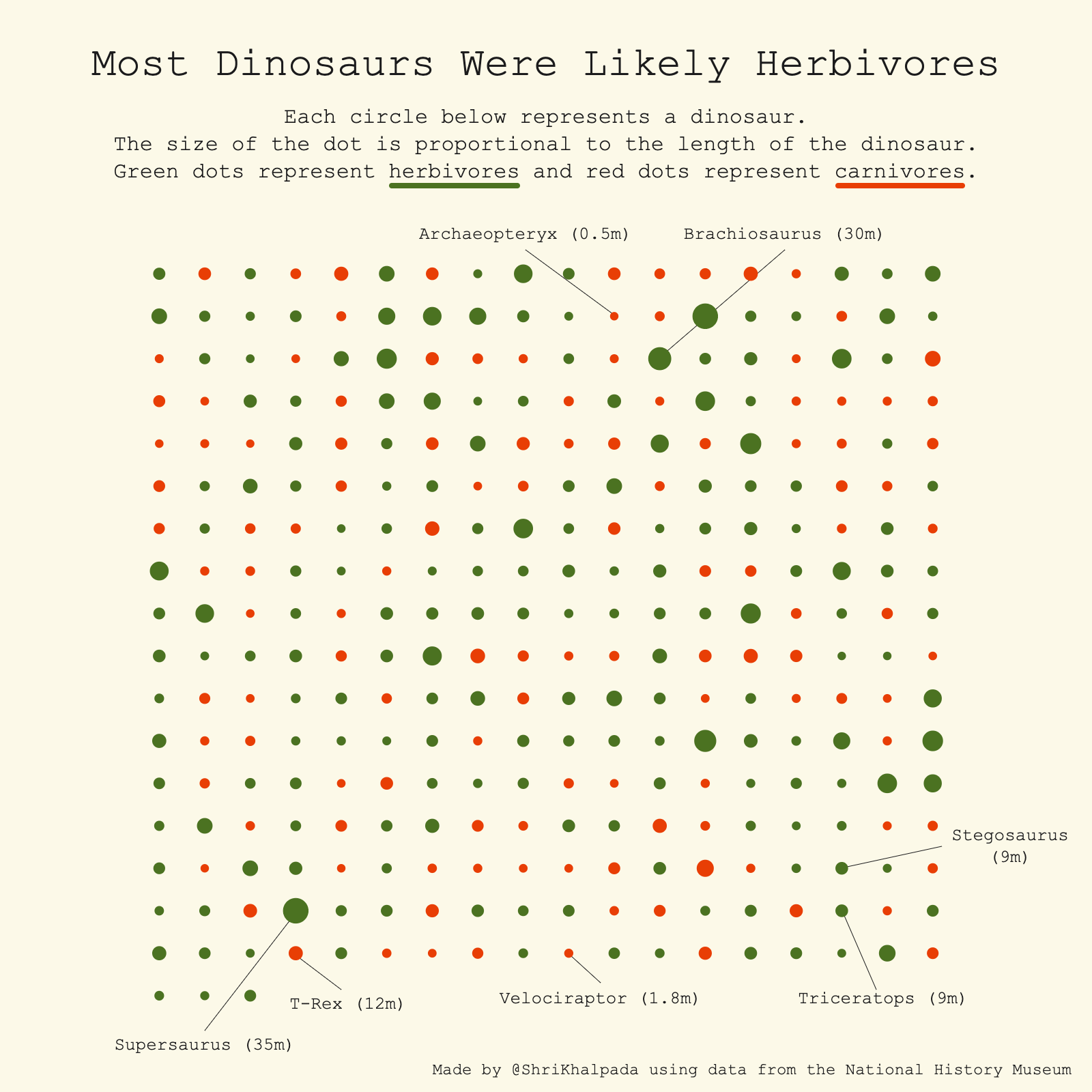 I knew that many dinosaurs were herbivores, but I didn't realize it was such a clear majority at around 65%!
Day 20 (Correlation)
 This remains one of my all-time favorite correlations.
Day 21 (Green Energy)
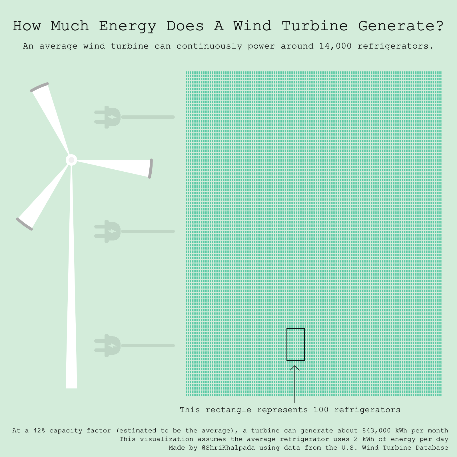 I find it hard to contextualize data around energy at any scale beyond my day-to-day usage. I found an FAQ page on USGS' website that helped contextualize wind energy, and that inspired this idea.
Day 22 (Mobility)
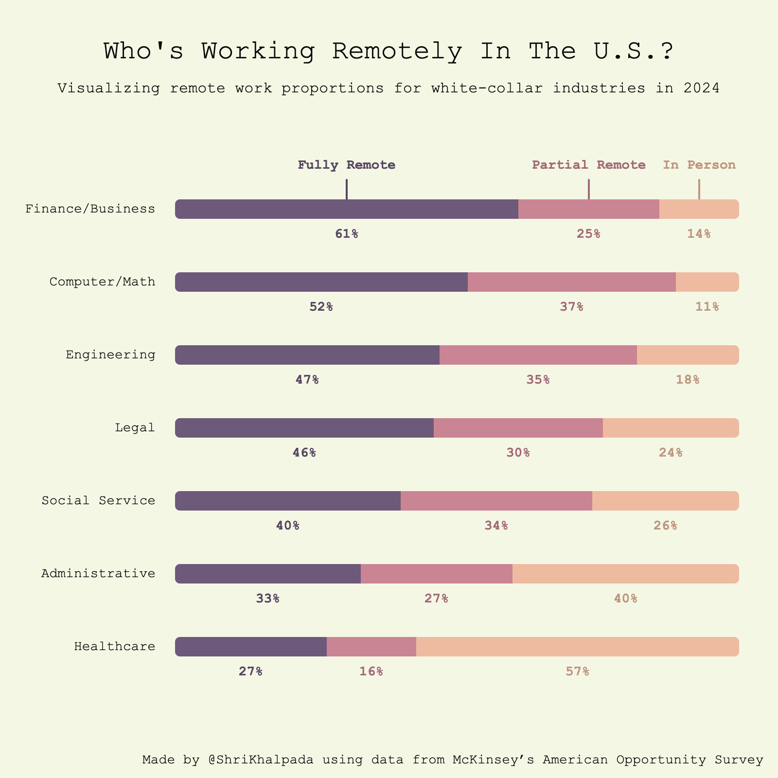 There were a lot of interesting statistics about American remote work in this piece by USA Today.
Day 23 (Tiles)
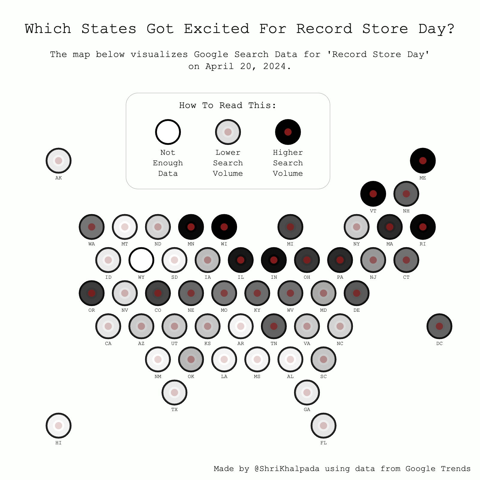 This one was fun to make! Some of the design decisions were somewhat tricky, like how to show state labels without making the visualization too cluttered.
Day 24 (ILO Region For Africa)
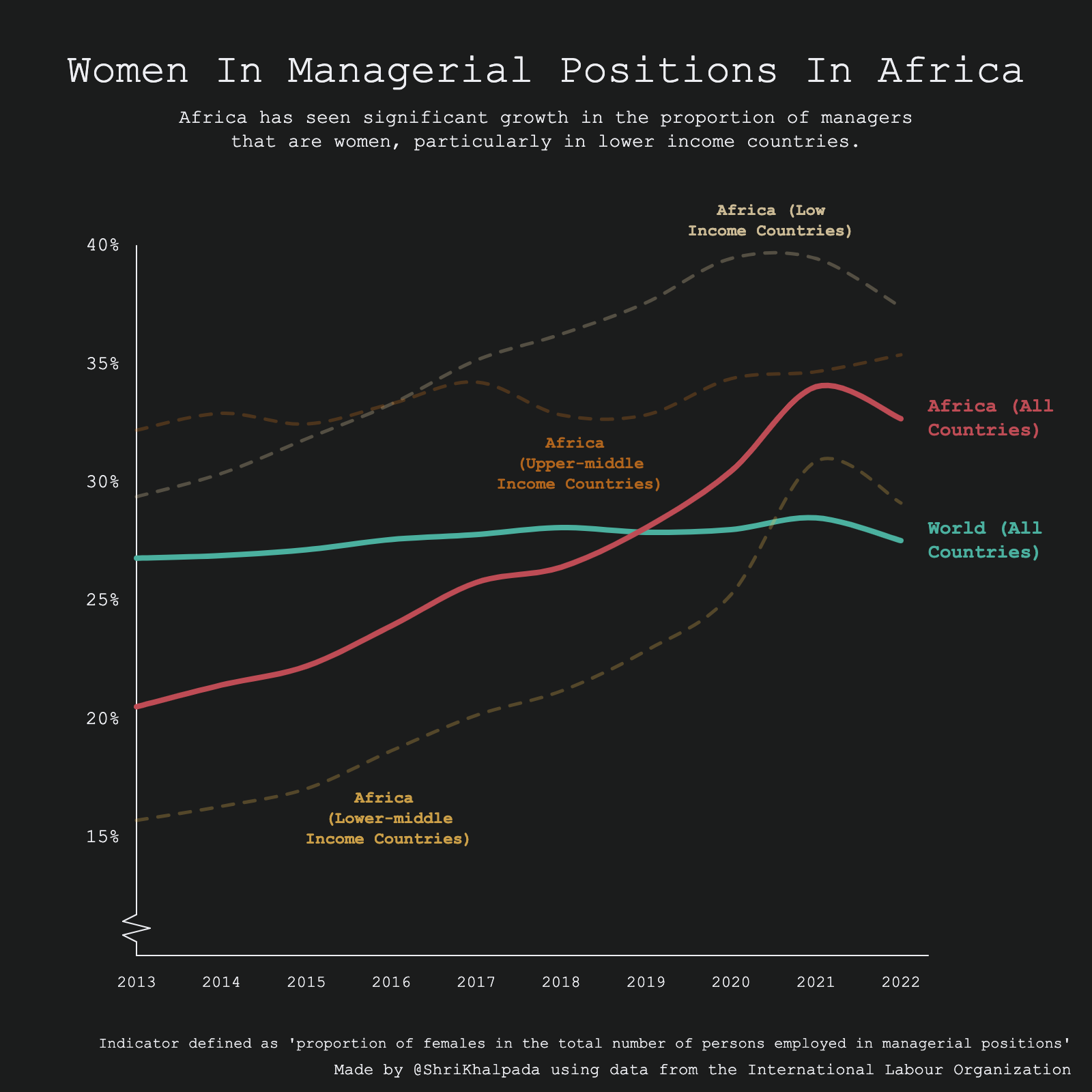 This is another one where I think it'd be fascinating to dive deeper into the data. I'd love to understand what drives these trends!
Day 25 (Global Change)
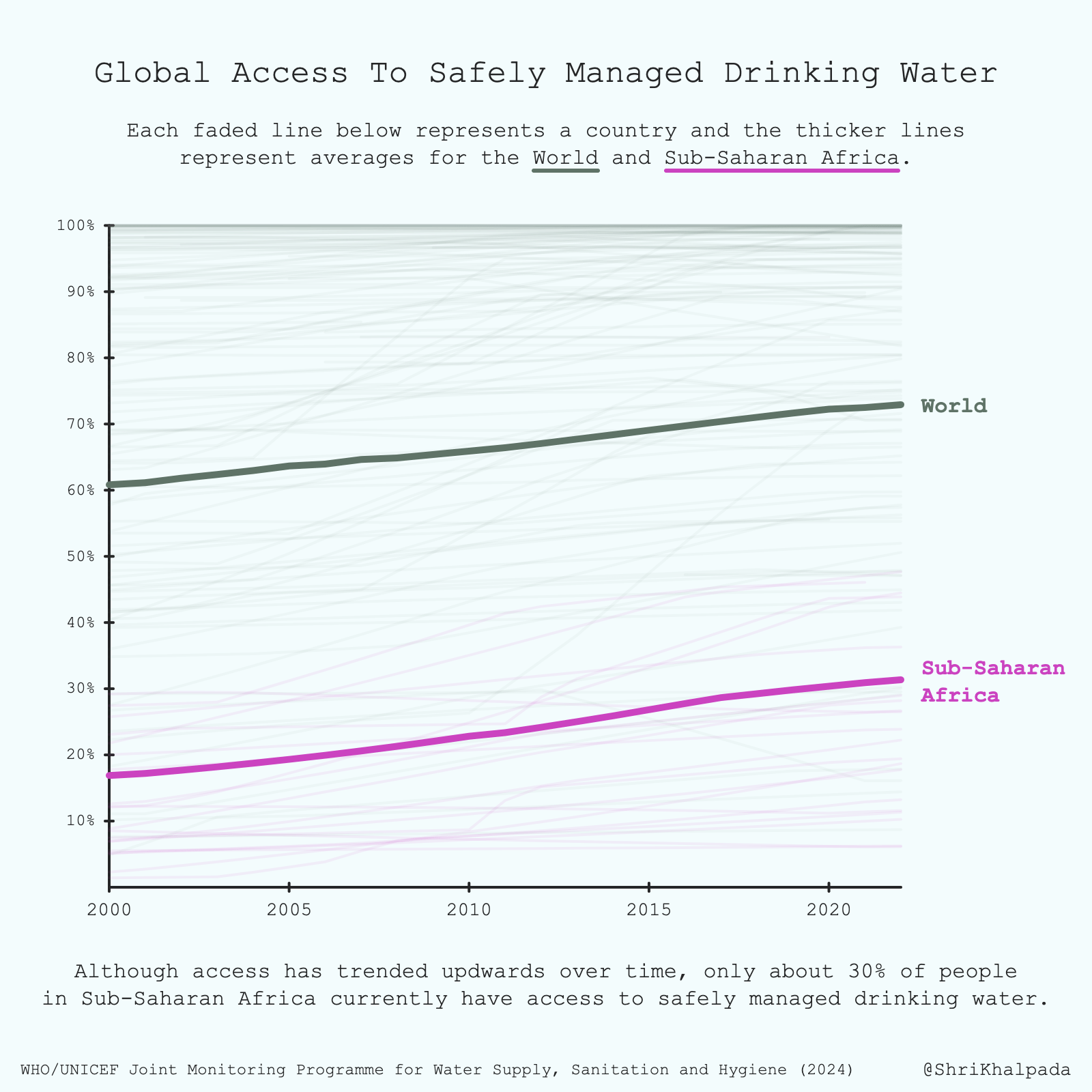 This is a sobering dataset. I had an intuitive sense that safe water is much less accessible in Africa, but visualizing the data really showed me the degree to which it remains a problem.
Day 26 (AI)
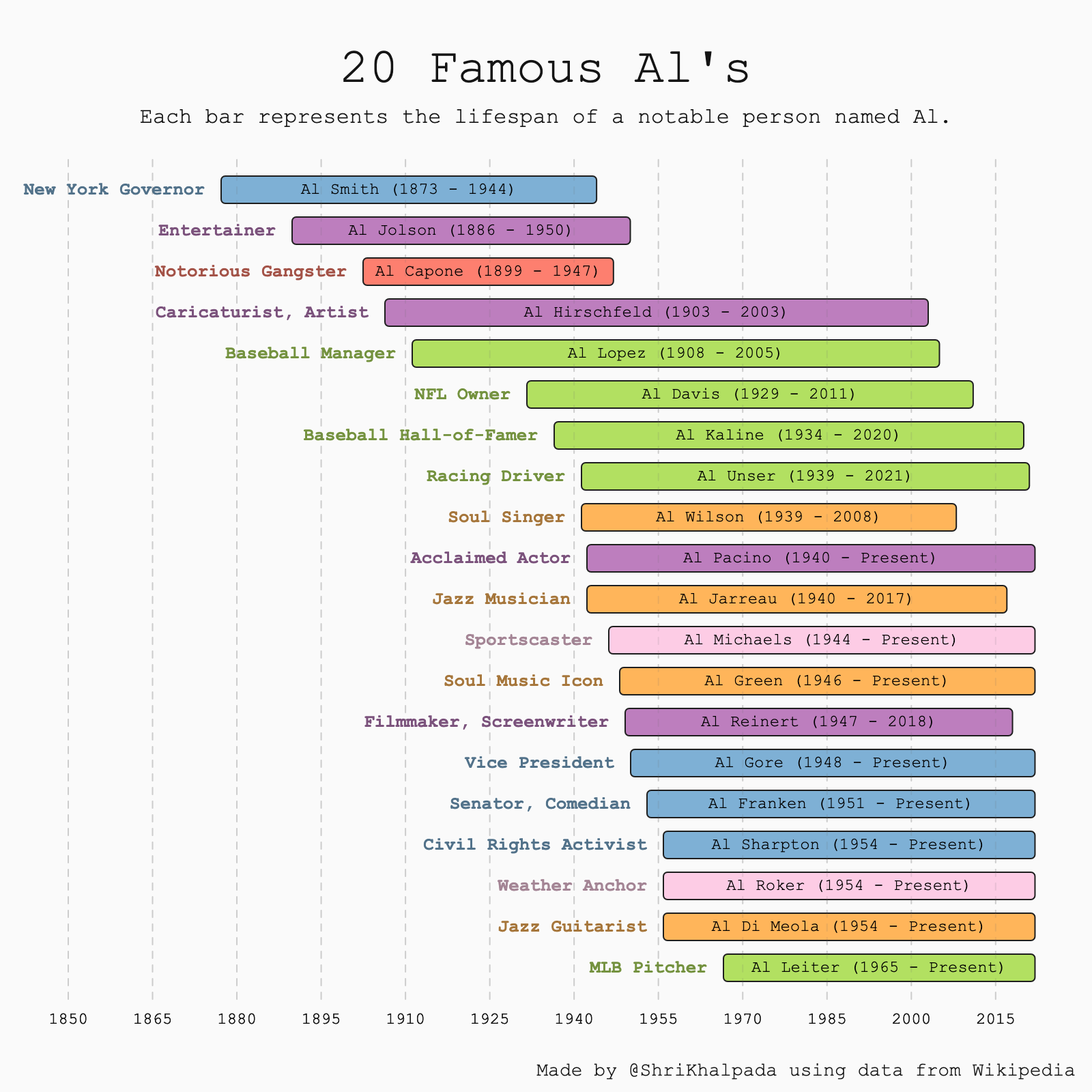 The theme for this day was AI, but I've been feeling a little AI'd out so I thought it'd be fun to make a visualization about Al's instead.
Day 27 (Good/Bad)
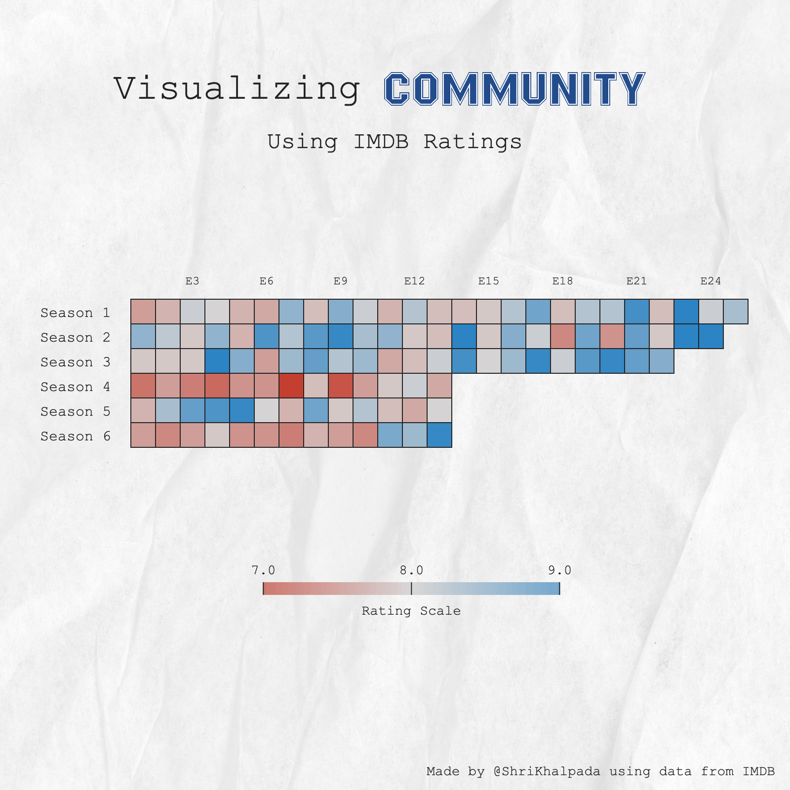 An ode to my favorite comfort show. #6SeasonsAndAMovie
Day 28 (Trend)
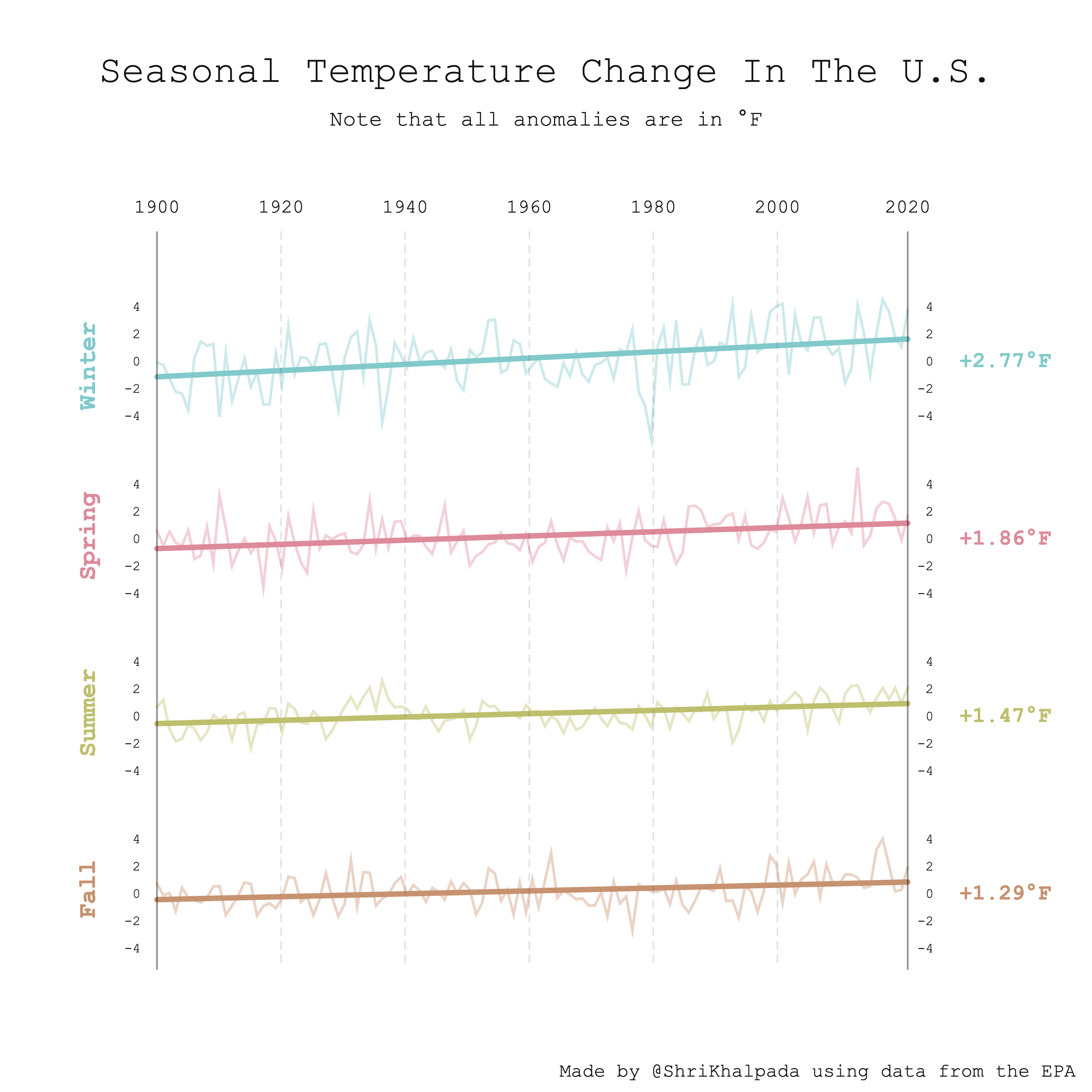 This is based on an interesting piece I found from the EPA. I'm pretty pleased with the hybrid approach of using line charts for the individual data points and a slope chart for the overall trend line.
Day 29 (Black'n'white)
 This was a very cool dataset to play around with.
Day 30 (Theme Day: FiveThirtyEight)
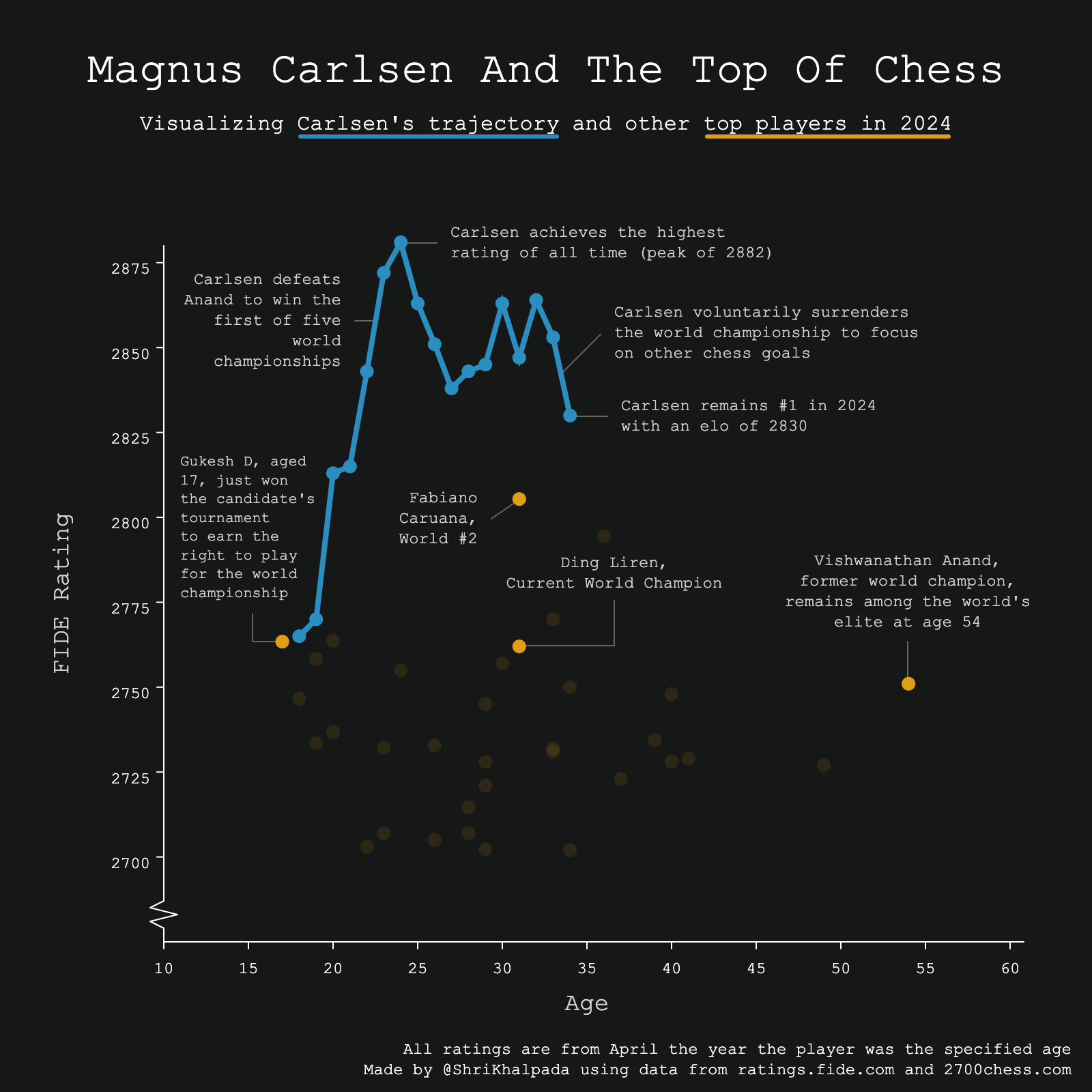 Once again, I had no idea what to do for the "Theme Day"! I've seen some FiveThirtyEight charts that do cool things around combining chart types and using lots of annotations, so I went for that here. I think it's a little confusing that the line represents one player over time and the circles represent different players at the same time, but hopefully it's not too unclear.
Very exciting to see the next generation of chess players starting to rise up!
Final Thoughts
And that's that! Shoutout to you if you're still reading this.
Overall, this challenge really pushed me to be consistent and creative. I found that it got progressively harder as the weeks went on, which probably isn't too surprising.
I'm proud of my output and learned a lot in terms of general visualization practices, some tool-specific quirks, and how to get the most out of the human + AI combination.
We're just getting started.
Subscribe for more thoughtful, data-driven explorations.