
Coding
Let's chat about about web applications and actually building this thing!
Web Applications
We'll build our visualization as a web application. Traditional websites are static (meaning users can see the content but can't affect it) while a web application updates in real-time as the user interacts with the page. Many web applications have two components: a frontend (or client) and a backend (or server). The frontend is what the user sees and interacts with on their machine, and the backend is typically another machine (or most commonly a lot of machines) which is where the data and a lot of data processing lives. The dataset for this project isn't very big, so we'll keep things simple and just use the frontend!
Frontend development is generally split into three parts: HTML which defines the layout of the page, CSS which defines how things look, and JavaScript which defines the interaction. The proliferation of JavaScript frameworks in the last decade has made it much easier to build web applications. Let's chat a bit about how data works in the context of a web application.
State and Reactivity
Something important to think about when building a web application is state. State is essentially the information that the application needs to do its job.
To use a metaphor, let's imagine a kitchen in a restaurant. At any given point in time, the state of the kitchen might be the ingredients, the staff, and the orders. It's basically the set of data you need to fully understand what's going on in the kitchen. Some of this state might be internal to the kitchen, like the ingredients and the staff, and some of it might come externally, like the orders coming in.
Let's revisit our diagram, with some arrows to show the flow of high-level flow of data:
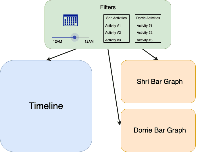
In our context, we can think about the timeline and graphs as being like the kitchen (in code, we often call these components). For those visualizations to have all the information they need to render, it needs to know about the data and also about state that the user will interact with, like the selected time range. In that way, we can think of the filters as being like the orders coming in to the kitchen.
Whenever an order comes in, the kitchen needs to know about it, and similarly whenever a filter is changed, the timeline and graphs needs to know about it. Another way to say this is that the application has to be reactive to changes in state, ready to render new changes seamlessly enough to give the user a smooth experience, which is where modern JavaScript frameworks can be really helpful! They handle much of that work for us. Any major frontend framework, like React, Vue, or Svelte will have packages that let you integrate with major technologies like D3.js or p5.js to achieve this type of smooth visual interaction.
Reacting To Filter Changes
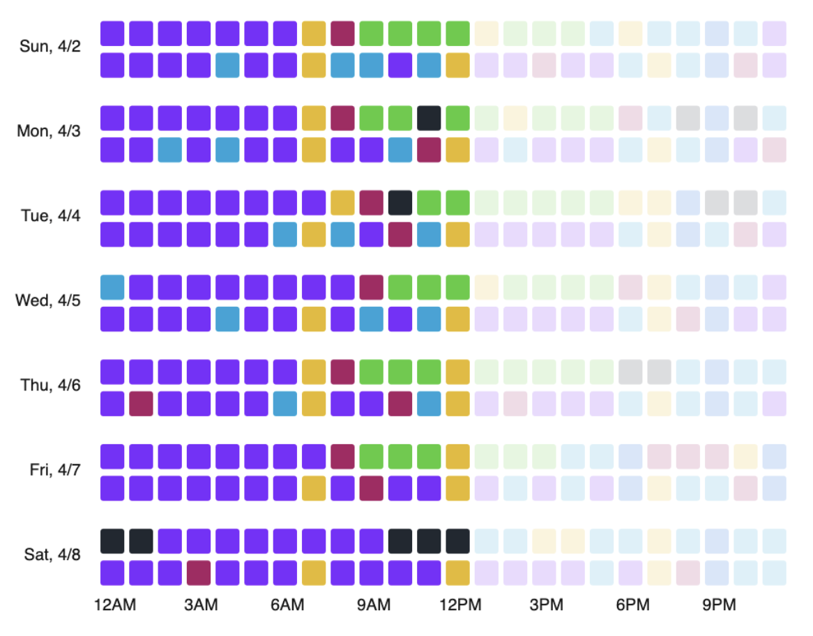
With this data flow in mind, we should think about how the timeline will actually update in response to a filter changing. Each shape we drew in the prototype code was built using, and represents, a piece of data. The position of the shape represents time and the color represents the activities. We can to encode an additional piece of state beyond the raw data intrinsic to the activities, which is the user filters. We can map this to another visual property, like transparency, and make a shape whose data is filtered out more transparent. This way, the user can always see the full dataset and also see how the filters are affecting the data:
Coding
We've chatted about the data, what we want to build, a design, and the technologies that make sense to use for this project. The next step is to start building! As mentioned earlier, I'm not going to go into too much detail about code here since that merits a whole series of its own.
As far as the actual act of coding, I tend to like working in one or two hour chunks, often in coffee shops. Any less isn't long enough for me to get into a good flow state, and any longer and I start to lose focus. To give you a sense of what my process looks like, here's a quick time lapse of me adding some labels to the timeline visualization:
Helpful References
Web development is a huge field! It can feel overwhelming to get started. If you're interested in jumping in, two great resources I've heard about are freeCodeCamp and The Odin Project.
Here's the tech stack I used on this project (largely inspired by my PerThirtySix cofounder, Rob, who is a data viz maestro!):