
Considerations
Now that we know what the data looks like, let's see what we can do with it!
Asking The Right Questions
Before deciding on which type of visualization to build, we need to think about some questions to refine our goals:
1) Who is our audience?
The type of visualization we'd build for this project probably has different requirements than, say, a visualization for an executive report. In this case, since we're using a fun and personal dataset, our audience might just be ourselves and anyone who finds it fun and interesting, like our friends and the online data community. This gives us some leeway in how creative we get!
2) What do we want people to be able to learn?
- Trends, or how things change over time: for example, does Dorrie sleep more as the week goes on? Line graphs are great for this.
- Comparisons, or how similar things are across the same category: for example, how much more does Dorrie sleep than me? Bar and column charts are great for this.
- Correlations, or how related things are across different categories: for example, does Dorrie sleep more when I'm sleeping? Scatterplots and heat maps are great for this.
- Distributions, or the spread of data: for example, how much did Dorrie sleep each day? Histograms and box plots are great for this.
There are surprisingly many ways to visualize a pretty simple dataset!
Since we've identified ourselves as one of the main audiences, we can also think about what we specifically want to learn. I'm personally most curious about exploring the data by slices of time, like by day or by hour. It would be really cool to be able to answer questions like "what does Dorrie usually do in the middle of the night?". Starting with a question like that can be a really powerful way to approach the sketching phase.
3) How much data are we working with, and how important is precision?
The volume of data and importance of precision should largely influence the decision-making process. For example, if there isn't much data and showing exact numbers is really important, then a simple table might be the most appropriate choice.
In our case there isn't much data, but there is enough that it's hard to get at those "what does Dorrie do while Shri is asleep?" questions from just looking at the table (you'd need to scroll a lot!), which validates that some type of visual representation is appropriate.
There's often a tradeoff between between data size and precision, particularly for data that's heavy on numbers. A visualization probably won't be able to clearly fit every single piece of data with nice labels, but it's often worth it to be able to highlight trends that would be really hard for a human to find with a table. Here's an example of this in a visualization we built at PerThirtySix:
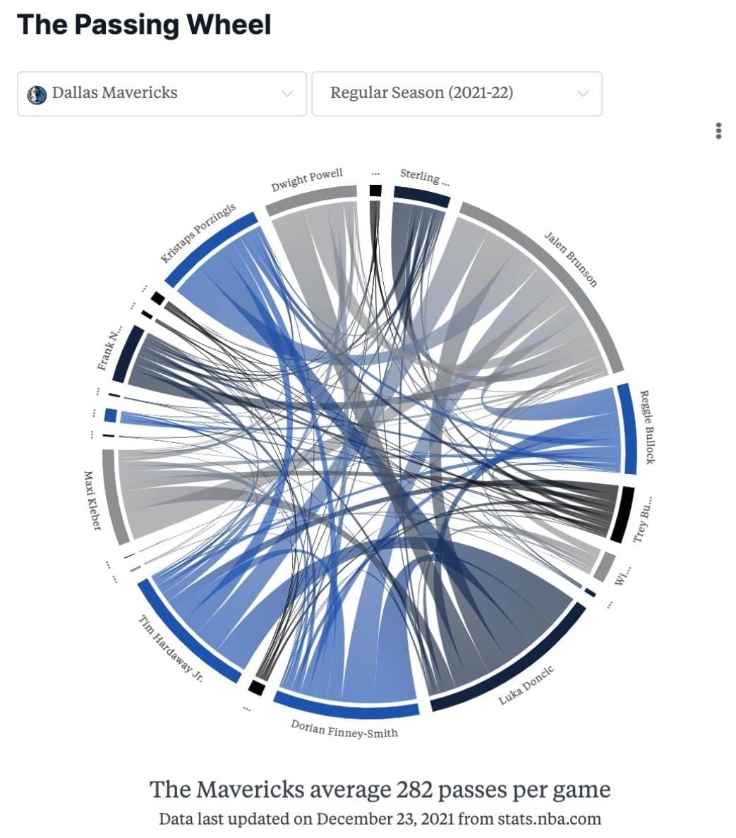
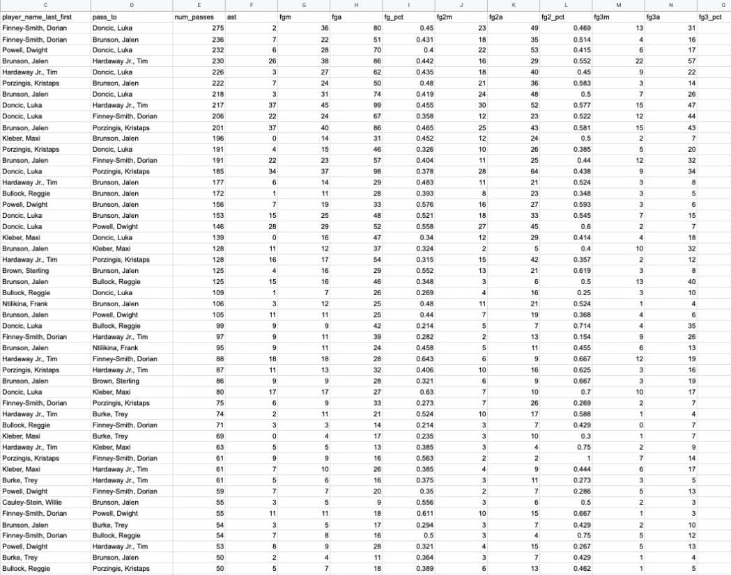
The two images above represent the same exact data: how the Dallas Mavericks passed the ball to each other in 2021-22. Notice how much easier it is to see patterns at a glance using the visualization vs. the spreadsheet! Furthermore, adding a ton of new data will make the size of the spreadsheet grow proportionally, but the visualization will remain the same size. Interaction can help get us closer to the best of both worlds with features like hover tooltips and exporting the raw data from a visualization.
4) What other constraints are we working with?
Two contraints that often come up in my projects are time and my own knowledge.
The time aspect, I've found, is usually much easier to define at a job since you might be given a deadline. For personal projects, I've found that firm but flexible goals work well for me. Having no internal deadline makes me likely to never finish a project, but conversely having a strict deadline takes away from the point of this being a fun personal project. Everyone's temperament and situation on this is different though -- if I were building this piece for a professional portfolio, for instance, there might be a little more urgency than if it were completely for fun.
The knowledge aspect is important to think about too. There's a big difference between building a project to learn a new skill, to sharpen existing skills, or to get the project done as efficiently as possible. I've found that my projects often end up being a combination of all of these.
Putting It Together
That was a lot of information! For the context of us building this visualization, and with the above questions in mind, let's synthesize our constraints and goals:
- Who is our audience? Ourselves and anyone who finds what we build fun and interesting.
- What is the goal of the visualization? We want to be able to interact with the visualization to get a sense of activities in specific time ranges.
- How will it be built? I'm most comfortable with web development using JavaScript for data visualization, so I'll use that.
Helpful References
Here's a list of some good resources on picking the right visualization type: