
Design
At some point when I was studying computer science in school, we learned about the "cost" of making a change at various points in the process of developing software. Cost here could refer to time, money, human hours, or any other resource. The idea is simple: it's really easy to make a change in the planning process, but quite a bit harder to make a change if you've started building, or especially if people are already using what you've built.
With that in mind, I wanted to do a little bit of design thinking before jumping into the implementation. In the last section, we sketched out a layout for a custom timeline and some charts. Here's a nicer diagram of that idea (made using the awesome draw.io tool):
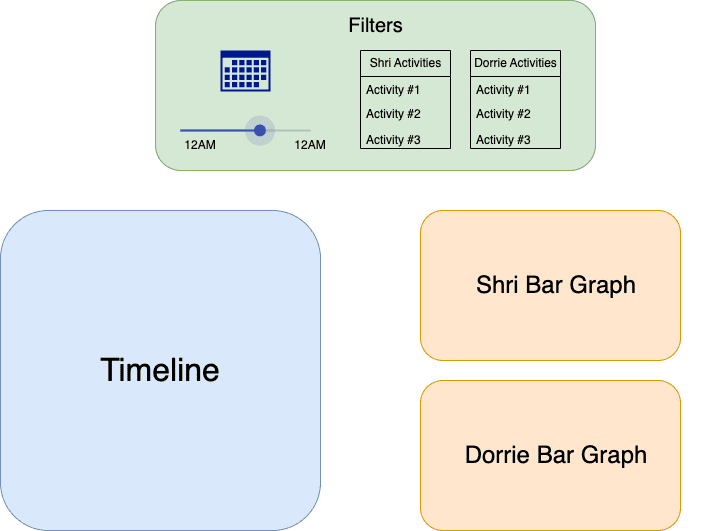
I'm most interested in chatting through the timeline portion here, since it will need to be pretty customized for our use case. I want to make sure that the visualization we end up using makes sense in conveying what we want to convey. We may also end up finding something new we can communicate!
The Visual Tools We'll Use
This is more on the technical side, but worth going through for those interested, and will largely drive some design choices. We're developing using web technologies, and there are two main ways to create and display graphics on the web: SVG and Canvas. I'll describe the differences between them at a high level, what we'll use for this project, and will share more detailed resources at the bottom of this page.
The stack I've gotten most comfortable with is using SVG libraries like D3.js for more traditional data-heavy charts, and using Canvas for more customized graphics, like our Wordle Solver. For this project, we'll stick with this approach and use SVG for the traditional charts and Canvas for the timeline (although SVG would be a completely sensible choice!). We'll be using p5.js, which is a great library that makes it easier to work with the canvas. They also have a great online editor which I like using for quick visual sketches.
Note that technologies like D3.js and p5.js are considered to be pretty low-level for data visualization, meaning that they give you a lot of control exactly what you're building, but you have to do a lot of the work yourself. There are lots of powerful and flexible higher-level libraries out there that make it easier to build visualizations in many fewer lines of code, but don't quite offer the same creative flexibility. It ends up being quite a bit more work and math, but I often find it worth it!
Designing For the Web
There are many web design details that we won't go into detail on here, but I did want to briefly touch on two operational topics. They're both focused on making sure your web application works well for as many people on as many devices as possible: responsiveness and accessibility.
Responsiveness is about making sure your website or web application works well on different screen sizes, and accessibility means making sure it's designed inclusively for people with varying disabilities. For this project, I'm going to add a bit of logic to make sure the time and graphs are responsive (by stacking them on top of each other for small screen sizes), and will implement basic accessibility by doing things like making sure the visualization uses UI components that support keyboard navigation and that the colors have good contrast. I'll link to some resources on responsiveness and accessibility at the bottom of this page.
Grouping and Colors
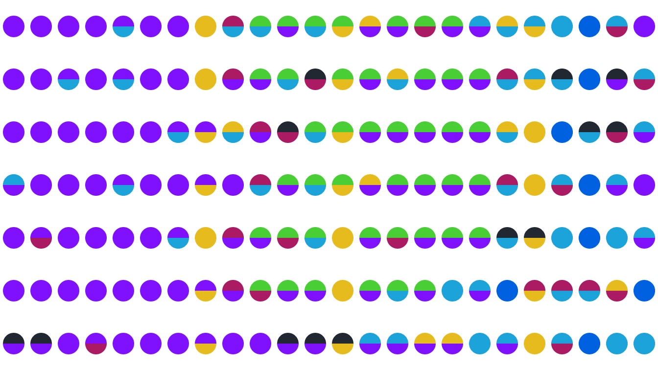
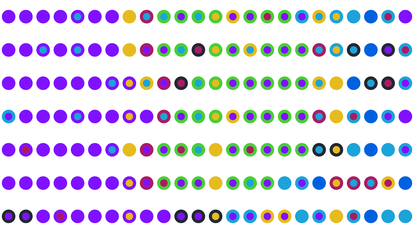
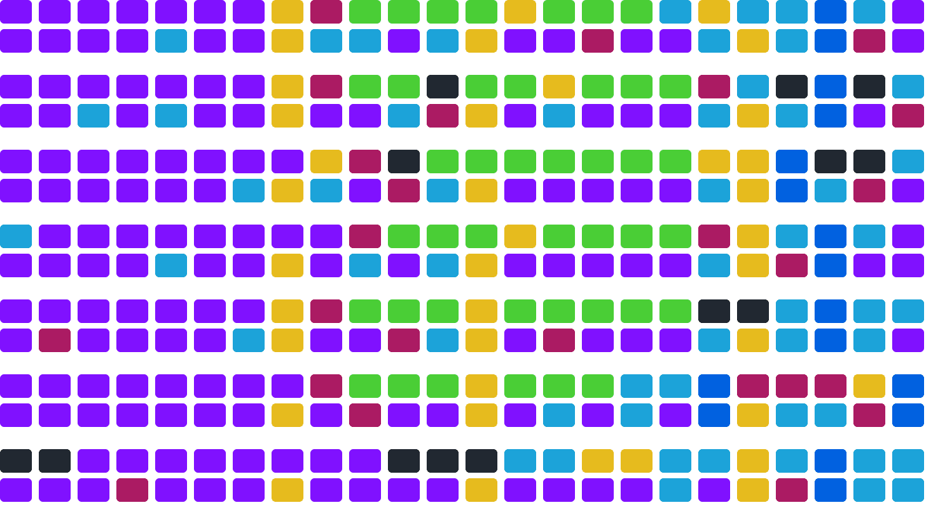
Per our sketches, we basically want to set up a visual grid where each row represents a day and each column represents an hour. I'm interested in exploring is what each cell in the grid should look like, and one huge aspect on that is color.
I'm not an expert in color theory, but I know that there are too many unique activities to assign each one its own visually distinct color. Remember from an earlier section that I had 21 unique activities during the week! We can definitely use color to convey the general type of activity, but we'll need to group the activities together somehow so we can come up with a color palette. Here's one possible grouping we can use:
This seems pretty reasonable, and covers all the activities Dorrie and I did during the week, although there are some borderline cases. Something like "Basketball with Friends" could fall into either "Exercise" or "Leisure". There is a natural loss of precision that happens when we group things together, but it's often worth it to be able to see patterns more easily. I also specifically wanted the "Playing Together" category to be it's own thing, so I could easily visually scan all the times that Dorrie and I did that same activity together during the week.
One approach we could use is to have these 7 groups in the timeline, and then show the more specific activities in the more traditional graphs we sketched out. Using the same colors throughout would help tie the two together.
To select a color palette, my main advice would be: if you're not a designer, don't try to do it yourself! There are a lot of great resources out there for color palettes, and I'll link to some at the bottom of this page. I'm going to use a palette I found on a tool I really like called Coolors:
I made a couple slight modifications manually, like making the yellow more mustardy so it pops more against a white background, which I often prefer to use (we could alternatively use borders on the shapes). Note that each color is visually distinct -- one bad design decision we could make here is using a gradient, like 7 different shades of green, since that would be extremely difficult to distinguish.
This actually required a decent amount of iteration! I tried to use colors that are traditionally associated with the activity, like purple with Sleep (think ZzzQuil packaging), and also tried to make the more similar colors represent similar activities, like the two shades of blue being Leisure and Play Together. There are inevitably going to be some tradeoffs here, but I think this is a good starting point.
Ideas
Armed with a technology to make visuals, a good grasp of the data, an idea, and some colors, we're finally ready to start making something! Let's explore different shapes we can use to represent the data.
These are the three ideas I ended up liking the most...
The Verdict
I actually really like all three options above! They all have a slightly different lens of the data. Because our visualization is interactive, and because the difference in code between the options is actually not that large, my lean is we should add an option where the user can switch between the views. Since we're using Canvas, we may even be able to implement some kind of fun animations!
We can make some more detailed decisions about the visualization during implementation, like what kind of titles and labels we want to show for each component.
Helpful References
We chatted a lot about low-level web technologies that are great for building highly custom visualizations, but there are lots of other options out there. This blog does a good job walking through some of them.
This is a good resource that goes into more detail on the differences between Canvas and SVG.
Here are some good guides on responsiveness, accessibility, and colors.
Here are the p5.js sketches for the three visualizations above: