
Sketching
Let's think about the visualization in more detail. At a high level, we know our project is going to have a main visualization (the graphical part) and some filters (ways to alter the visualization so the user can explore what they want, like slices of time in this case). I find it more manageable to think about these parts separately and then combine them afterwards. Let's start with the filters, since they're a little less open-ended.
Filters
In the previous section, we decided we wanted to build some sort of interface to let the user of the visualization select ranges of time. As a next step, I like throwing some rough ideas of what this could look like on pen and paper. Here's what I came up with:
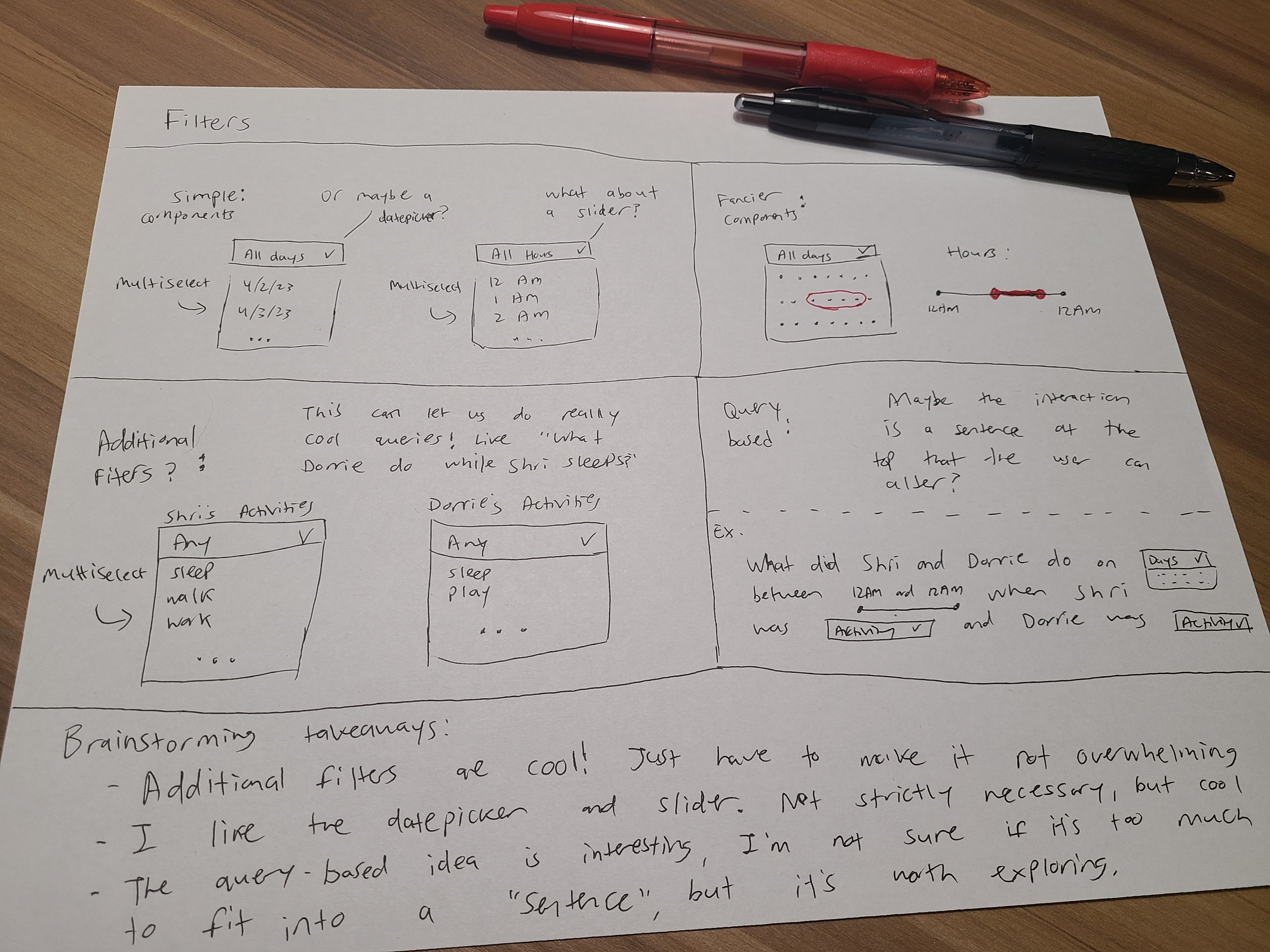
And here's what I was thinking for each section of this sketch...
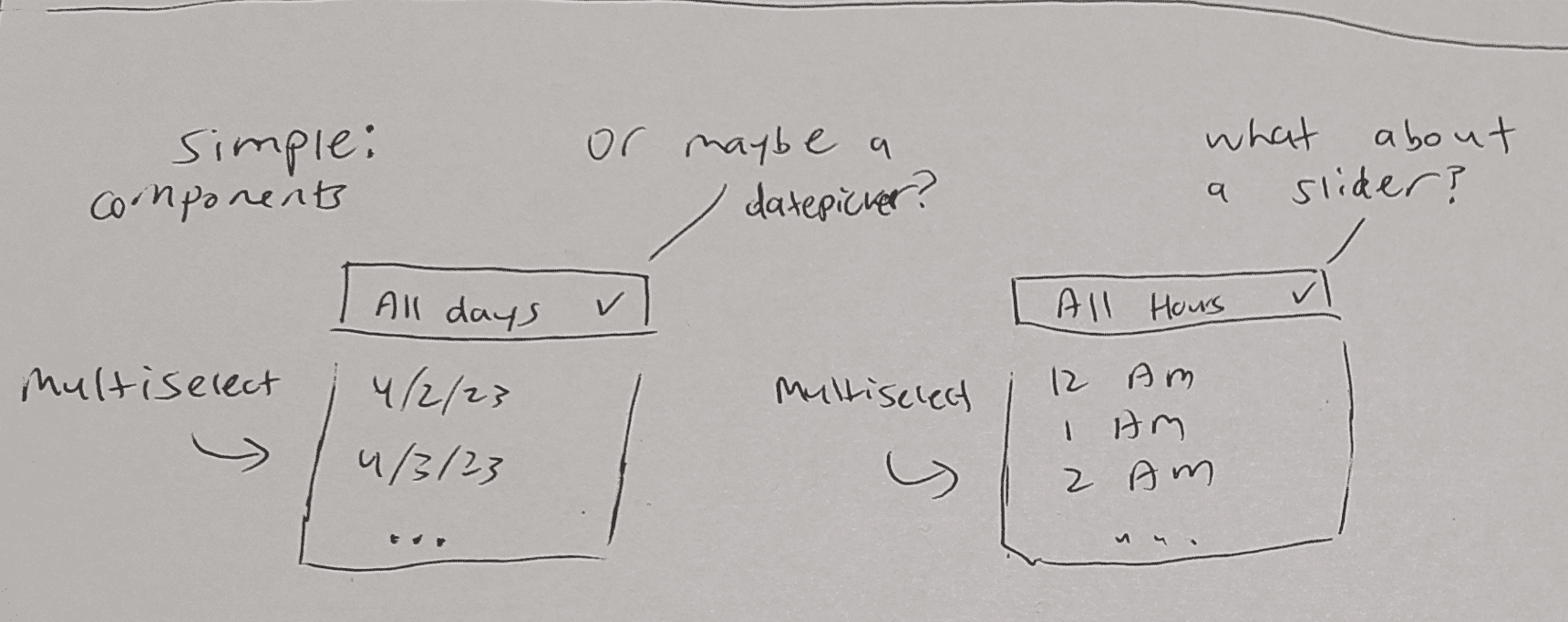
I started with just the simplest UI component for filtering that I could think of: dropdowns. A UI (user interface) component is just a building block that we can use to build our interface, like a button or a dropdown. I split up the time field into two different dropdowns, one for date and one for hour. This gives us more flexibility than if there were just a single component for the date and the hour. For example, we could filter down to "weekday mornings" or "weekend nights" much more easily with two filters than with one.
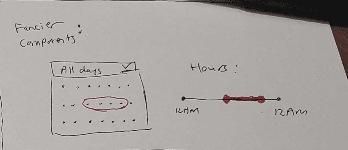
For the dates, a more natural UI component is a datepicker, which lets us select a date from a calendar. This lets the user see exactly which dates they're selecting in the context of a month and ensures that the user can't pick an incorrect date. Given that we only have 7 days of data, a dropdown would actually work pretty well too, but I think a datepicker feels a little more polished.
For the hours, I thought about a few different options. A dropdown could work, but it would be cumbersome to have to scroll through 24 different choices. I'm more inclined to use a slider, which lets us select a range of hours. In my experience, sliders also work really well for letting the user feel like they're interacting with the visualization in real-time, since it's a natural and almost tactile input. As with any choice we're making here though, there are tradeoffs. For example, it's not easy to select disjoint ranges with a slider, like 1PM-3PM and 7PM-9PM. This is something we could think of a workaround for, but I think we can just accept that it's not a common use case and move on.
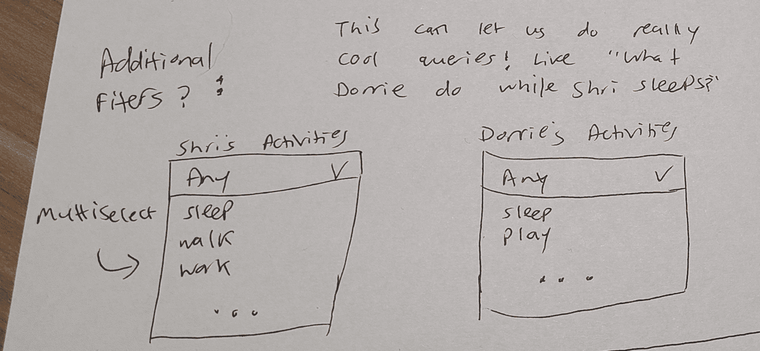
The next idea that came up in my sketching session, particularly when I was thinking around dropdowns, was having some additional filters. For example, if I want to find out what Dorrie does while I sleep, a time filter isn't going to be enough since I may sleep at different times. We have access to the categorical data in the dataset, and we can certainly use them as filters.
My intuition is that these filters would make sense as multiselect dropdowns, so that if I selected "Sleeping" and "Eating Breakfast" as my filtered activities, I would get a visualization that answers "what did Dorrie do while Shri was sleeping or eating breakfast?" We'll typically be using a component library, which is a collection of pre-built and customizable UI components that we can use to build our interface. A multiselect dropdown with features like built-in search is a pretty common component, so we should be able to find one in our library of choice.
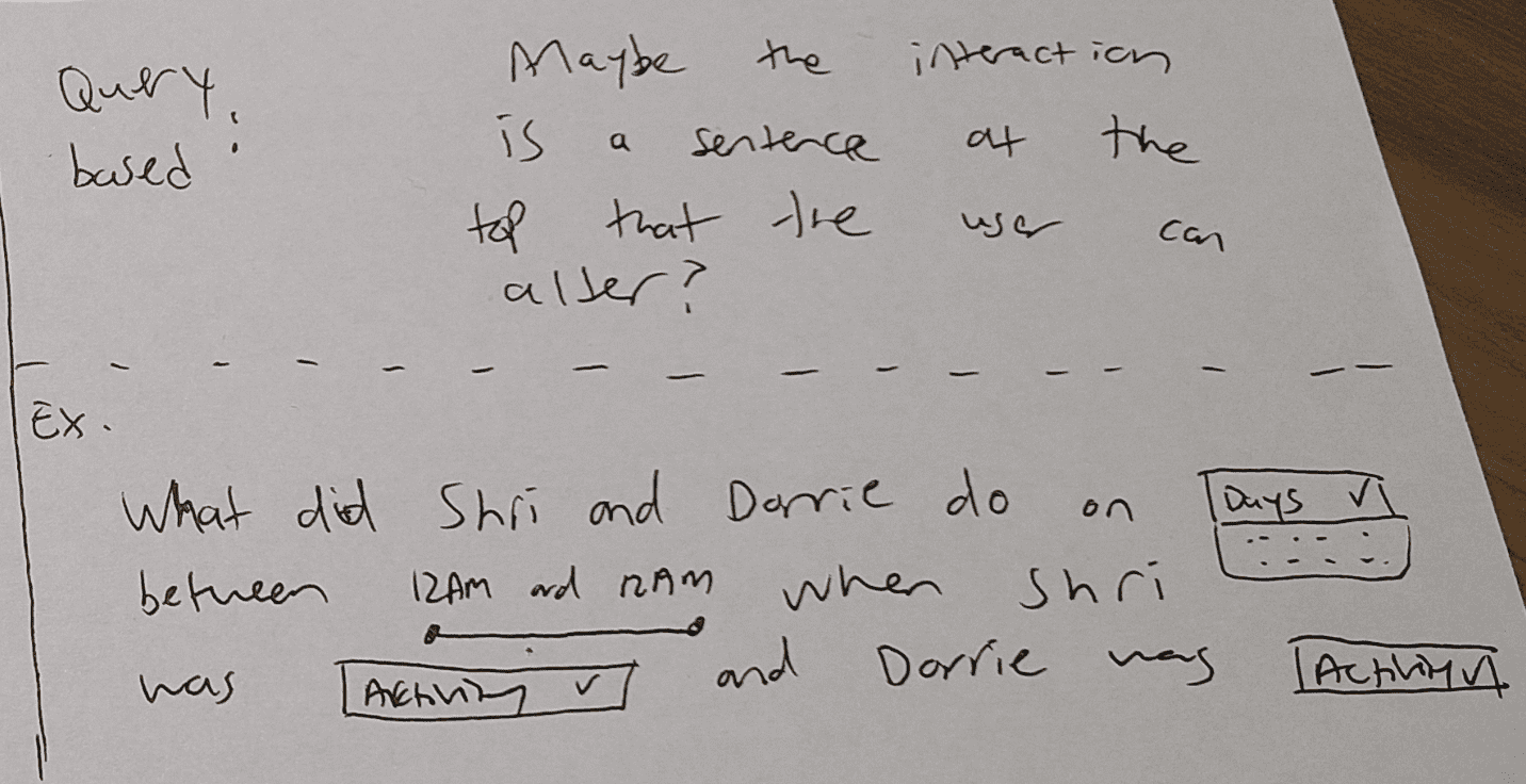
The last major decision point I thought about around filters was how to present them. The main options I brainstormed were to simply lay them out in a row, or to have some type of user interface that lays the filters out within a natural sentence, like "What did Shri and Dorrie do on DATE FILTER HERE on HOUR FILTER HERE?". I think either option is reasonable, and it's not much more work to try them both, so this is a decision we can make once we start building. There are other reasonable choices here too, like a sidebar interface.
In general, I find it very helpful to look at apps and websites that I enjoy using to get inspiration, especially since filters are such a common interaction pattern. I'd encourage you to do the same!
The Main Visualization
Following a similar sketching exercise, here's what I came up with.
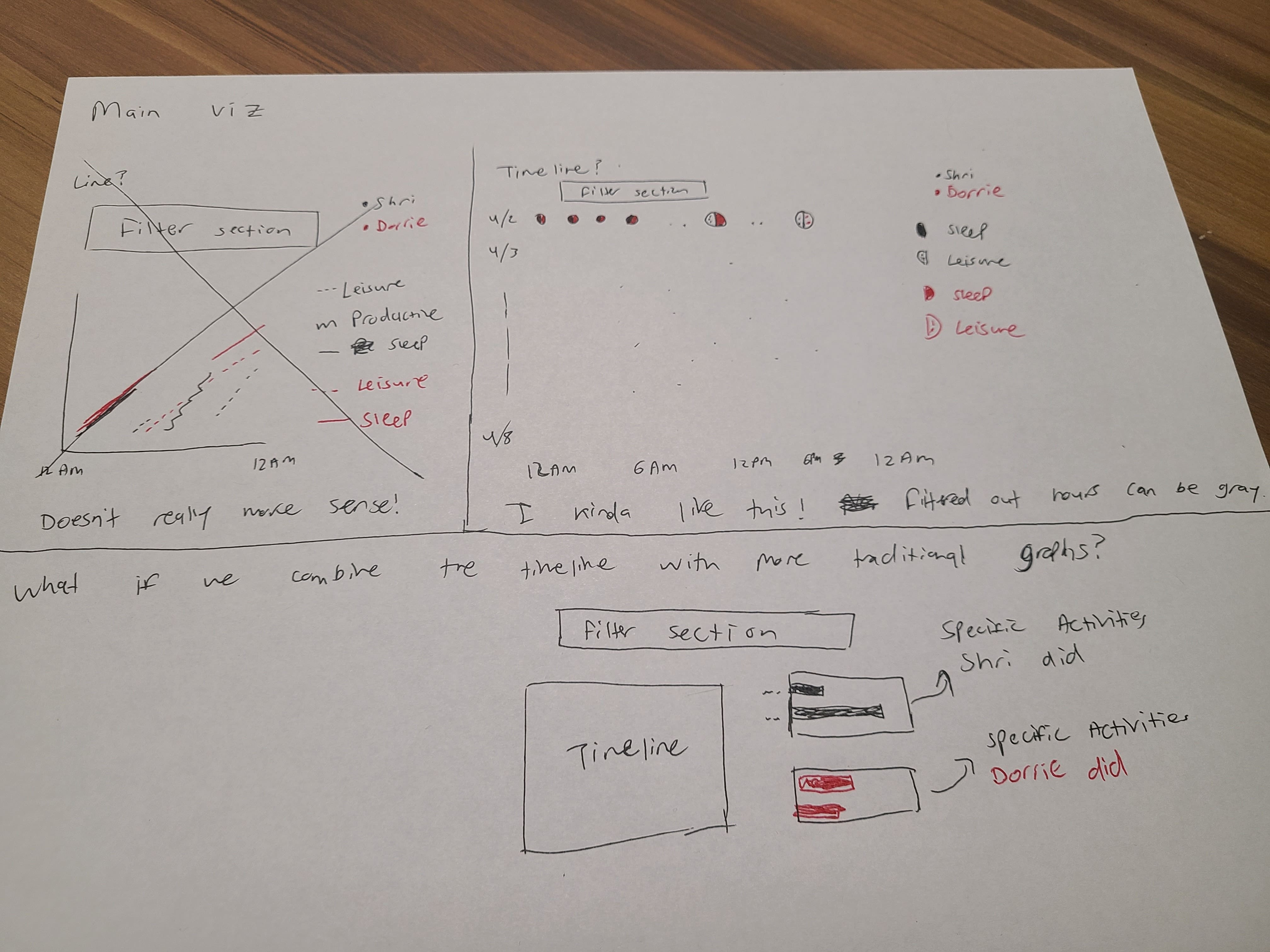
Here's what I was thinking while sketching each part...
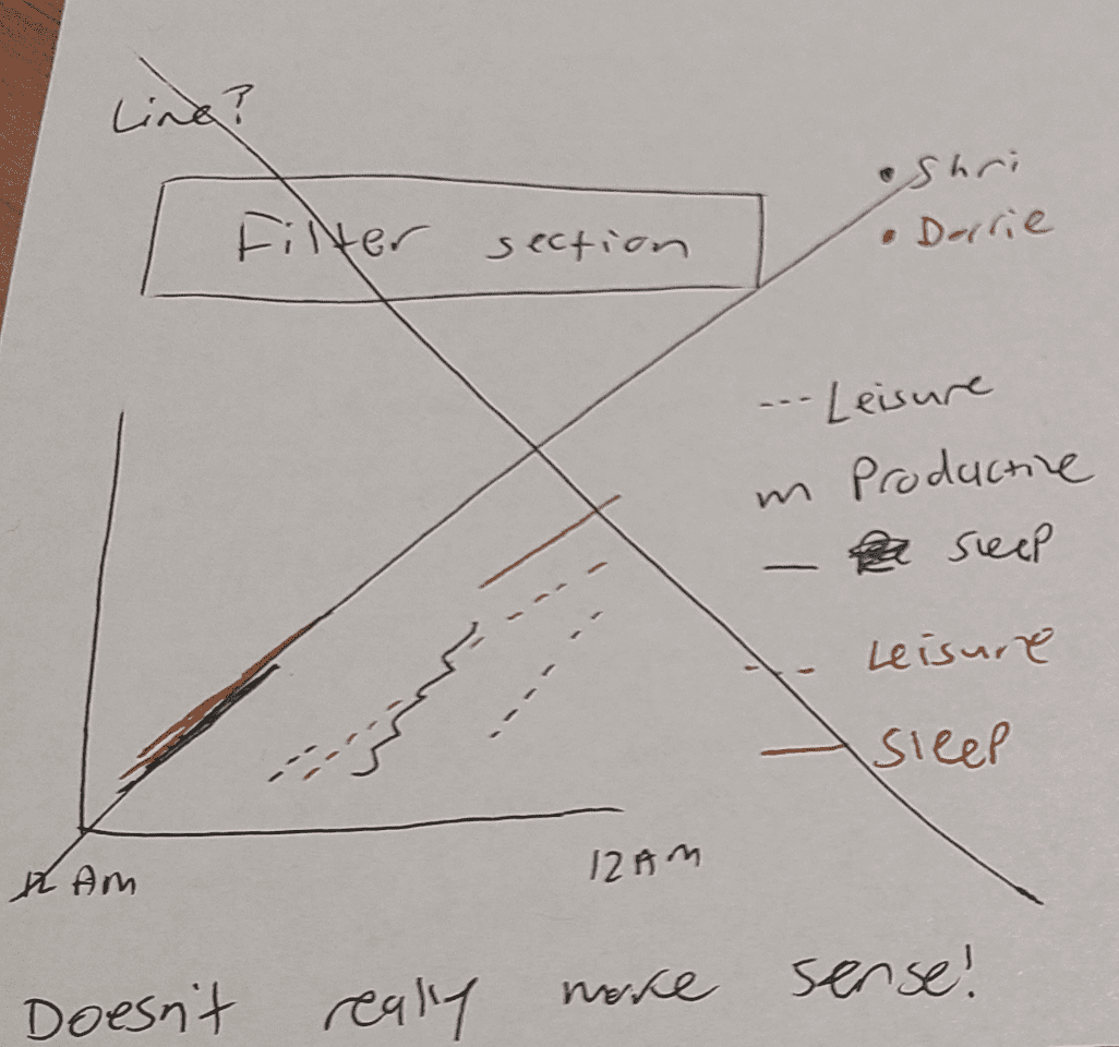
My first instinct was to explore using a line graph, since they're well suited for time-series data (data where each point has a time associated with it). Line graphs typically use numerical values for the y-axis, but I thought maybe we could turn our categorical data into numerical data by using an accumulation of time. For example, if I'm on my 6th hour of sleep at 6AM then the y-value would be 6. As I sketched it out, I realized this would be confusing to read, especially as we're combining multiple concepts together: time, categories, and two values for each data-point. I also wasn't sure if we should represent the graph as the whole week or an average per-day. In any case, this was a good example of trying something and realizing it wouldn't work.
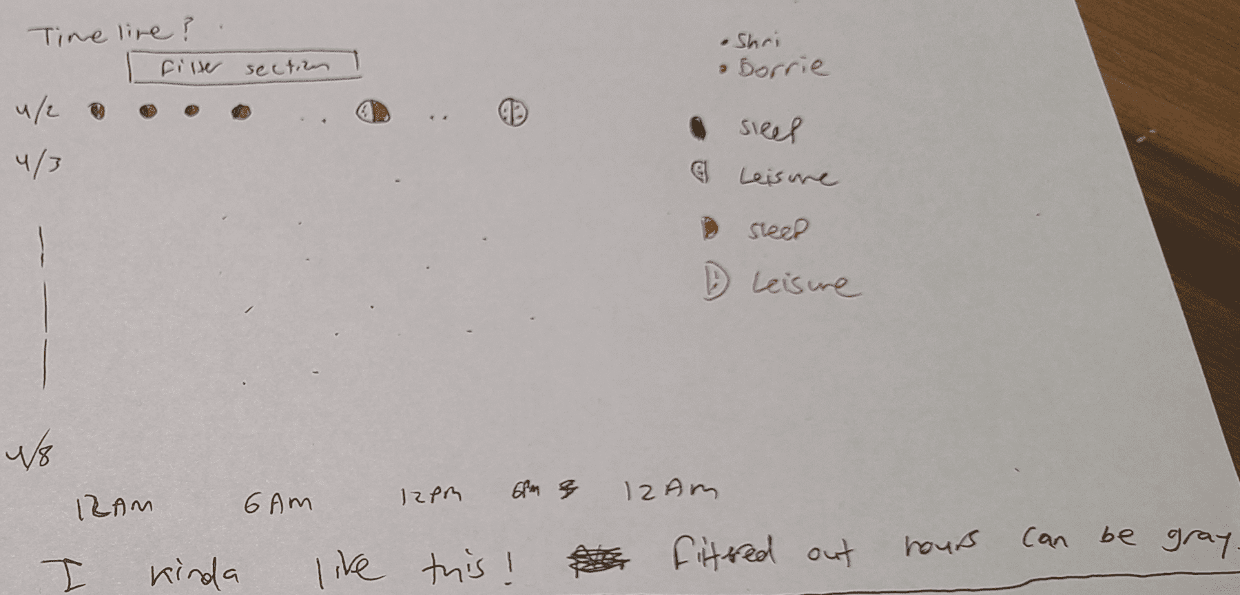
My next idea is a timeline represented as a sort of scatterplot, where the x-axis is the hour of the day and the y-axis is the day of the week. For the sketch, I only filled out a few points of data, but you can imagine the whole grid is filled. Each point would represent an activity, and we could color the points by the activity (in my sketch I used different patterns since I had limited colors!). Alternatively, we could use bars instead of points, which could give us a better sense of the volume of activities. Another interesting idea is having the data points that get filtered out fade out, which could be a nice way to visually show the user which time ranges they're looking at. This is another example where I may want to see a couple different options in action before deciding on one.
One downside of this visualization is that it won't scale well if we added lots more dates of data in the future, since each day needs a new row in the grid. Given that we know we're only working with 7 days of data, I think this is a reasonable tradeoff to make.
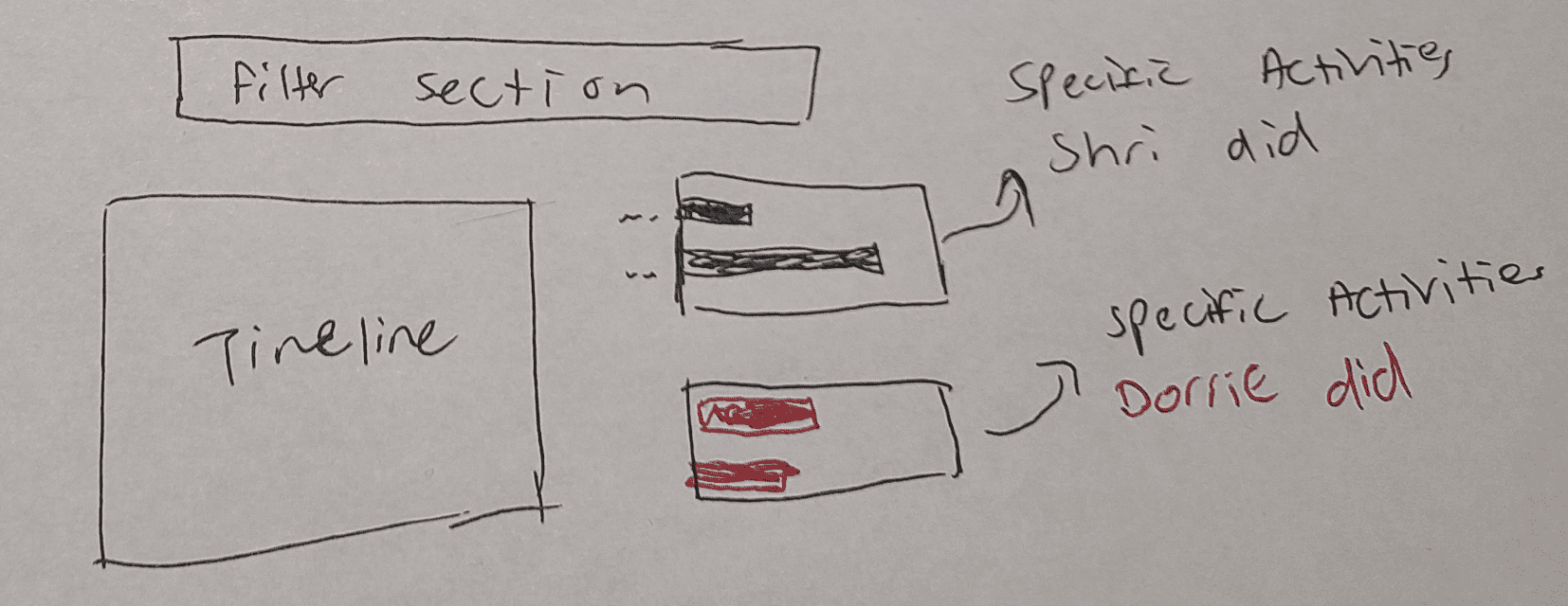
I like the timeline idea a lot, but I don't think it gives a full breakdown of the types of questions we want to answer. For example, if my filter is effectively "what does Dorrie do while I sleep?", the timeline might show us when those activities are, but not necessarily a consolidated view of what they are. For this, I think either two separate bar charts or a single stacked bar chart would work really well.
We touched on this in an earlier section, but this is where doing some grouping of the data would be helpful. For example, representing each activity with a unique color may be overwhelming, so we could group them into broader categories like "Sleep" and "Work" to simplify the presentation. I did this a bit in my sketching, but I think it's something we can explore more once we start designing and building.
In general, as you do this process more, you'll start to get a sense of what types of decisions you need to make early and what can be left flexible.
Helpful References
Here's a list of some good resources on learning some fundamentals about design: