
The visualizations below show how the distribution of household wealth in the United States has changed over the last 35 years. The data comes from the Federal Reserve's Distributional Financial Accounts. I was inspired to create this based on current events and wanted a view of the data that showed both the absolute and percentage changes in wealth distribution in the same view.
You can hover over the charts to see the exact values for each year. Clicking and dragging will let you compare the values for different years. Note that the first chart is not adjusted for inflation.
Interpreting The Data
The data shows that the overall wealth of the country has increased significantly over the last 35 years. Even taking into account:
- roughly a 250% increase in CPI between 1990 and 2025
- roughly a 37% increase in population between 1990 and 2024
- events like the 2008 financial crisis and the COVID-19 pandemic
The roughly 800% increase in total wealth during the same period still results in a substantial rise in real, per capita wealth. In other words, the country isn’t just wealthier on paper—adjusted for both inflation and population growth, Americans collectively hold more real wealth than they did a generation ago.
As our wealth has increased, however, the distribution of that wealth has become increasingly unequal. Furthermore, the bottom 50% is much more affected by economic downturns than the top 1%—not just because they have less wealth overall, but because their share of total wealth tends to fall further.
Looking at quarters 2007:Q3, 2009:Q1, and 2012:Q3, which are centered on the 2008 financial crisis, we can see that the bottom 50% had their share of wealth cut by roughly two-thirds, while other groups came out of the crisis with roughly the same share of wealth they had before.
If you're more interested in a more granular breakdown of wealth over time, the Federal Reserve's explorer lets us look at various asset classes. One staggering statistic is that the top 1% of the country owns roughly half of corporate equities and mutual funds (e.g. stocks).
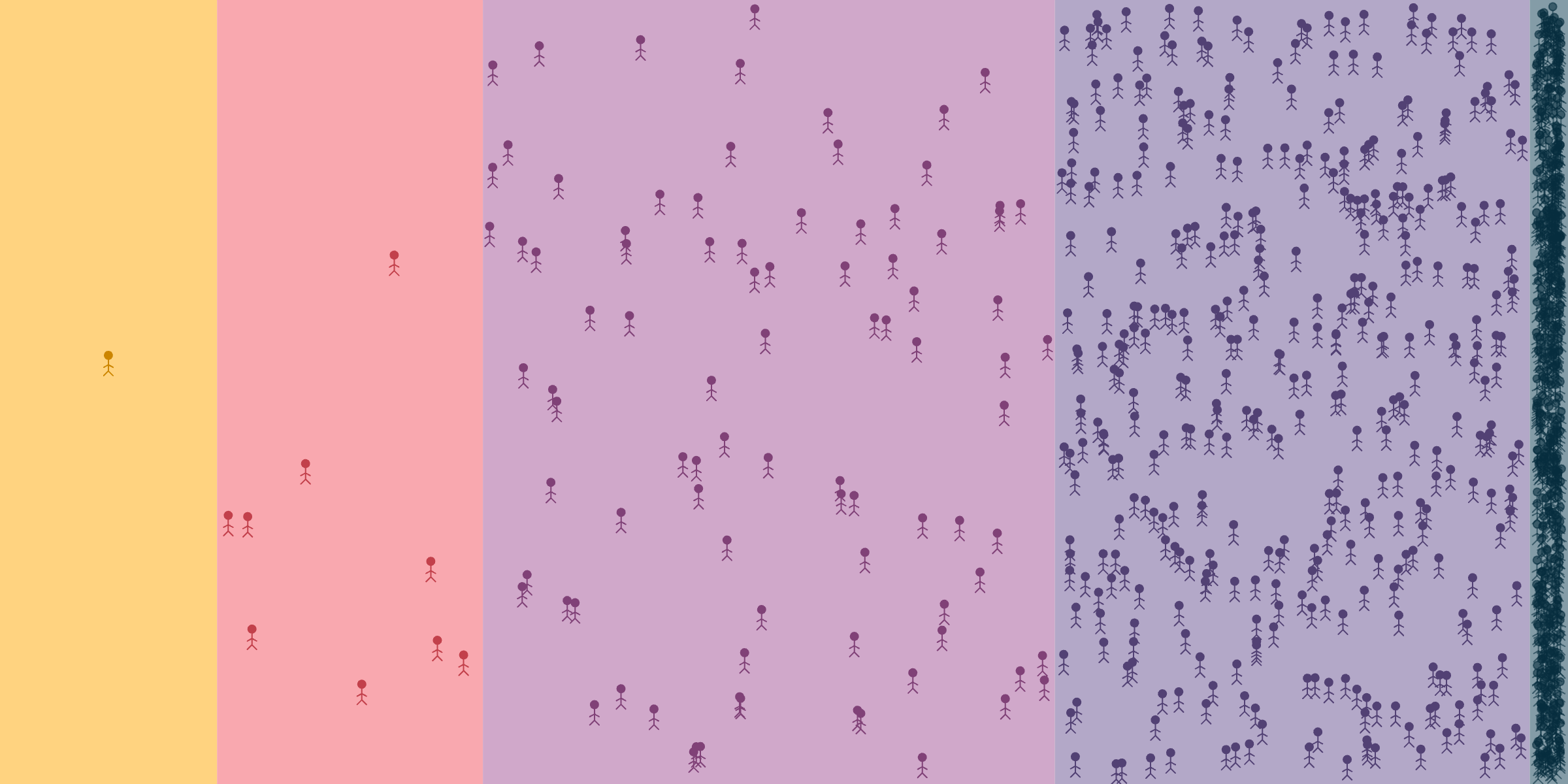
Inequality Today
The graphic below represents the distribution of wealth in the United States as of the latest data from the Federal Reserve (2025:Q3). Wealth is encoded as space, and population is encoded as stick figures. I find the sense of claustrophobia in the bottom 50% of the population to be particularly striking.
Thank you
I hope you found this piece interesting. If you're interested in exploring data about global wealth inequality, we have a tool for that. If you found this piece useful, please consider supporting my work by buying me a coffee or following me on BlueSky! ☕
We're just getting started.
Subscribe for more thoughtful, data-driven explorations.