A NEWSLETTER FROM PERTHIRTYSIX
The Nine Thirty-Six
A letter from the two of us, most Mondays.
|
||
|
A LETTER FROM
ShriOne of my pet peeves around statistics is the idea that “numbers don’t lie.” Numbers are like words. They can be fabricated, taken out of context, oversimplify a complex situation, or mislead an audience in any number of ways. A few months ago, the White House shared this tweet: 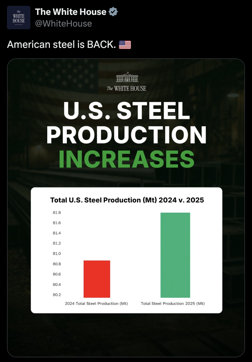
The y-axis starts at 80.2 Mt, so a 1% bump looks like a 100% one. The underlying numbers don’t outright “lie” here (i.e. they’re not fabricated), but the story is clearly misleading. The y-axis shows a change from 80.8 Mt of steel production in 2024 to 81.8 in 2025, roughly a 1% increase. The y-axis starting at 80.2 Mt makes it look like steel production has doubled between the two years. This is enough to raise a red flag. A 1% increase being masked as a 100% increase with simple axis truncation makes it hard to trust any stronger claim that “American steel is BACK.” But it’s a good exercise to try to get a fuller picture of the story. To get a more complete picture of the data, I:
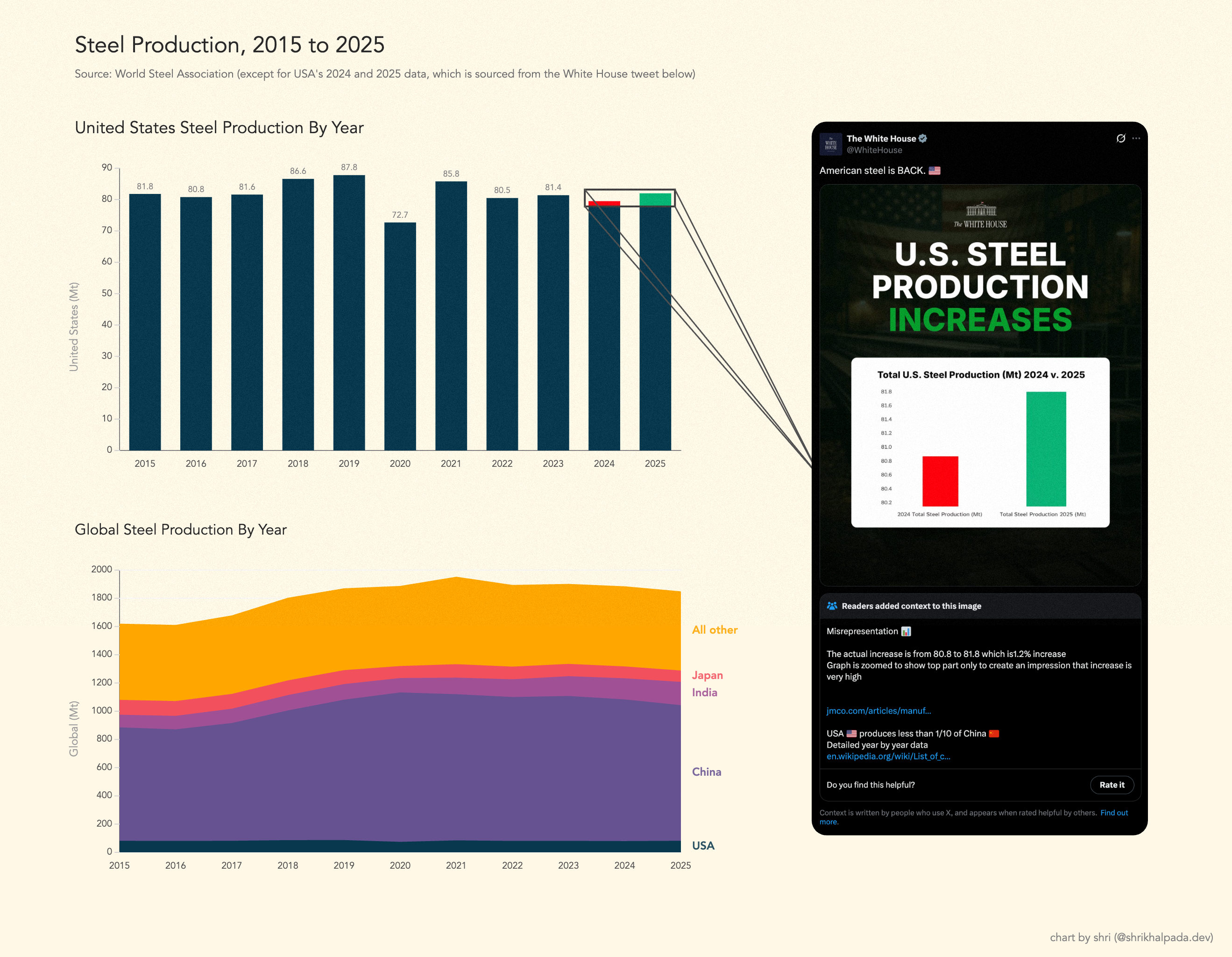
Same data. More years, more countries, axis at zero. This paints a much clearer story. The 2025 level of steel production is ostensibly the same as it was in 2023, and the level of U.S. steel production relative to the rest of the world has remained stable for the past 10 years. While this version of the chart doesn’t explain every peak and valley, like the obvious dip during the 2020 pandemic, it provides us with enough baseline truth to have a more honest conversation. For a more detailed breakdown on how charts can be misleading, I’d highly recommend checking out FlowingData’s Defense Against Dishonest Charts. — Shri |
||
|
A LETTER FROM
RobIt has surprised me as much as anyone, but the hot new data vis I keep coming back to in 2026 is…tables. When it comes to good data vis, I always want to do three things: inform, inspire, and delight. Tables have always scored highly on the inform axis. Their layout is universally understood — a row for each entity of data, and columns for each attribute of that entity. It’s the inspiration and delight they tend to fall short on. And the root cause of that is that tables have poor scanability. You can look for a particular data point and retrieve an exact value, but to get a sense of how the data ebbs and flows you have to assemble that picture yourself in your head. So let’s take a baseline table, and augment it with data vis indicators to improve the reader’s ability to intuit the full array of data at a glance. Below is some of my recent work re-designing dashboards for a B2B company. Dashboard design isn’t everyone’s cup of tea, but I can happily think all day about different ways to present data, always coming back to how to best inform, inspire, and delight. SLA OverviewBEFORE 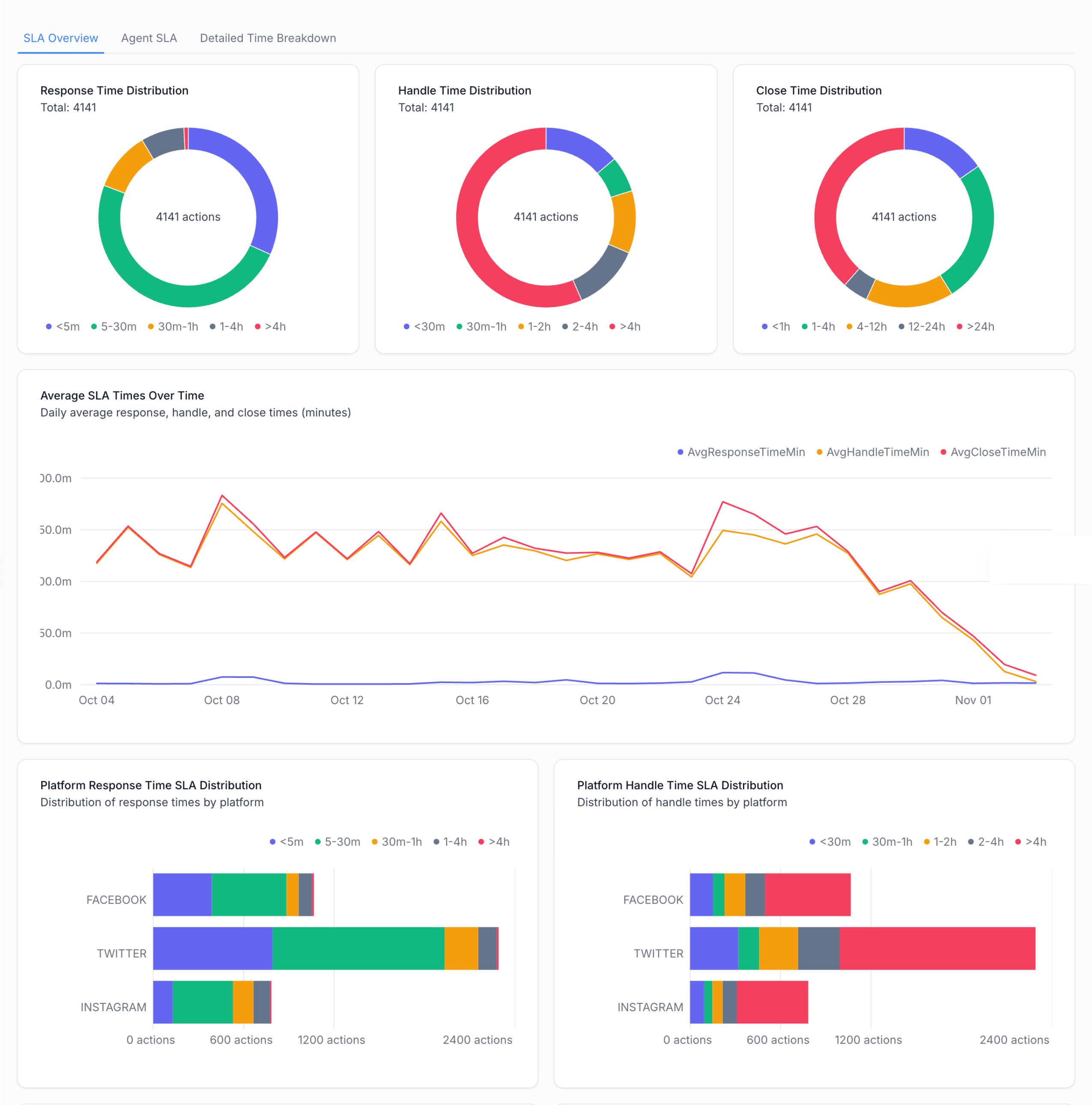
AFTER 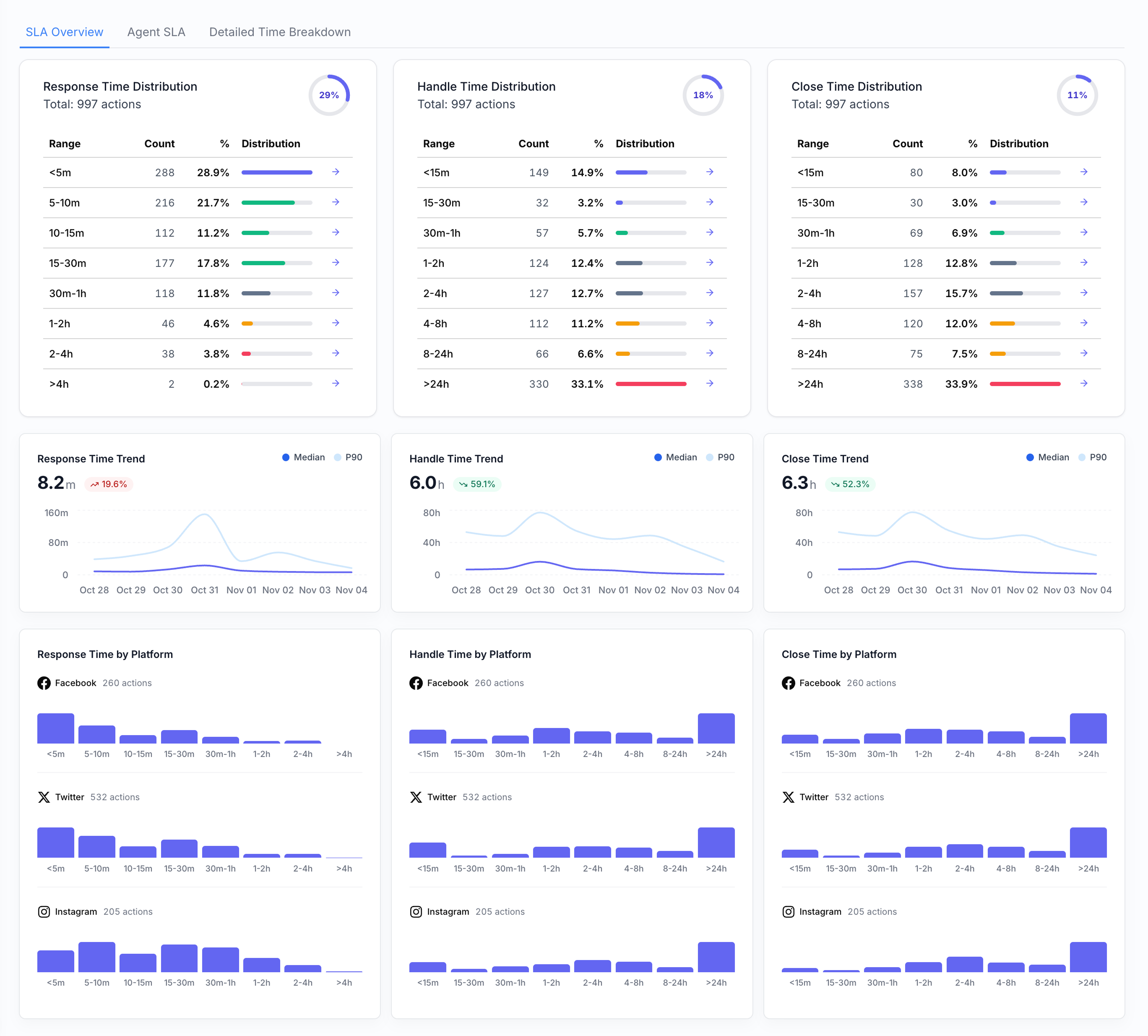
The three donuts at the top of the dashboard become three mini tables, augmented with mini horizontal bar charts for scannability. This rework also featured keeping a consistent three-column breakdown across the full dashboard for three different categories of support work (response, handle, and close times) to help cognitive ease. The line chart that used to show all three becomes three different line charts, and now we can separate out median and p90 times. Performance FactorsBEFORE 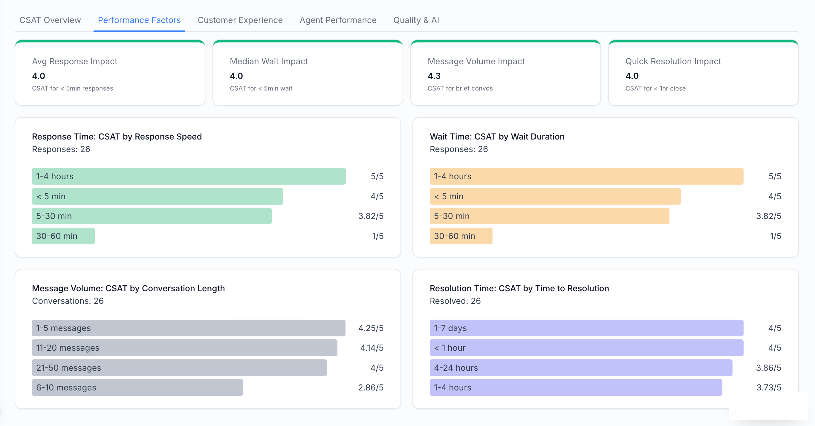
AFTER 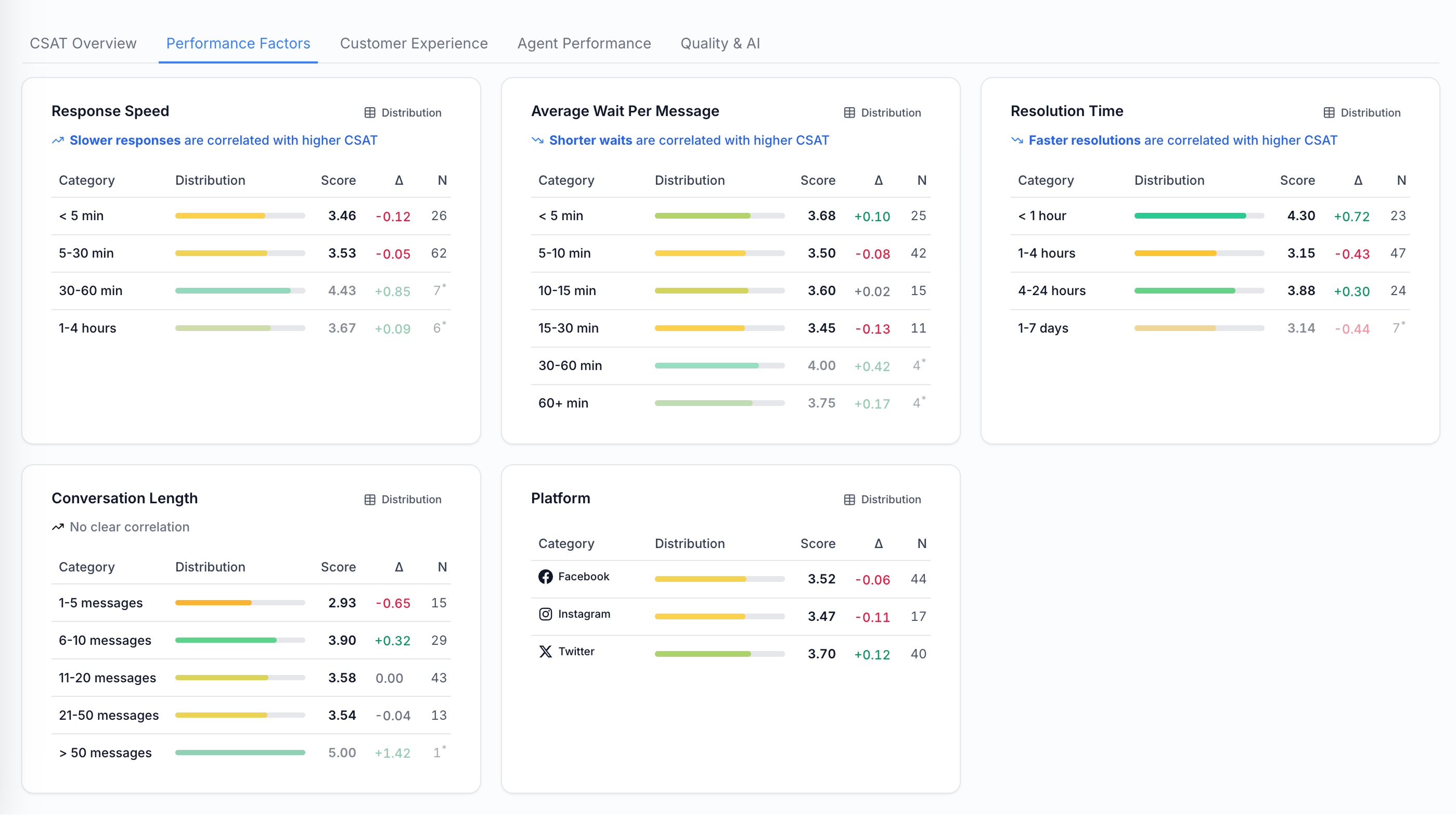
The horizontal bar charts become tables with mini bar charts. This also lets us add a delta column showing the difference from the overall average within each subcategory. Actions & SupportBEFORE 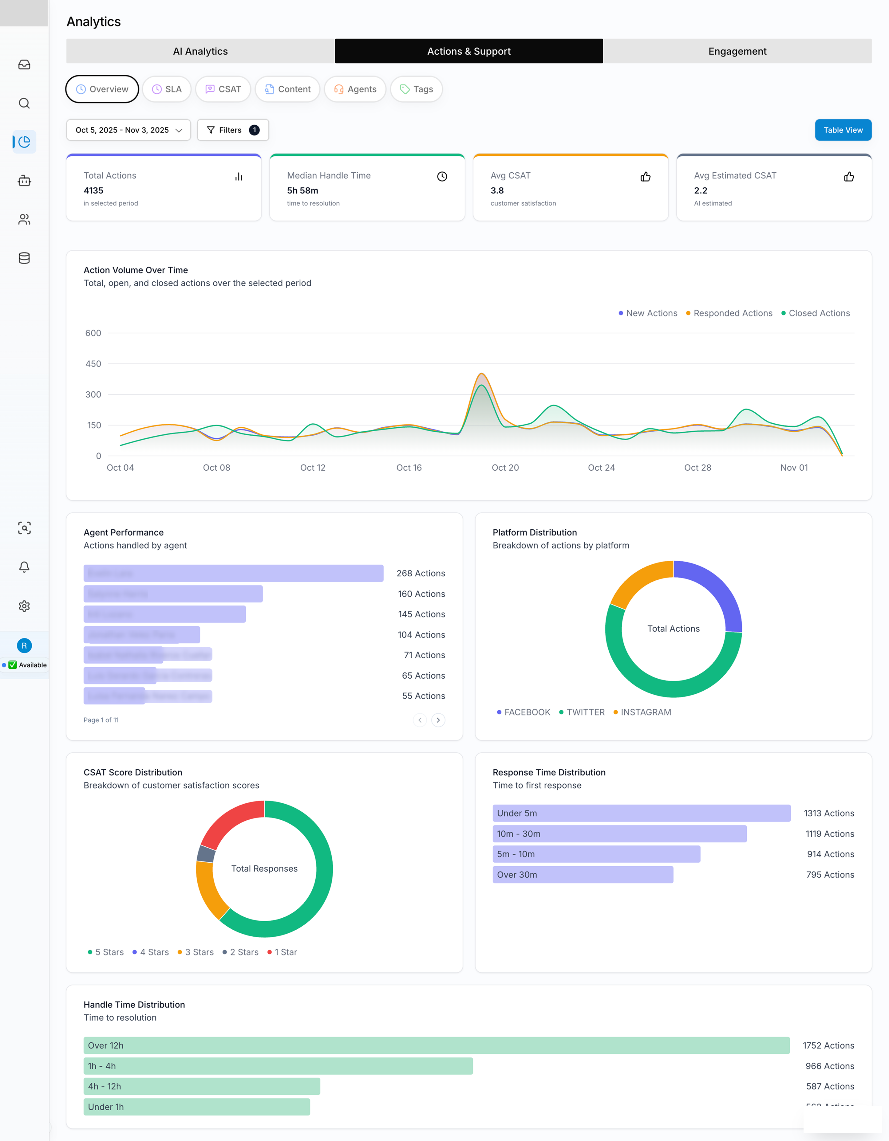
AFTER 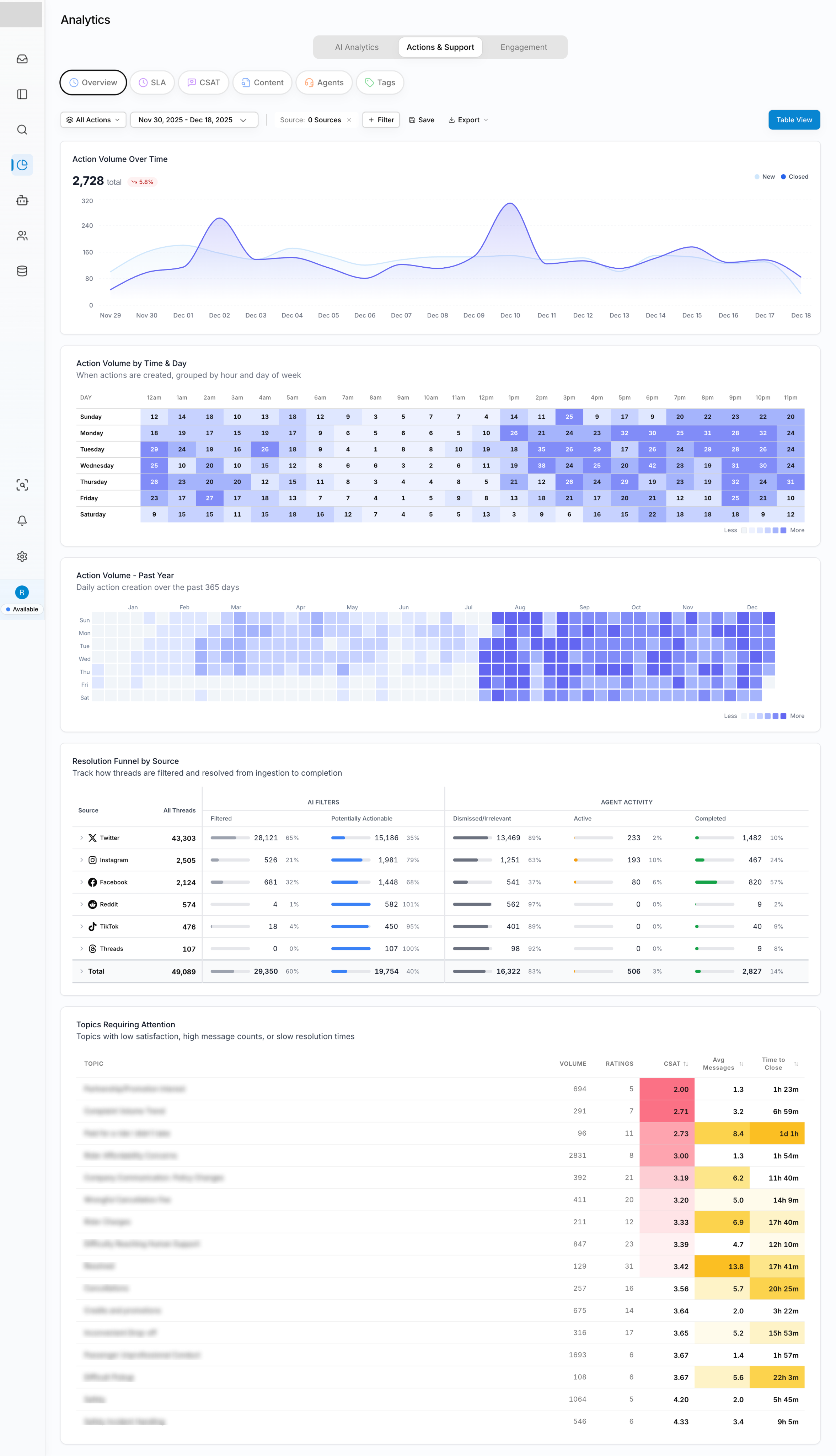
Coloring tables is a really easy way to improve scannability, whether in pure heatmap form or by highlighting specific rows or data cells worth a look, as in the Topics Requiring Attention table. Turns out the table was the data vis all along. — Rob |
||
|
A FEW SMALL THINGS
If you’ve been forwarded this by a friend, you can subscribe directly here. If you have a specific question for either of us to answer in a future issue, just reply — it comes straight to our inboxes. |
||
|
THANKS FOR READING.
Written by Shri & Rob ·
perthirtysix.com
|