A NEWSLETTER FROM PERTHIRTYSIX
The Nine Thirty-Six
A letter from the two of us, most Mondays.
|
||
|
A LETTER FROM
RobOne of the easiest things you can do to upgrade your charts is move labels into the chart, next to the data they describe. External legends and row identifiers make a chart feel like Microsoft Excel (sorry, shots fired). In-place labels make it feel like The New York Times. Here’s a line chart with the legend re-worked into in-place labels. BEFORE 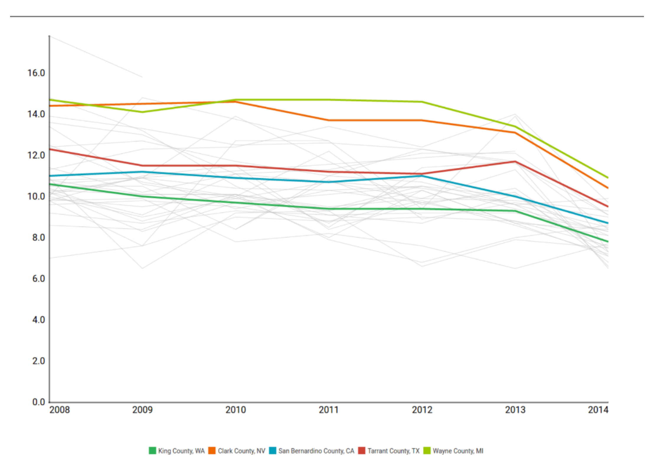
AFTER 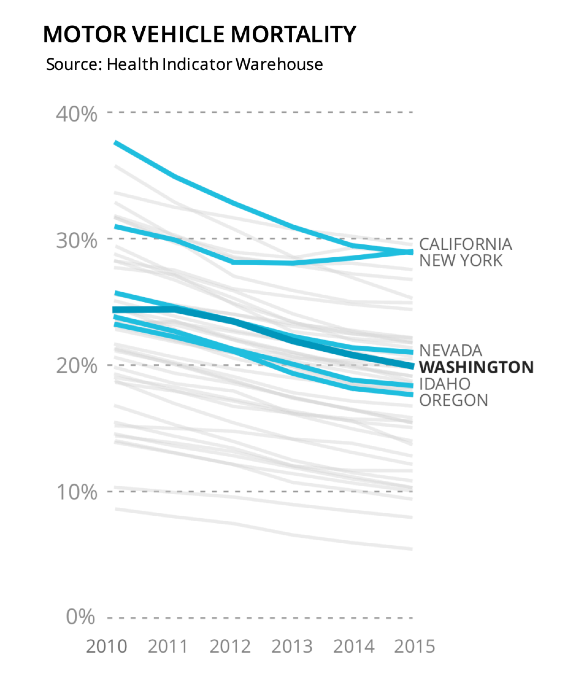
Each label sits at the end of its own line, so there’s no eye tennis between chart and legend. In the live version, hovering a label brings its line into focus. Aside: this line chart re-work includes one of my favorite pieces of code I’ve ever written, which nicely spaces out the labels to make sure they’re not overlapping. Placed naively at the right edge of the last point in each series, California and New York would overlap, as would the group of four with Nevada, Washington, Idaho, and Oregon. My layout helper repurposes D3.js’s force layout function to find nice, non-overlapping placements for each label. This applies past legends too. Take an arrow chart with row identifiers down the left-hand side. A reasonable thing to do, but in practice it leaves the reader going back and forth trying to figure out what each line or point means. Pulled in-place, the labels meet the reader where their eyes are already. BEFORE 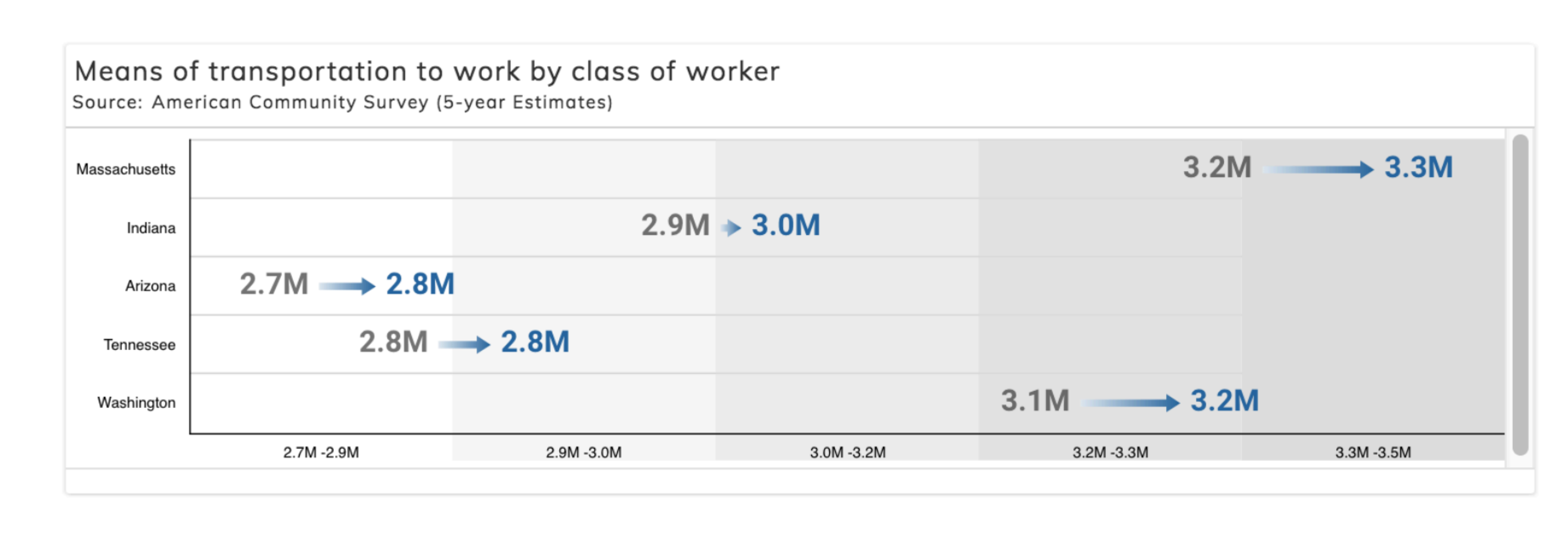
AFTER 
Intentionally redundant labels on both sides of the slope chart. Out-of-chart references will probably always be the default because, programmatically, they’re simple. They exist entirely outside of the chart’s plotting area, meaning they work in Excel and scientific articles, and they work no matter the shape of the data. In-place labels live with the data. And most times they require more thought and care. But they’re often one of the places you can get the most ROI on reader delight when re-working a chart. — Rob |
||
|
A LETTER FROM
ShriRecently I was out on a walk, thinking about what the fifth entry in the How The Heck series should be. I had a few ideas bouncing around in my head, but nothing particularly stuck. I was thinking about the spirit of this series while looking around my neighborhood and something hit me: I had no idea how traffic lights work. It felt like a great “what’s actually going on here?” type of question, so I started researching and was surprised by how much I didn’t know. This piece will go down the rabbit hole of traffic lights, from their Victorian origins to the inductive loops in our roads, and the networked systems that control them today. 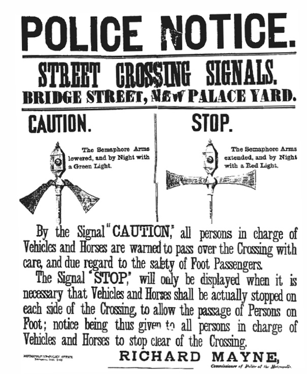
The first traffic light outside the House of Parliament in London, 1868. Public domain. 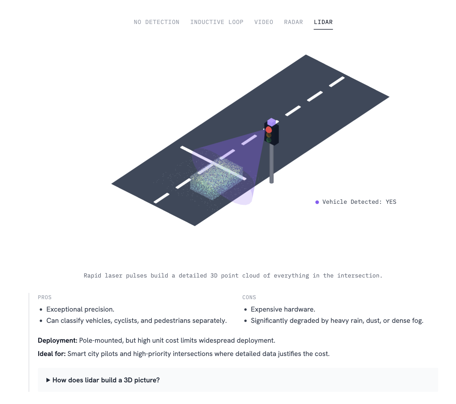
An interactive visual demonstrating the modern lidar-based approach to traffic detection. I’m hoping to get it shared this week, so stay tuned! — Shri |
||
|
A FEW SMALL THINGS
If you’ve been forwarded this by a friend, you can subscribe directly here. If you have a specific question for either of us to answer in a future issue, just reply — it comes straight to our inboxes. |
||
|
THANKS FOR READING.
Written by Shri & Rob ·
perthirtysix.com
|