A NEWSLETTER FROM PERTHIRTYSIX
The Nine Thirty-Six
A letter from the two of us, most Mondays.
|
||
|
A LETTER FROM
ShriThe fifth installment in How The Heck? is out, and it’s all about traffic lights! 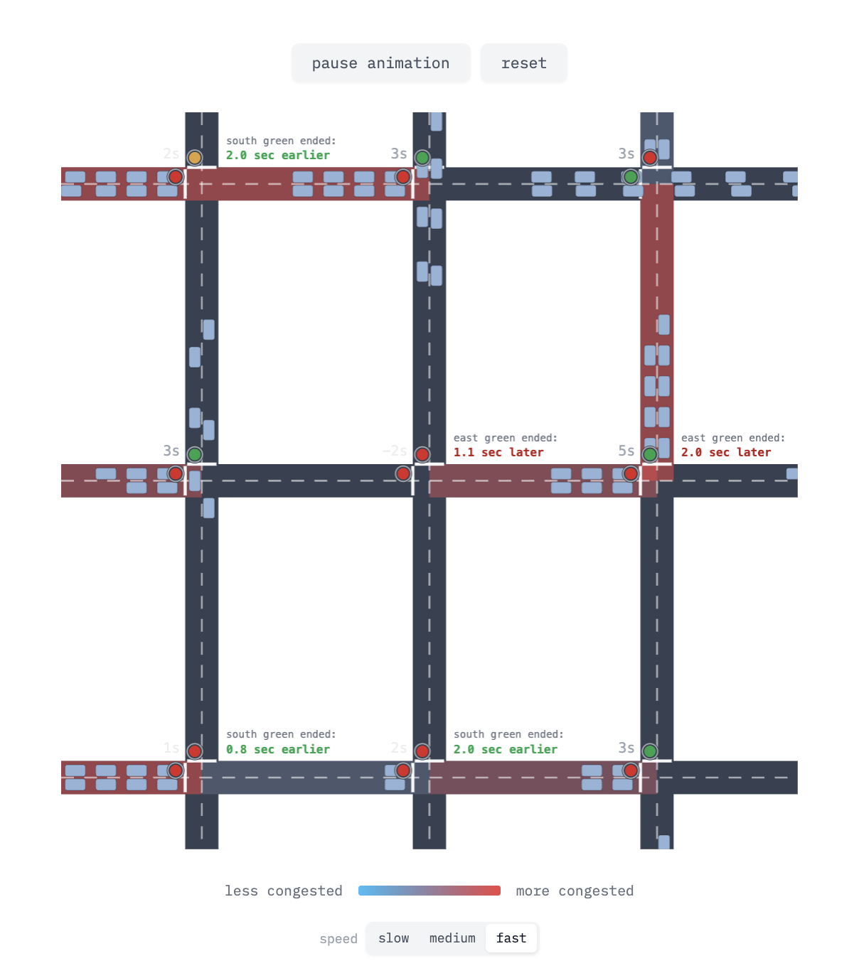
A 2D, canvas-based rendering of a 3x3 traffic grid simulation. Although the series is meant to be fairly cohesive as a whole, I’ve noticed that each of these pieces demands something a little unique: the Shazam piece required interactive audio components, the one on solar panels required me to dust off some introductory physics, etc. What I really enjoyed about the new piece is that I got to dive a bit deeper into history. There’s a certain amount of humility that comes from learning about the origins of things, and the countless failed experiments that led to concepts which we accept today, almost self-evidently, like that “red” means “stop”. I hope you enjoy reading it as much as I enjoyed learning about it. Alongside the traffic piece, I’ve been wanting to get back into tracking and visualizing some data about myself. At the same time, I’ve been wanting to write some more lower level code “by hand”. It felt right to combine these goals: write some code by hand, take my time, make a chart about my life. I decided to focus on a health goal. I set out a target for myself at the beginning of May to finish the month with an average of 10,000 steps per day. Here’s the month visualized: 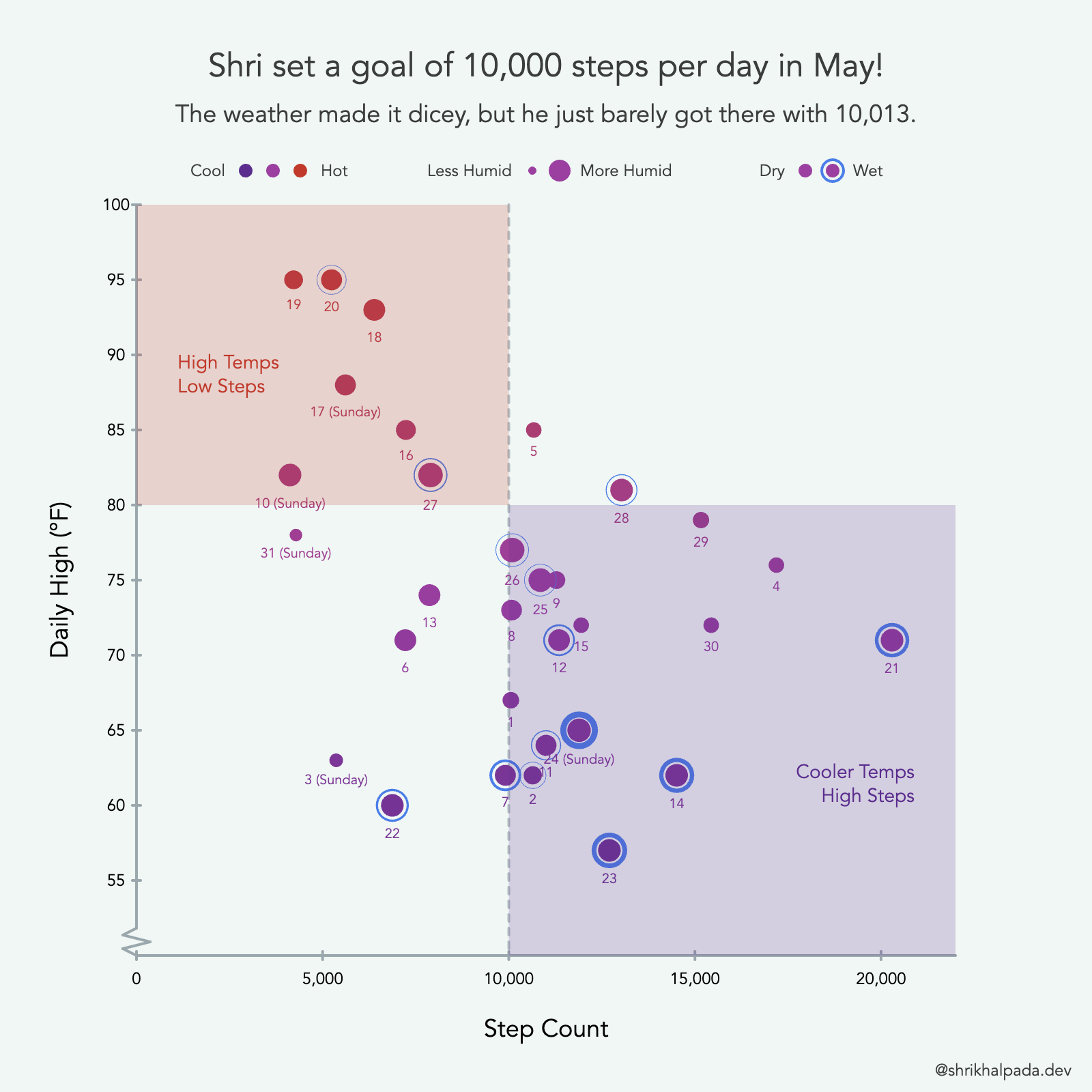
A scatterplot mapping Shri’s daily step count with the temperature in May 2026. I may have gone a bit overboard with the amount of variables I’m trying to display with each dot in the scatterplot: x-position for steps, y-position and color for temperature, size for humidity, outline for precipitation, text for date. But it works well for an audience of one! I can see the stories of my month in this chart:
Maybe the collective theme of my newsletter update this week can be summed as: stories are everywhere. — Shri |
||
|
A LETTER FROM
RobOn Wednesday the Spurs host the Knicks in Game 1 of the NBA Finals, and the series can be framed as a tale of two sizes. On one side, the 7’4” Victor Wembanyama, one of the most singular talents to ever play the sport. On the other, Jalen Brunson, a 6’2” guard you may not otherwise be able to pick out of a line at the grocery store. 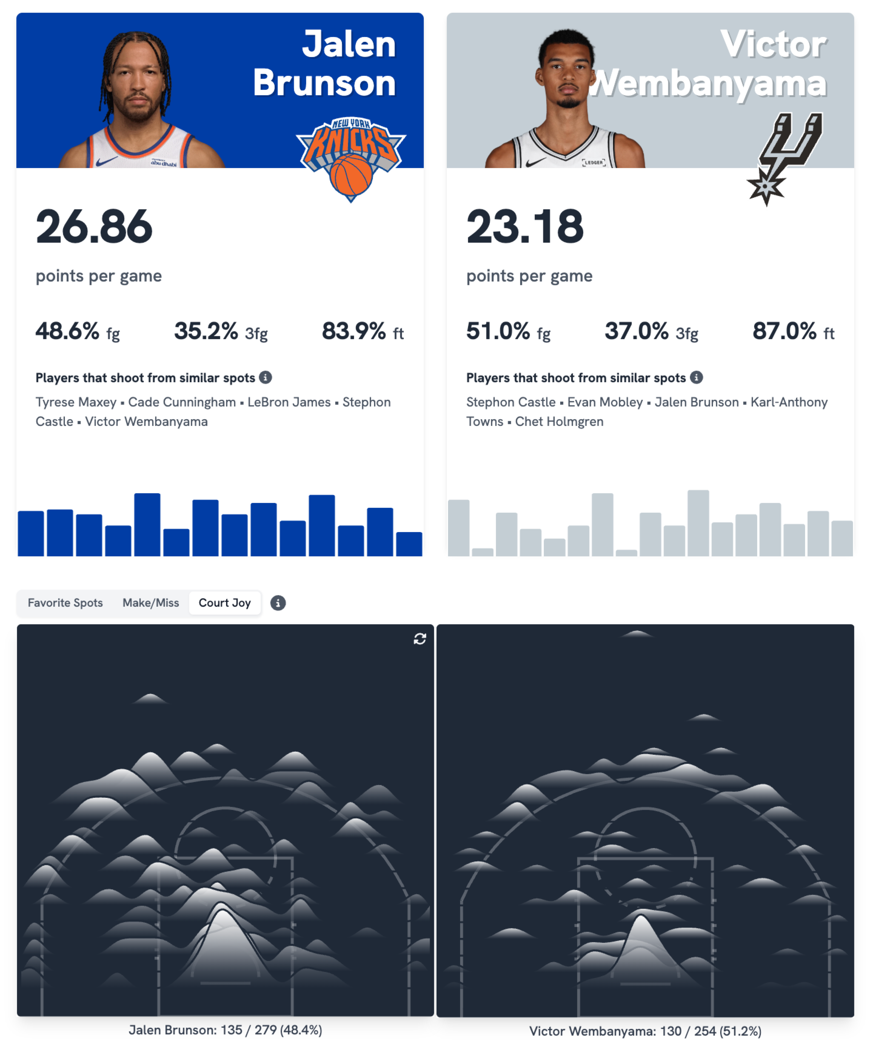
Where each man scores. Wembanyama (left) lives at the rim and the arc; Brunson (right) works the mid-range. Wembanyama gets his points the way the modern league prefers: at the rim and from behind the arc, the two most efficient places on the floor. Brunson is a footwork wizard, and does a real chunk of his work from the mid-range even at 6’2”. He shot 50% from between 5ft and 20ft this season and has continued at the same impressive clip in the playoffs. On a more nostalgic note, the passing wheel was the first visualization we ever built at PerThirtySix, a little over five years ago, and it’s still one of my favorites. Each ribbon represents the ball moving between two teammates. A connection that starts out thick for player A and becomes thin as it goes to player B means player A passes more to player B than player B does to player A. NEW YORK KNICKS 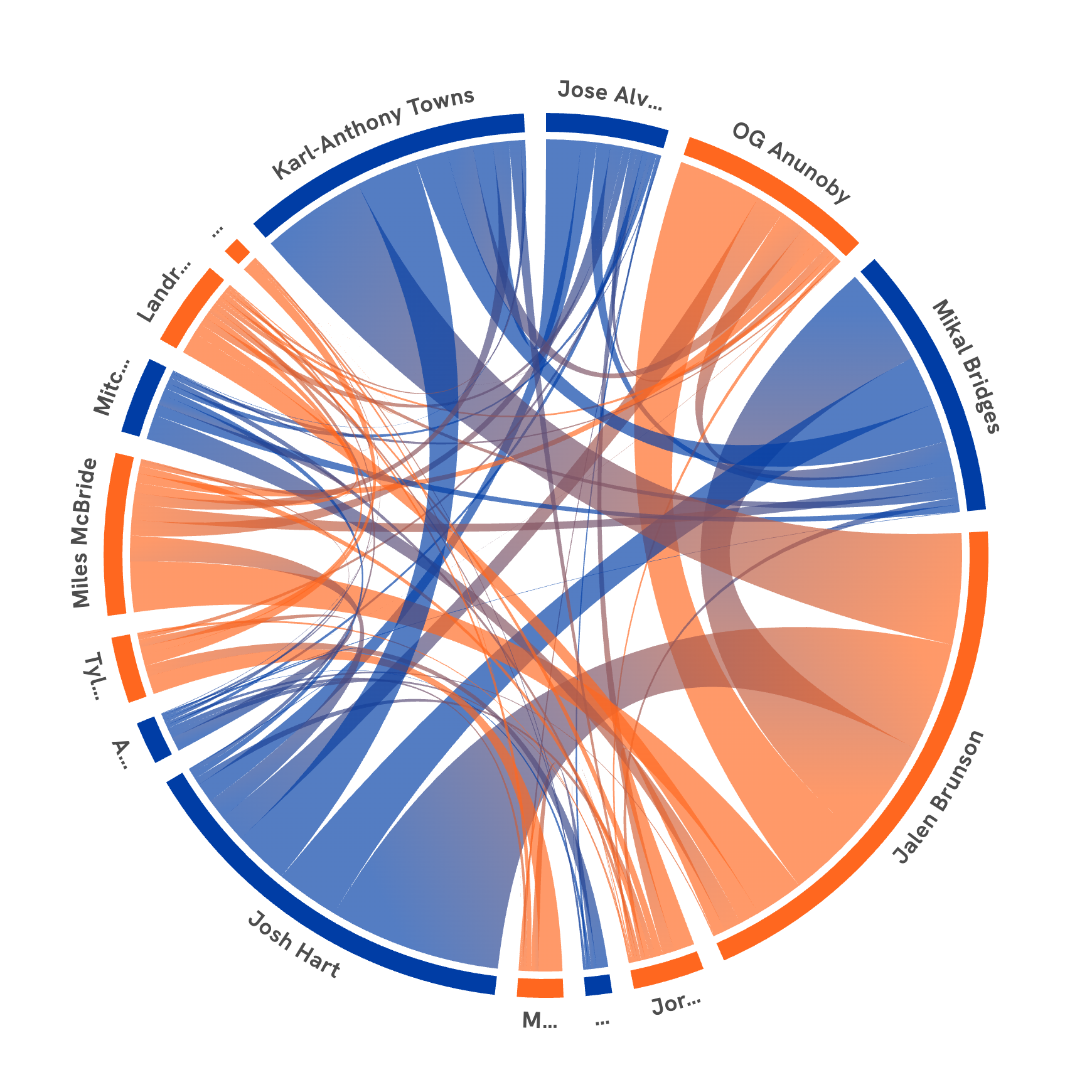
SAN ANTONIO SPURS 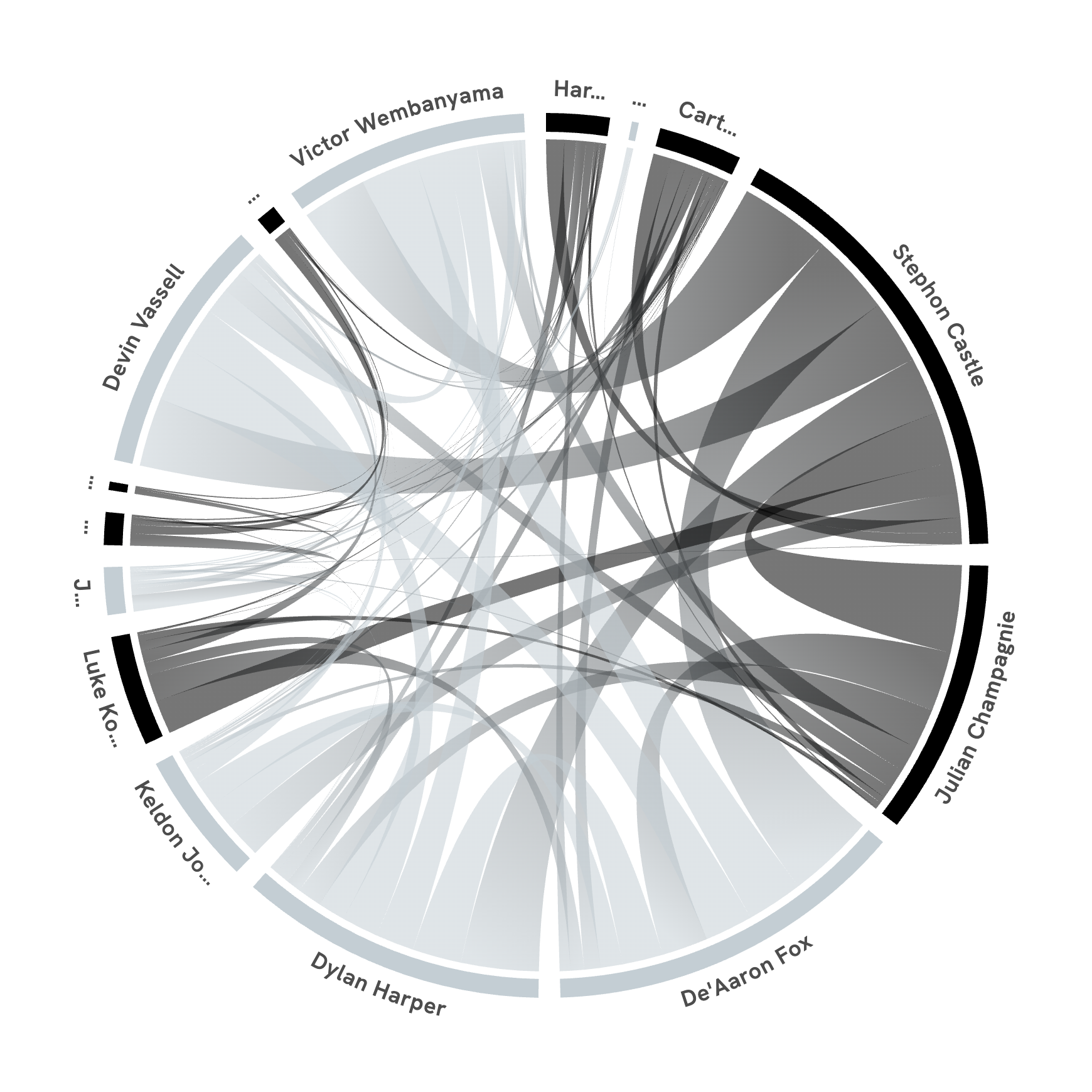
While I love the aesthetic of the circular chord chart, it has a really dense visual encoding. I came across Nadieh Bremer’s Lord of the Rings dialogue loom chart and thought it could be perfect for this same data. The Loom visualization shows passers on the left and receivers on the right. Both sides are sorted, meaning the players who pass the most are on the top-left and the players who receive the most are on the top-right. NEW YORK KNICKS 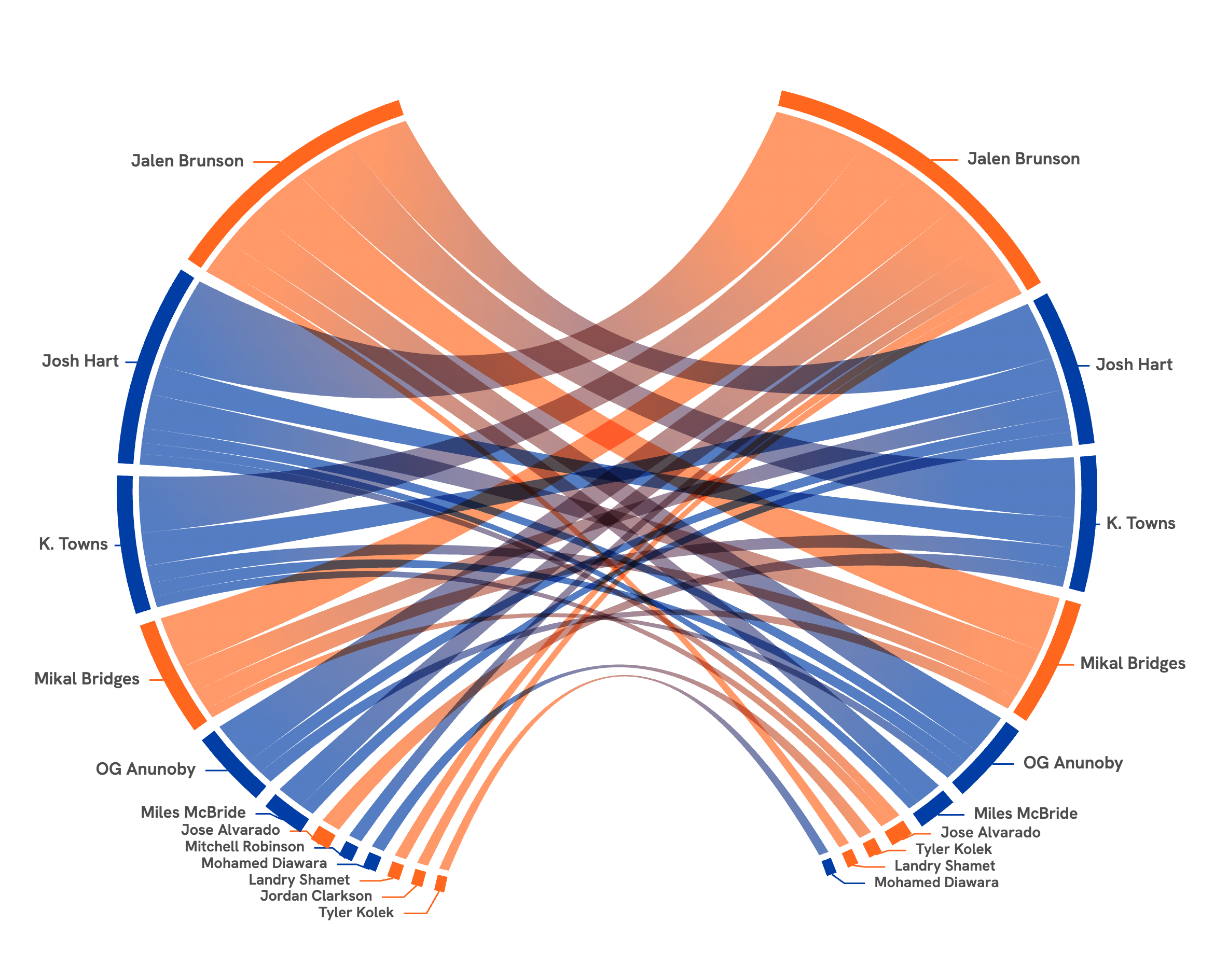
SAN ANTONIO SPURS 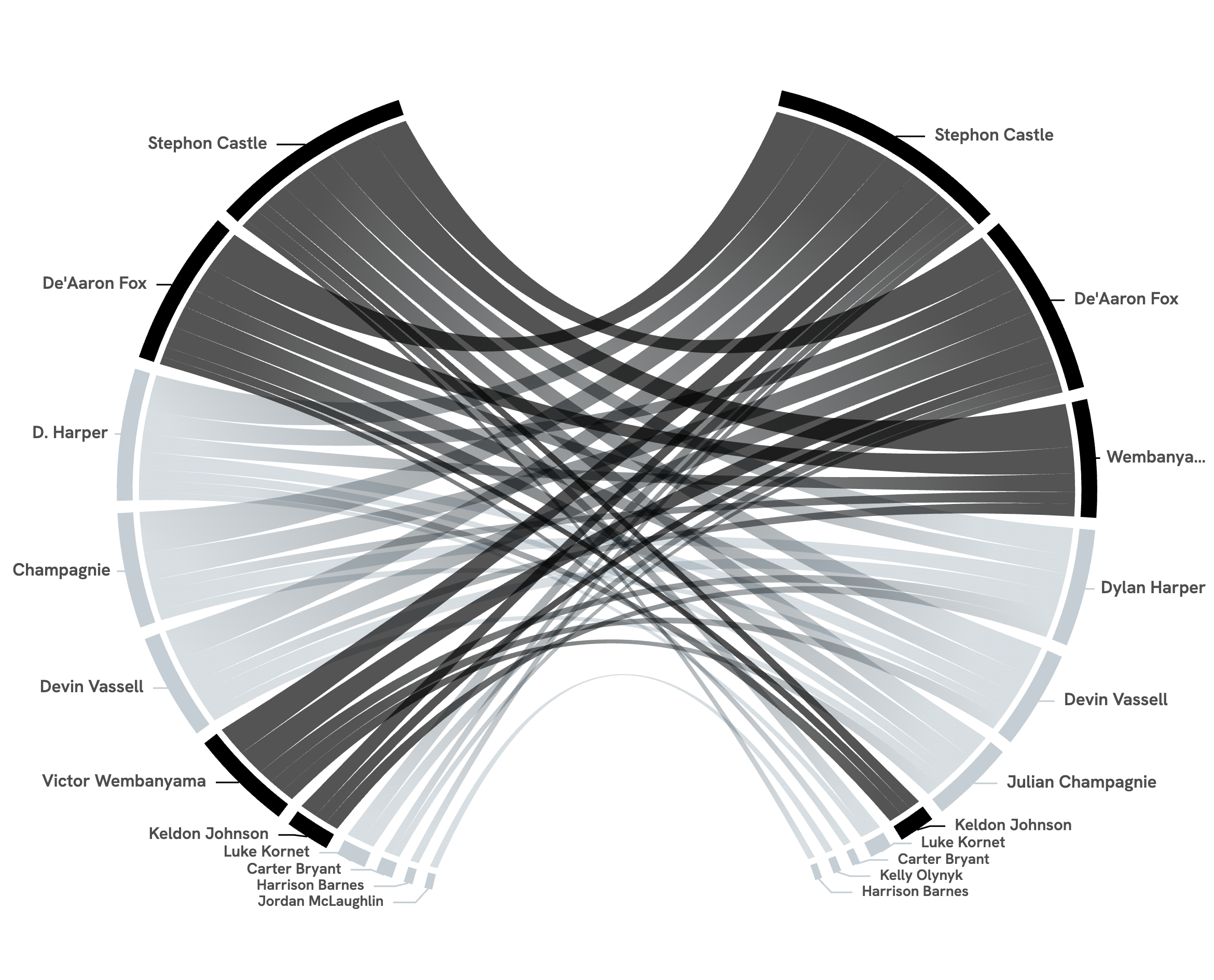
We should be in for a treat for this year’s NBA Finals. — Rob |
||
|
A FEW SMALL THINGS
If you’ve been forwarded this by a friend, you can subscribe directly here. If you have a specific question for either of us to answer in a future issue, just reply — it comes straight to our inboxes. |
||
|
THANKS FOR READING.
Written by Shri & Rob ·
perthirtysix.com
|