A NEWSLETTER FROM PERTHIRTYSIX
The Nine Thirty-Six
A letter from the two of us, most Mondays.
|
|||||||||||||||
|
A LETTER FROM
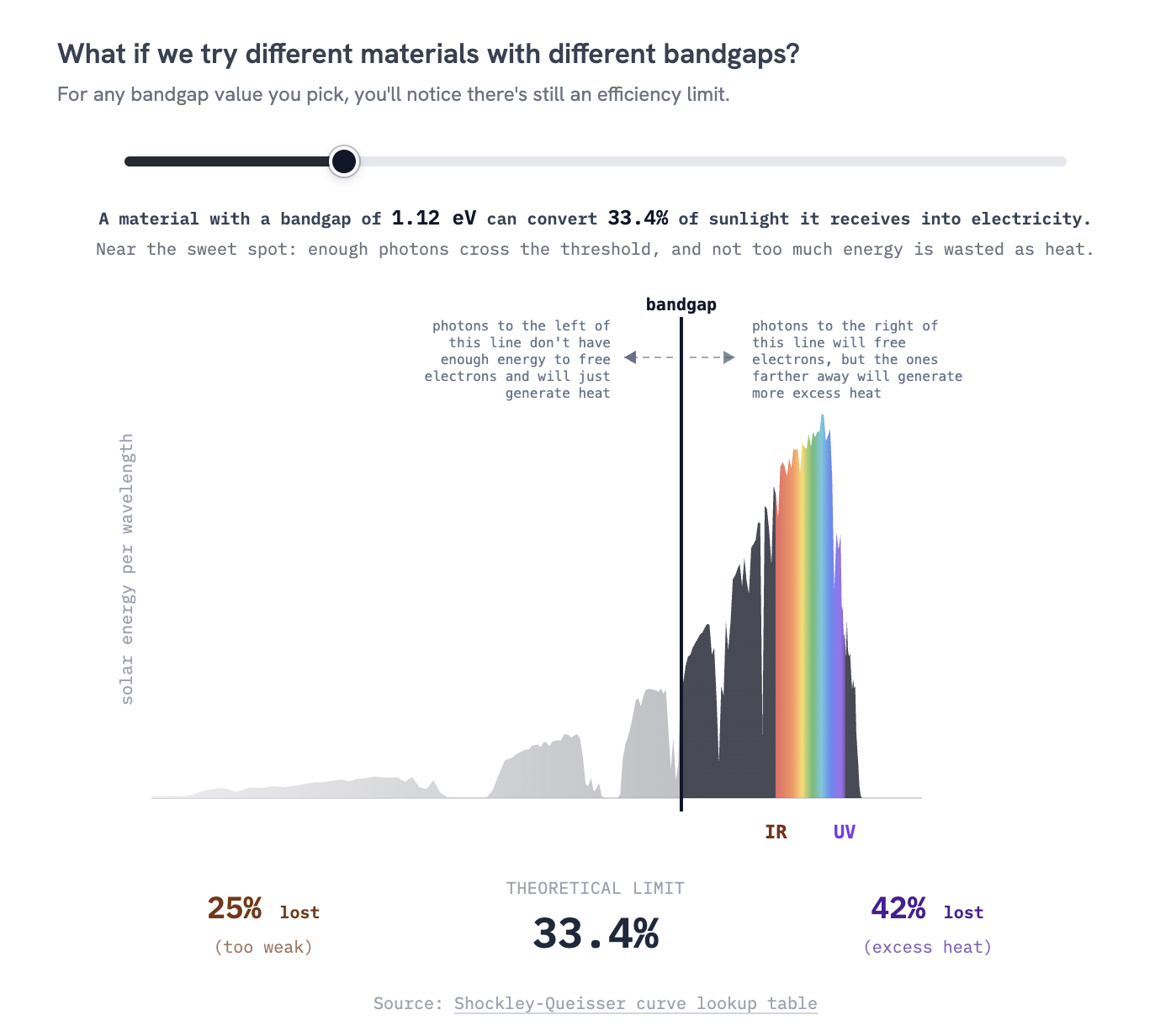
ShriThe fourth installment in the How The Heck series is out! It's all about solar panels, following the journey of how an atomic process in the core of the sun eventually gets converted into electricity on your rooftop. And also why, at this point, the technology isn't the hard part. I've got an idea I'm excited about for the next topic in the series, and look forward to diving into it after a little break. Besides that, I've been thinking a lot about the role of data visualization in how we communicate important and complex topics. Here's a particularly inspiring visualization by climate scientist Ed Hawkins: 
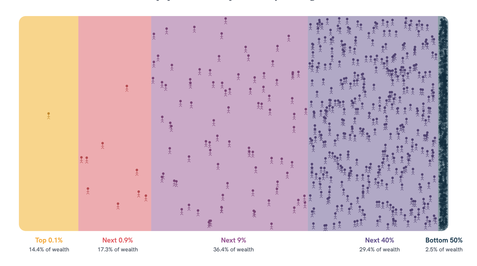
Ed Hawkins's climate stripes — global temperature, 1850 to now. It shows the change in average global temperature starting at 1850. Each stripe represents a year and the color represents the temperature. In many ways, it breaks the norms of what we'd consider “good” data visualization. There are no titles, legends, or annotations baked into it. It's not precise; I can't tell you what the value for a particular year is. But it is highly evocative and makes me feel a real sense of urgency. I made a chart last year that tried to apply this approach to American wealth inequality data. By representing wealth as space and people as stick figures, my hope was that the visual evokes a sense of claustrophobia as the reader realizes how crammed the right-most slice is: Any way to communicate information is a tradeoff. No approach will perfectly balance precision, intuition, ethics, and all of the other dimensions a visualization operates in. I wrote a longer-form piece about this last year. Hopefully some good food for thought. I'd love to hear what you think. — Shri |
|||||||||||||||
|
A LETTER FROM
RobOn February 27, 2016, Steph Curry hit an iconic 38-foot game-winning three-pointer, giving the Golden State Warriors a 121–118 overtime victory against the Kevin Durant–led Oklahoma City Thunder. Mike Breen, brilliant as always, had the call: “They have a timeout, decide not to use it. Curry, way downtown… BANG! BANGGG! Ohhh, what a shot from Curry!” 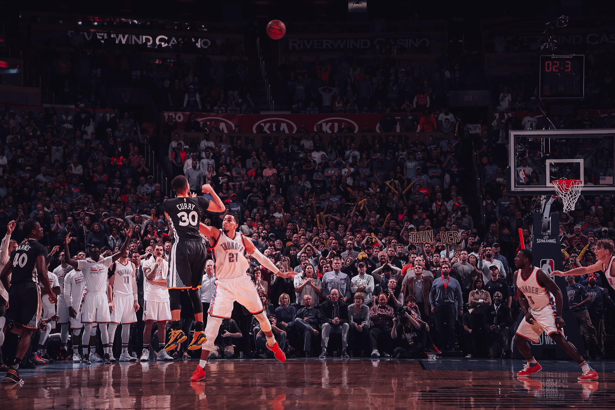
Curry's 38-footer over Oklahoma City, February 27, 2016. During the 2015–16 season, Steph shot an absurd 44% from beyond 30 feet on 32 attempts. For context, the other 3-point leaders that year were Klay Thompson, Damian Lillard, and James Harden. All future Hall of Famers. Between the three of them, they attempted only 18 shots from beyond 30 feet, and made only 3. Because shooting from beyond 30 feet just doesn't make sense…unless you're Steph Curry.
Let's take a look at one more game-winner, this time from 2019. We join this game with only 3.1 seconds left on the clock. The Hornets are down 114–112 against the Toronto Raptors. Jeremy Lamb receives the inbounds pass, and immediately loses control of the ball. He has to run back beyond half court to chase it down. By the time he grabs it, he has less than a second to spin 180° and throw up a heave. Miraculously, the ball hits off the backboard and drops in to the sound of the buzzer against a silenced crowd. By any measure, Lamb's shot was more difficult. (a) He was further away, (b) he had less time to set up, and (c) he was practically spinning as he shot it. And within the game, it was a higher-stakes shot — the Hornets were down two, not tied like Golden State. Yet…it's the less impressive shot. And I'd bet almost all fans would agree, even if they can't tell you why. So here's the puzzle. If we grade shots on probability, Lamb's clears easily. His shot was less likely to go in, so when it did, something more improbable happened. So his shot should be more impressive, right? But it isn't. The Curry Paradox: Curry's iconic 38-foot game-winner is more impressive than Lamb's wilder half-court heave. The less surprising the make, the more impressive it is. When a shot goes in, there are two questions we can ask. How unlikely was that? And what does it tell me about the shooter? Lamb's heave was literally a long shot, essentially a lottery ticket. An elite shooter, a benchwarmer, or just a guy off the street all make that shot at roughly the same near-zero rate. The make is rare, but it's rare in about the same way for everybody. So when it goes in, it doesn't tell you much about Lamb you didn't already know. You don't walk away with a stronger belief about him. You walk away shocked at what just happened. Curry's game-winner is different because shooting 35-footers at a 40% clip is something only Curry produces. The league hits maybe one in twenty shots from that spot; Curry hits closer to one in two. When his shot went in, we're not watching a coin land on its edge, we're watching a master at work. It was a make consistent with a shooter who's rewritten basketball geometry, and inconsistent with almost anyone else. 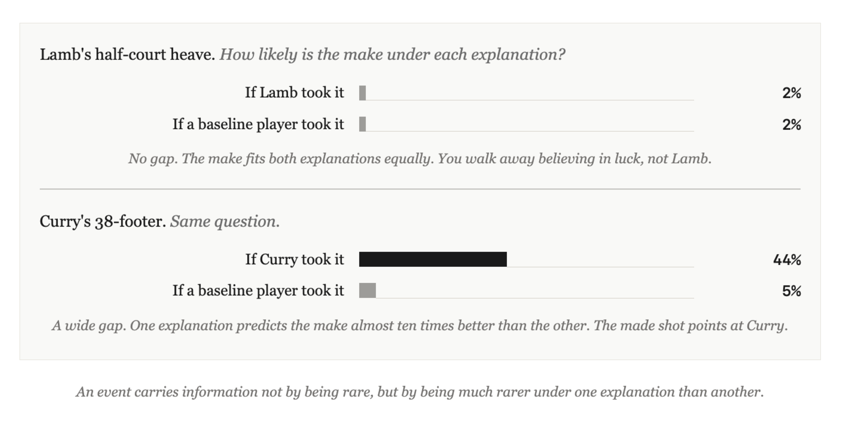
The make tells you something only when one explanation predicts it far better than another. Information theory gives us a nice framing for this: an observation tells you something about a hypothesis only when it's more likely under one hypothesis than another. Lamb's heave is essentially equally likely under “Lamb” and “anyone else,” so it doesn't discriminate between them. Curry's shot is far more likely under “Curry” than under “typical NBA shooter.” In other words, the rarity alone isn't information. It's not how rare is this event in the world, but how much rarer is it under one explanation than another. Lamb's shot was surprising. Curry's shot was meaningful. The Curry Paradox arises when, in information theory lingo, surprisal and weight of evidence are conflated. Our gut says “impressive” should track surprisal — the rarer the event, the more impressive. But I think what we actually respond to when we say a shot is “impressive” is weight of evidence. We're impressed by what the shot proves about the player, not by how unlikely the event was in a vacuum. Steph hitting that shot wasn't an event in a vacuum. It's his signature. — Rob |
|||||||||||||||
|
A FEW SMALL THINGS
If you've been forwarded this by a friend, you can subscribe directly here. If you have a specific question for either of us to answer in a future issue, just reply — it comes straight to our inboxes. |
|||||||||||||||
|
THANKS FOR READING.
Written by Shri & Rob ·
perthirtysix.com
|